Discuss positioning in css in detail
The elements in CSS are arranged according to the normal flow by default. There are two situations in which the arrangement of elements can be changed. One method is floating, which has been explained in detail in the previous article. The other method is to be discussed now. The positioning attribute Position has four values, namely static, relative, absolute, and fixed. The positioning element controls the position of the positioning element through the attributes left and top, which is 0 by default. We will describe the usage and differences of the four attribute values in the following content.
1. static (static positioning)
Static is the default value of the position attribute. Indicates that there is no positioning and the element appears in the normal flow.
2. relative (relative positioning)
Generate a relatively positioned element and position it relative to its normal position.
Look at the following case:
HTML code:
<p class="father">
    <p class="son">son</p></p>
CSS code:
.father{
    width: 500px;
    height: 500px;
    background: pink;
    margin: 0 auto;
}.son{
    width: 200px;
    height: 200px;
    background: lavender;
    margin: 0 auto;
}The effect is as follows:
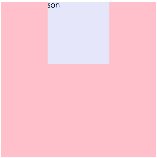
Code explanation: Under normal circumstances, p with the class name son appears in the following area, try it below if Add relative positioning to the element:
CSS code:
.son{
    width: 200px;
    height: 200px;
    background: lavender;
    margin: 0 auto;
    position: relative;
    left: 0;
    top: 0;
}The effect is as follows:

It can be found that the above case has not changed after adding relative positioning. The reason is that relative is positioned relative to its own position and does not break away from the document flow. In fact, if an element is set to relative positioning And after giving left:0;top:0;, it has no effect on the element. Let's continue to see what will happen if the left value and top value are not 0:
CSS code:
.son{
    width: 200px;
    height: 200px;
    background: lavender;
    margin: 0 auto;
    position: relative;
    left: 50px;
    top: 20px;
}The effect is as follows:
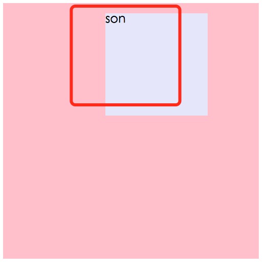
Effect explanation:
The red line frame is the position where the element itself should exist. Because the attribute left is 50px and the attribute top is 20px, it will be relatively Offset the position where the element itself should exist (that is, the position of the red line frame) by 50px to the left and 20px upward, to the position as shown in the picture.
3. absolute (absolute positioning)
First, absolutely positioned elements will break away from the document flow. Secondly, let’s analyze how absolutely positioned elements are positioned. , the absolutely positioned element will first find its nearest positioned parent element (except static). If there is no positioned parent element, it will keep looking upwards until the root element html. That is to say, if the absolutely positioned element does not have a positioned parent Level elements will be positioned relative to html.
Let’s take a look at the following case:
HTML code:
<p class="father">
    <p class="son1">son1</p>
    <p class="son2">son2</p></p>
CSS code:
.father{
    width: 500px;
    height: 500px;
    background: pink;
    margin: 0 auto;
}
.son1{
    width: 150px;
    height: 150px;
    background: lavender;
    margin: 0 20px;
    position: absolute;
    left: 0px;
    top: 0px;
}
.son2{
    width: 150px;
    height: 150px;
    background: skyblue;
    margin: 0 20px;
    position: absolute;
    left: 0px;
    top: 0px;
}The effect is as shown in the figure:

Effect analysis:
Absolutely positioned elements will break away from the document flow and be positioned later will cover the previous positioning, so son2 covers son1. son1 and son2 do not have a positioned parent, so they are positioned relative to the root element html. What happens if there is a positioned element? Let’s look at the following code:
CSS code:
.father{
    position: relative;
    width: 500px;
    height: 500px;
    background: pink;
    margin: 0 auto;
}.son1{
    width: 150px;
    height: 150px;
    background: lavender;
    margin: 0 20px;
    position: absolute;
    left: 0px;
    top: 0px;
}.son2{
    width: 150px;
    height: 150px;
    background: skyblue;
    margin: 0 20px;
    position: absolute;
    left: 50px;
    top: 50px;
}The effect is as follows:
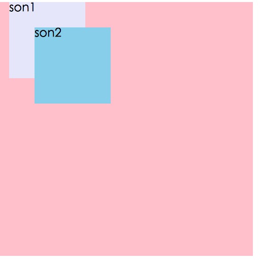
Effect analysis:
Father is the positioning parent of son1 and son2, so son1 and son2 are positioned relative to father. Because son2 is positioned later, son2 is covered. above son1. Because of the characteristics of relative positioning, relative positioning is often used as a containing box for absolute positioning.
4. fixed (fixed positioning)
Many times fixed positioning is needed in pages, such as the back to top button in the lower right corner of the page. Fixed positioning means that the element is always fixed in this place according to the size of the browser window. Even if the page slides, its position will not be affected. Let’s look at the following case:
HTML code:
<body>
    <p class="backTop">top</p></body>
CSS code:
body{
    height: 2000px;
    background: #C0C0C0;
}.backTop{
    width: 70px;
    height: 70px;
    background: pink;
}
The effect of the page without positioning is as follows:
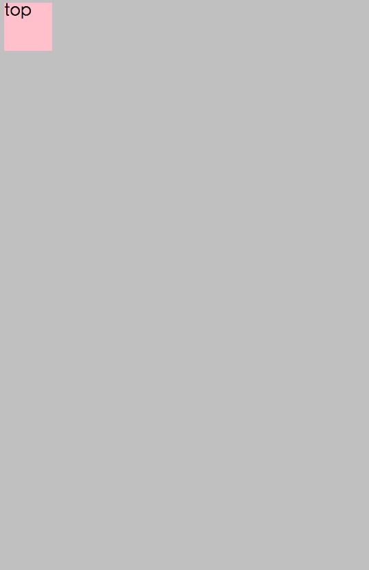
Give the button a fixed positioning, as follows:
CSS code:
.backTop{
    width: 70px;
    height: 70px;
    background: pink;
    position: fixed;
    right: 30px;
    bottom: 30px;
}The effect is as follows:

Even as the page scrolls, the position of the button will not change. There are many advertising areas on the page. Even if the page scrolls, the position of the advertisement is always there. This is also achieved by using fixed positioning. Note that fixedly positioned elements are also outside the document flow.
5. Summary
For several situations of floating, we only need to consider it from two aspects. On the one hand, it is the question of how to position the positioning element. On the other hand, there is the issue of whether the positioning element is separated from the document flow (the issue of being separated from the document flow will not be elaborated here). As long as these two aspects are thoroughly understood, it will be easy to understand positioning. Let’s summarize several positionings:
position:static (static positioning) fixed (fixed positioning) relative (relative positioning) absolute (absolute positioning)
static: The default value of position, which is equivalent to no positioning. Does not break away from the document flow and takes up page space.
relative: The position is relative to itself. Does not break away from the document flow and takes up page space.
absolute: The position is relative to the positioned parent element. It is separated from the document flow and does not occupy page space.
fixed: The position is relative to the browser window. It is separated from the document flow and does not occupy page space.
For more details on positioning in css, please pay attention to the PHP Chinese website for related articles!

Hot AI Tools

Undresser.AI Undress
AI-powered app for creating realistic nude photos

AI Clothes Remover
Online AI tool for removing clothes from photos.

Undress AI Tool
Undress images for free

Clothoff.io
AI clothes remover

Video Face Swap
Swap faces in any video effortlessly with our completely free AI face swap tool!

Hot Article

Hot Tools

Notepad++7.3.1
Easy-to-use and free code editor

SublimeText3 Chinese version
Chinese version, very easy to use

Zend Studio 13.0.1
Powerful PHP integrated development environment

Dreamweaver CS6
Visual web development tools

SublimeText3 Mac version
God-level code editing software (SublimeText3)

Hot Topics
 1387
1387
 52
52
 Building an Ethereum app using Redwood.js and Fauna
Mar 28, 2025 am 09:18 AM
With the recent climb of Bitcoin’s price over 20k $USD, and to it recently breaking 30k, I thought it’s worth taking a deep dive back into creating Ethereum
 Vue 3
Apr 02, 2025 pm 06:32 PM
It's out! Congrats to the Vue team for getting it done, I know it was a massive effort and a long time coming. All new docs, as well.
 Can you get valid CSS property values from the browser?
Apr 02, 2025 pm 06:17 PM
I had someone write in with this very legit question. Lea just blogged about how you can get valid CSS properties themselves from the browser. That's like this.
 A bit on ci/cd
Apr 02, 2025 pm 06:21 PM
I'd say "website" fits better than "mobile app" but I like this framing from Max Lynch:
 Stacked Cards with Sticky Positioning and a Dash of Sass
Apr 03, 2025 am 10:30 AM
The other day, I spotted this particularly lovely bit from Corey Ginnivan’s website where a collection of cards stack on top of one another as you scroll.
 Using Markdown and Localization in the WordPress Block Editor
Apr 02, 2025 am 04:27 AM
If we need to show documentation to the user directly in the WordPress editor, what is the best way to do it?
 Comparing Browsers for Responsive Design
Apr 02, 2025 pm 06:25 PM
There are a number of these desktop apps where the goal is showing your site at different dimensions all at the same time. So you can, for example, be writing
 Let's use (X, X, X, X) for talking about specificity
Mar 24, 2025 am 10:37 AM
I was just chatting with Eric Meyer the other day and I remembered an Eric Meyer story from my formative years. I wrote a blog post about CSS specificity, and


