
As a coder, my art foundation is weak. We can refer to some mature web PS tutorials to improve our design capabilities. To paraphrase a sentence, "If you are familiar with three hundred Tang poems, you can recite them even if you don't know how to compose them."
The tutorials in this series come from online PS tutorials, all from abroad, and all in English. I try to translate these excellent tutorials. Due to limited translation capabilities, the details of the translation still need to be worked out. I hope that the majority of netizens will give me some advice.
Agreement:
1. The software used in this article is the Photoshop CS5 version
2. The screenshots of the original tutorial are in English. I re-screened them based on the re-production. Chinese version of Figure
3. Some operations in the original text do not give parameters. I measured some parameters through repeated testing, which are displayed in red text. For some wrong parameters, the correct parameters are displayed directly in red text
For example: (90, 22, 231, 77) , indicating that the coordinates of the upper left corner of the rectangle are (90, 22) , width 231, height 77
For example: (90,22), indicating that the coordinates of the upper left corner of the rectangle are (90,22), the other two parameters of the rectangle have been specified in the tutorial
4. My own experience will be attached at the end of the tutorial. Some are optimizations of some steps in the tutorial, etc.
Step 0 – Start by setting-up the document
Step 0: Set-up the document
Open a new document: dimensions 1200×1640 pixels and resolution 72 pixels/inch.
New document: dimensions: 1200px*1640px, resolution: 72px/inch

To keep everything aligned we can use the 960s Grid System from here; it is not essential in this case, because we can use the Photoshop Guides (Ctrl+R to activate rules, View > New Guide to add the guide), but, how you can see in the previous tutorials, sometimes it can help.
To align elements, we can use the 960 grid layout system here ; It is not necessary here, because we can use PS guides (Ctrl + R to activate the ruler, View> New Guide to add guides), but you can refer to the previous tutorial, Sometimes it can help us very well
Step 1 – Background
Step 1: Background
We're going to create the basic layers for the background. In this case I had a precise idea on how to separate the different blocks to create the layout, why? Well, my tutorial, my web designs, ever start from a sketch (or a wireframe), it is useful just to keep in mind what is the final aim; but it's clear that during the design process we will probably add new elements.
We are going to create a basic background layer. In this case, I differentiate the different blocks exactly on the layout, why? Well, my tutorials, my web designs, constantly start from sketches (or wireframes), it helps to remember what the ultimate purpose of each piece is, but obviously during the design process we may add new Elements.
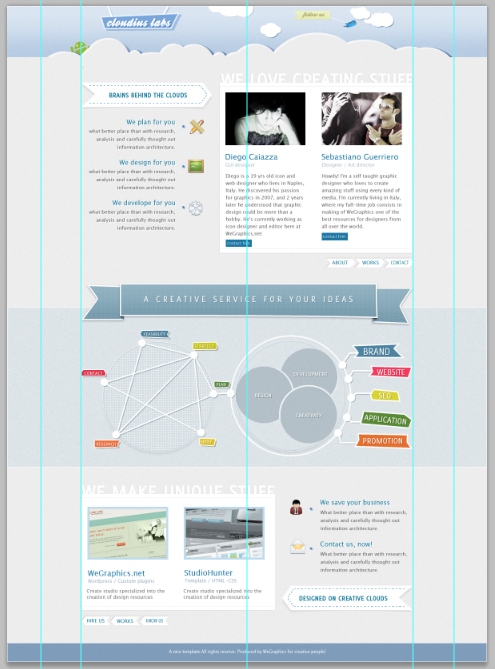
So, in this case, we'll create 5 containers, where we'll add the content.
So, in this tutorial, we'll create 5 containers, where we'll add the content. Different areas, add different content to each area
Add a first layer, it will be our background, with the color #ededed. Rasterize the layer (color #ededed) and add a subtle noise effect (Filter > Noise > Add Noise… Amount 0,5 – 0,8; check Gaussian and Monochromatic).
Add the first layer, this will be our background, Color: #ededed. Rasterize the layer (color: #ededed) and add a subtle noise effect (Filter>Noise>Add Noise, Amount: 0.5-0.8; check Gaussian Distribution and Solid color)

Draw a rectangle on the top of the page (using the Rectangle Tool, color #cddcec) and, again, rasterize the shape and add a subtle noise effect (Filter > Noise > Add Noise… Amount 0,5 – 0,8; check Gaussian and Monochromatic). Add a Gradient Overlay (Soft Light, 54%, from black to white, Angle 90% and Scale 75 %).
Draw a rectangle (0, 0, 1200, 128) (Use the Rectangle Tool, Color: #cddcec) at the top of the page. Again, rasterize the layer and Add a subtle noise (Filter>Noise>Add Noise, Amount: 0.5-0.8; check Gaussian Distribution and Monochrome). Add a Gradient Overlay (Soft Light, 54%, Black to White, Angle 90, Scale 75%)

Add, using the Rectangle Tool (U), a new shape (color #608bb6, height around 400 pixels) for the middle container, set Blend Mode to Color Burn and Fill to 75% and, then add a white Stroke of 1 pixel (from Layer Style). Finally the rectangular shape for the credits (the footer), use the same tool and color of the middle container, but now set Blend to Linear Light and Opacity to 70%.
Use the Rectangle Tool to add a rectangle(0,753,1200,400)(Color: #608bb6, Height 400px) as the middle area, set Blending Mode Set Color Burn, Fill to 75%, then add a 1px white Stroke (from the Layer Styles panel). Finally, add a rectangle (0, 1592, 1200, 48) to display the subtitles (footer) at the bottom, using the same tools and colors as the middle area, just set the blending mode to Linear light ( should be linear deepening), opacity is 70%
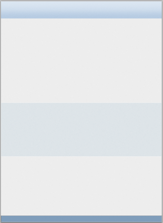
Below the final result.
The following is the final result. Result
##Step 2 – Background details
Step 2: Background details
We want to give more character to our background!Add a new layer (Ctr+Shift+N) and use the Single Row Marquee Tool to add a 1 pixel white line on the top od the canvas.We want to add more symbols to the backgroundCreate a new layer (Ctrl+Shift+N) and use theSingle Line Marquee ToolAdd a 1px white line at the top of the canvas
Suggestion: It is better to use the Straight line tool to draw a straight line (0, 0, 1200, 1)

Rectangular Marquee Tool to create two 1px*1px squares, one with a fill color of #ffffff and the other with a fill color of #000000, as shown below. Then click: Edit> Define Pattern
Suggestion: It is more appropriate to use the Pencil Tool

##We have a new pattern that we're going to use, go back to our main document. Create a new layer and (with the Rectangular Marquee Tool) draw a selection that covers the whole canvas , fill it with a random color, set Fill to 0% then add Pattern Overlay from Layer Style.
We are about to use our new pattern and return to our main document. Create a new layer,
name it pattern(use the Rectangular Marquee Tool), draw a selection covering the entire canvas, fill it with any color, and set the fill to 0%. Then add a pattern overlay layer style


You can add 5 guides (84px – 186px – 600px – 1014px – 1118px) in order to limit the work area, then use the Ellipse Tool to add some shapes as shown to create the basic shapes. Select all the layers from the Layers Palette (Ctrl+click on layers) and then Ctr+G to group the shapes.
You need to add 5 guide lines (84px – 186px – 600px – 1014px – 1118px) to divide the work Area, use the Ellipse Tool to add some shapes as shown below to create the basic shape. Select these layers on the Layers panel (Ctrl+Click these layers), then press Ctrl+G to merge these shapes into a group

Duplicate the group and convert the copy to a Smart Object – right click on the group in the layer palette, then Convert To A Smart Object – resterize it and add a subtle nois effect. Now you have to hide the excess part of the clouds using a layer mask: Ctrl+click on the “Top-background” layer thumbnail (in the Layer Palette), in order to create a selection which excludes the bottom of the clouds, then select the clouds' layer and add a vector mask.
Duplicate the group and convert the copy to a Smart Object - right-click the group on the Layers panel and select Convert to Smart Object - Rasterize the layer and add subtle noise color effects. Now, you have to hide the rest of the clouds using a layer mask: Ctrl + mouse click on the Top-background layer thumbnail (in the Layers palette), create a selection excluding the bottom clouds, Then select the cloud layer and Add a layer mask.


Then apply the following style.
Then apply the following style as shown below,Move the pattern layer to the top in the layer panel

Color of color overlay: #ededed

Now we draw a nice shadow for the clouds. Duplicate the clouds' layer and positionate the copy just below the original layer, set the fill to 0% and apply the following style.
Now we add a nice shadow to the clouds. Copy the cloud layer, then place the copy below the current layer (a little to the right), set the fill to 0%, and then add the style as shown below
Note: before adding the style Before, we still have to perform some operations, which is to delete the lower half of the copied cloud
Select the layer of the cloud copy, and then use the rectangular marquee tool to create the following selection

Press the delete key and delete the lower half of the copy of the cloud
Then fill it to 0% and add the style as shown below

Gradient Color Editor: Color on the left: #4d76a4, Opacity on the right 80%


At this point use the same techniques to draw other clouds.
At this point use the same techniques to draw other clouds. For the cloud color overlay, select white color

Step 3 – Header details
Time to add the logo. Use the Pen Tool (color #79a7db) to design a billoboard (doubts on how to use the Pen Tool? Read this fantastic article written by Sebastiano), use the Line Tool to add the two white segments. Then add the following style to the billboard.
Step 3: Details of the header area
Add the LOGO of the web page. Use the Pen Tool (color: #79a7db) to design a billboard (Wondering how to use the Pen Tool? Read this wonderful article by SEBASTIANO) and use the Line Tool to add two white lines Line segment, thickness is 4px, and then add the following layer style
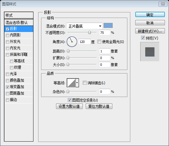
Color of projection to the billboard: #79a7db


Apply the same Drop Shadow for the two white lines too.
Give two Add the same shadow to the white straight line, change the distance to 2
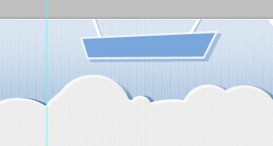
Add the text using the Horizontal Type Tool (T) , using the Ballpark Font, then add a Drop Shadow and a soft Gradient Overlay. The colors of the gradient overlay are: #79a7db

 #After the logo we are going to draw a nice, and simple, robot character using Zoom, Pen Tool, Ellipse Tool and Rounded Rectangle Tool. There isn't the need to explain step by step how to create the robot, take a look to the image below and, at a glance, you'll unbderstand how to draw our “friend”.
After completing the logo, we use the Scale Tool, Pen Tool, and Ellipse Tool , Rounded Rectangle tool to draw a nice, simple, robot symbol. There is no need to explain step by step how to create a robot, let’s take a look at the picture below. At a glance, you will understand how to draw our friend.
Group all the shapes used to compose the robot and Add a Layer Mask, as previously done, to obtain the following result.
Group all the shapes into a group, Form the robot and add a layer mask, I have done this before and got the following result.
Drawing this robot is too complicated. I directly found an Android picture on the Internet to replace this robot

Now we have to draw the bird and the badge. We use the Pen Tool, the Brush Tool an the Horizontal Type Tool. Take a look below to understand how to enhance our layout with a sweet and, I repeat, very simple illustration.
Now let’s draw the bird and the coat of arms . We use the pen tool, brush tool, and horizontal text tool. Take a look at the following tips and very simple example to understand how to improve our layout.
Note: I don’t want to draw the bird anymore, just find it online
Add the image of the bird to the appropriate location

Add a rectangle on the upper left side of the bird using the Rectangle Tool, color: #ebefbc

Use Add Anchor Point ToolAdd an anchor point in the middle of the left side of the rectangle

Add the new Drag the added anchor point to the right

Add the following layer style to the shape:


Use the Line Tool to draw a white straight line between the bird and the shape

Use Text tool to add text follow us in the light yellow shape, font: Ballpark

Step 4 – First container
Step 4: First content area
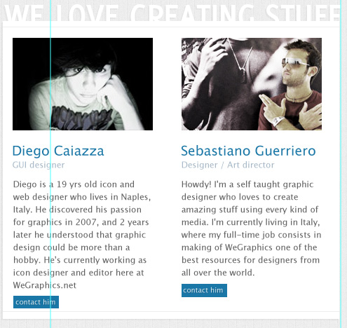
First of all create the box where we will insert the information of the team's members. Use the Rectangle Tool to draw a 480×425 white box, add two gray lines as shown (Create Clipping mask to limite the segments within the white box), and add also a text (use Delicious Font).
First create an area to display team member information. Use the Rectangle Tool to create a white rectangle (532, 192) , size: 480px*425px, add two gray (#eeeeee) straight lines as shown below ((532, 200) and (532, 606)) (Create a clipping mask so that the straight line only shows inside the white rectangle) and add a piece of text (Font: Delicious), and follow The following picture adds styles to the white rectangle and text:


The font settings for the designer’s name text are as follows: Color: #1b77a8
Identity The font of the text is as follows: Color: #a8b9c9
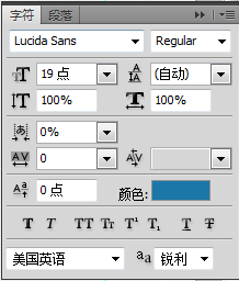
The font of the description information is as follows: Color: #898989

Button Color: #1b77a8
Text font on the button: Color: #ffffff

 Use the same technique as follow us to draw a white arrow. With the help of the grid, create a rectangle with the
, add anchor points with the
Add Anchor Point Tooland then turn it into A beautiful ribbon
Add the shadow to the ribbon. Duplicate the layer just created (you can temporarily hide the main shape), set color to #000 and opacity to 5%. Right click on the shape and go to Free Trasform Path and activate swarp modes to obtain the following result.
Add a drop shadow to the streamer. Duplicate the layer you just created (you can hide the main shape temporarily), set the color to #000000 and the opacity to 5%. Right-click on the shape and selectFree Transform Path and activate
, and adjust it to look like the following


Use the Horizontal Type Tool to create a “- – – – – – – –” string, you can rasterize and trasform it to create the following effect .Also add a soft drop shadow. The effect below transforms and adds a soft drop shadow
 Finally add the text (using Delicious Font).
Finally add Some text (Font: Delicious)
 Now create three blocks with descriptions of services that the studio provides. In this section we use the awesome icon sets , created by Asher Abbasi for WeGraphics, Wapp vol. 2 and Wapp vol. 1.
Remember: in this case the guides are really useful to fill with icons and text the section.
Now Create 3 blocks to describe the services provided by the studio. Here we are going to use some icon sets, Wapp vol. 2 and Wapp vol. 1 from WeGraphics by Asher Abbasi
Remember: the grid is here to help you place your icons and text
 Title font: color: #10789b
## Paragraph text font: color : #585858, text right-aligned

Add three “dots” (with a nice drop shadow) and enhance the text with a 1px white drop shadow as shown below.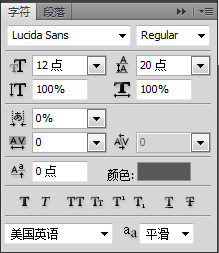
Color: #5a8cc1
, and add a 1px white shadow to the previous text as shown belowPoint projection, projection color: #a3c6e6
Projection of text

We create also a nice menu, just below the white box, it should be clear how to realize this menu at this point. We add just a soft Inner Shadow to the “arrows.”
and add text


Step 5 – The middle ribbon
Step 5: The middle ribbon
The middle element of our design is an informative infographic that is introduced by a big ribbon that contains a slogan. In order to realize this ribbon we will create 5 custom shapes using, as usual, the Pen Tool (I remind, again, that if you are a beginner you can read Photoshop For Beginners: The pen tool to learn more about how to use this tool). Take a look below to understand what kind of shapes we need to draw (note: we will use #497287 for the main shapes and #798ea4 for the darker shapes).
The middle element of our design is a The informative infographic area is introduced with a large streamer containing a slogan. To implement this ribbon, we create 5 custom shapes using the Pen Tool as usual, (I remind you again that if you are a beginner, you can read Getting Started: Pen Tool in Photoshop , to learn more about how to use this tool). Let's take a look at exactly what shapes need to be drawn, (note: the color of the main shape: #497287 and the color of the darker shapes: #798ea4).
Note: You can also use theRectangle Tool plus Direct Selection Tool to complete similar shapes, as shown below. In order to be eye-catching, each uses a bright eye The color of


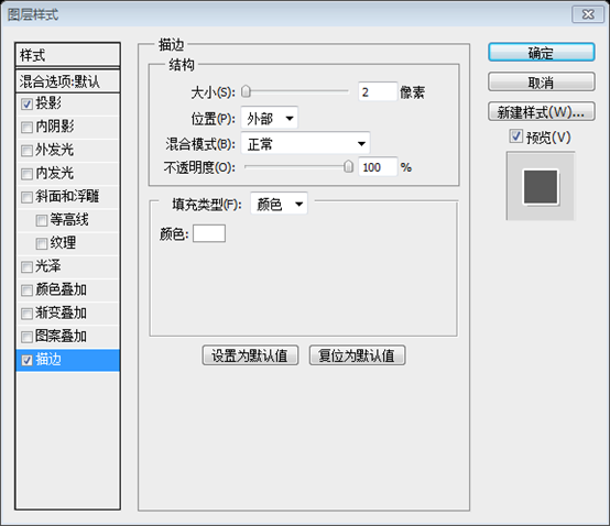
What about the style? Well, we apply the same style for the “front-shape,” as you can see below (the pattern, that we are going to use, is from Old Paper Patterns on WeGraphics).
What is the style setting? Okay, we will add the same layer style as the front-shape, like in the image below (for the pattern, we are going to use Old Paper Patterns on WeGraphics)
Color of the drop shadow: #445055

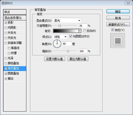 The pattern overlay uses a custom pattern, and the effect is similar
12*24 pattern, the left and One line on each side, color: #f0f0f0


 ##
##

For the two little triangles we apply the following style:
Add the following style to the two triangles:
The triangle on the left
Projected color: #445055


#Finnally add the slogan.
Finally, add the slogan
 The color of the projection: #445055


Step 6 – The infographic
The idea of adding a little infographic borns from the need to synthesize the creative process of our fictionary design studio. Below you can see the finale result (obvious, it's just a simplistic example of how you can describe a creative process behind the development of a project). Here's what you see as the final result (obviously, it's just a simple example, you can describe a creative process later in the process)
 Start designing the two circles (hold down Shift to draw a perfect circumference, color #3d3d3d). Set the, for the left shape, Fill to 0%; for the right shape, set Blend Mode to vivid Light and Fill to 35%. Add the style as shown below (it is the same for both the shapes, Pattern Overlay fo the left shape apart).
At the beginning design two circles
((240,840 , 275, 275) and (572, 837, 275, 275))(Hold down the Shift key to draw a very perfect circle, color: #3d3d3d). Set the left circle's fill to 0%; the right circle's blending mode to light, and its fill to 35%. Set the layer style as shown below (set the same for both circles, and then add a pattern overlay to the left side)
Color of projection: #445055
Inner glow color: #aac1d1

Add a pattern overlay style to the left one, the pattern is 12*12, and the upper left corner is 8*8 black Square

Note that the left circle use a custom pattern, we can create this pattern adopting the same technique of the Step 2.
Note that the circle on the left uses a custom pattern. We can create this pattern using the technique in step 2

Use Ellipse Tool (create the little white circle one time and then duplicate it to use again) and the Line Tool (Weight: 3px, color #ffffff) to design the graph on the left. Group all the shapes and the lines created , duplicate the group, convert it to smart object and then rasterize it. Now you can add the style to the layer.
Use the Ellipse Tool (create the small white circle once, then duplicate as many as needed) , and the Line Tool (weight: 3px, color: #ffffff), design the circle on the left. Group these shapes and lines, copy the group, convert to Smart Object and rasterize. Now you can add the layer style
for the drop shadow color: #94acb5



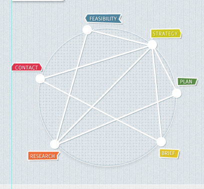
Color: #092f46) to the circle on the right, set the fill to 20%, and add text (you can add a soft drop shadow to the text) as shown below


Now we have to hide the excess parts of the “Design” and “Development” circles. As already seen we'll use the Layer Mask.
Ctrl+click on the shape of the “Creativity” circle in the Layer Palette, then go to Select > Modify > Expand set the value to 3 pixels.
Now we want to hide the excess parts of the Design and Development circles. As you saw before, using a layer mask
Ctrl+click the Creativity circle on the layers panel, then click: Select> Modify> Expand, set the extension amount to 3px

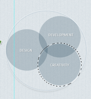
Ctrl+Shift+I to invert the selection and then apply layer mask to the shape named “Design.”
Press Ctrl+Shift+I to invert the selection, and then add a layer mask to the Design shape

Repeat the operation creating a new selection and expanding it as shown. You can use Ctrl+Shift+Click when you need to add two or more selections from vector mask thumbnail; in this case we create the selection by clicking on “Design” and “Creativity” shapes.
Repeat the above operations to create a new selection and expand it as shown below. When you need to add a vector mask selection from two or more thumbnails, you can use Ctrl+Shift+click to create a composite selection by clicking on the Design and Creativity shapes.

Ctrl+Shift+I to invert the selection and then apply layer mask to the shape named “Development.”
Press Ctrl+Shift+I Inverse selection, then add a layer mask to the Development shape

Apply a soft Drop Shadow to the three circles to obtain the following result.
Add soft shadows to the three circles to get the following result. The other parameters of the three circles are the same. The only difference is that the angles are different. Each circle must be adjusted carefully


Draw a new circle.
Draw a beautiful circle


Convert to Smart Object, rasterize it and add a drop shadow (the same drop shadow applied to the graph in this “Step”). Finally, complete the infographic adding other lines and tags as shown in the following image.
Convert to Smart Object, rasterize and add a drop shadow (add the same drop shadow as before in this step). Finally, add other labels and lines as shown below

##Step 7 – Bottom container
Step 7: Bottom content area
You can reproduce this section using the same techniques of the Step 4.You can reproduce this section using the steps The techniques in 4 are reproduced in this part.Rectangle Tool
Create a white rectangle (186, 1220, 484, 290); useStraight Line Tool
to create two straight lines (186, 1229, 484, 1) and (186, 1501 , 484, 1), Color: #eeeeee; UseText Tool to add some text, Font: Delicious. Add a drop shadow style to the text and white rectangle
Use the
Rectangle Tool  Create 2 rectangles (201, 1252) and (442, 1252), size: 202px*132px, and add the following stroke style and stroke color: #bedbed

Place image files above the two rectangles, then right-click on the image layer on the layer panel and select Add a clipping mask so that the image is only displayed in the rectangle


As shown below, add captions to the image
Title text font: Color: #1b77a8
## Subtitle text font: Color: #a8b9c9
Font of paragraph text: Color: #898989
#

Add some icons and text, as well as points on the right side, and add corresponding styles.
Title font: Color: #10789b

## Paragraph text font: Color: #585858

Add 2 points, color: #5a8cc1, and add a 1px white shadow to the previous text as shown below
Point projection, projection color: #a3c6e6
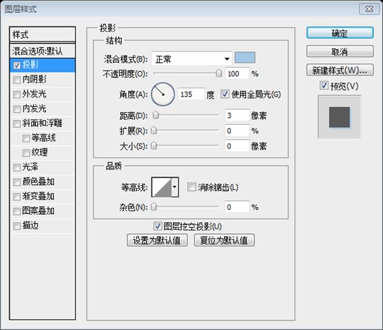
Text projection


Copy the large white streamer in the main content area, flip it horizontally, and modify the corresponding text
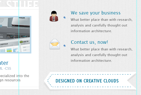
Copy the three ribbon buttons in the lower right corner of the main content area, flip them horizontally, and modify the corresponding text

Step 8 – Credits
Step 8: Copyright
Add a string with the credits.Add copyright information
 vcruntime140.dll cannot be found and code execution cannot continue
 pr shortcut key
 How to dress up Douyin Xiaohuoren
 What does data intelligence mean?
 parentnode usage
 How to read data from excel file in python
 What to do if the computer fakes death
 What to do if css cannot be loaded
 What is the difference between JD International self-operated and JD self-operated


