 Web Front-end
 PS Tutorial
 PS Web Design Tutorial XXV – Old-fashioned combination layout designed using Photoshop
PS Web Design Tutorial XXV – Old-fashioned combination layout designed using Photoshop
As a coder, my art foundation is weak. We can refer to some mature web PS tutorials to improve our design capabilities. To paraphrase a sentence, "If you are familiar with three hundred Tang poems, you can recite them even if you don't know how to compose them."
The tutorials in this series come from online PS tutorials, all from abroad, and all in English. I try to translate these excellent tutorials. Due to limited translation capabilities, the details of the translation still need to be worked out. I hope that the majority of netizens will give me some advice.
Agreement:
1. The software used in this article is the Photoshop CS5 version
2. The screenshots of the original tutorial are in English. I re-screened them based on the re-production. Chinese version of Figure
3. Some operations in the original text do not give parameters. I measured some parameters through repeated testing, which are displayed in red text. For some wrong parameters, the correct parameters are displayed directly in red text
For example: (90, 22, 231, 77) , indicating that the coordinates of the upper left corner of the rectangle are (90, 22) , width 231, height 77
For example: (90,22), indicating that the coordinates of the upper left corner of the rectangle are (90,22), the other two parameters of the rectangle have been specified in the tutorial
4. My own experience will be attached at the end of the tutorial. Some are optimizations of some steps in the tutorial, etc.
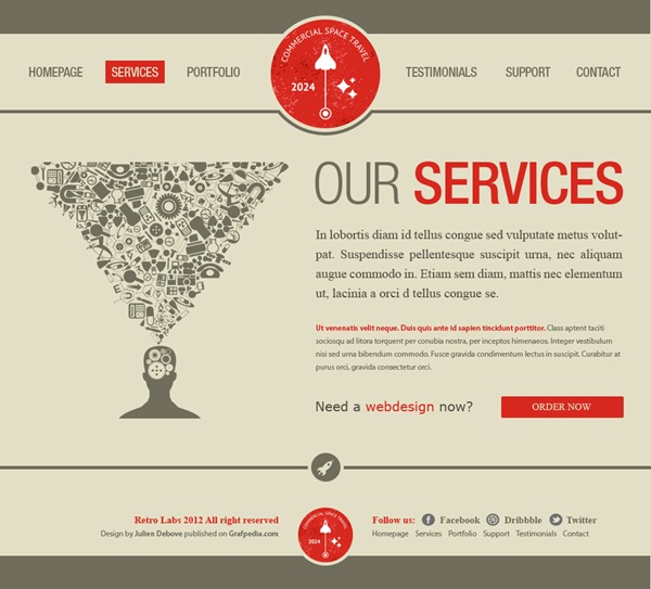
Welcome by this new Photoshop tutorial. During this tutorial will learn to create the Template of a website especially dedicated to the publication of Graphical works (portfolios for Web designers, graphic designers or photographs) . For its design, I created a vintage design. I invite you to follow this tutorial because it is really easy to do, then go on!
Welcome to this new Photoshop tutorial. In this tutorial you will learn how to create a website template, especially for publication dedicated to graphic work (including web designer, graphic designer or photo). For its design, I created a retro design. I invite you to follow this tutorial because it is really easy to do, let's get started!
Before to start, please, watch the preview of the final result of this Photoshop tutorial: Preview
Before you start, please preview the final result of this tutorial
STEP 1 Create a new document
Step 1: Create a new document
You are nowGo now to the menu File>New. Enter the name, the width and height used for your future picture, then click on the OK key.
You are ready to open your Photoshop software (please note that I am using CS6, but you can use a previous version to follow this tutorial). Click: File > New. Enter a name, width, height, etc. for your picture and click OK
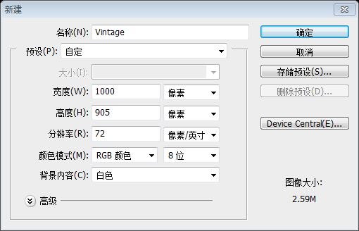
You picture gets automatically open. Press the Ctrl/Tab + R keys to display the guides. Go now to the menu File>Save as, to save your file.
Your picture will open automatically. Press Ctrl/Tab + R keys to display the grid. Click: File> Save as to save your file
STEP 2 Create the background and the top
Step 2: Create the background and top area
Select the Paint Bucket tool (G) to change the foreground color to #e3dfc6, and use the Paint Bucket tool (G) to fill the background.
Use the Rectangular Marquee tool (U) to create a gray bar #706d5c with a size of 1000x52px.
Select the Paint Bucket Tool and change the foreground color to: #e3dfc6 and fill the background with the Paint Bucket Tool. Use the Rectangle Tool to create a gray banner (0,0), color: #706d5c, size: 1000*52px

Keep under this bar a free space of 117px, then create a second bar with a size of 1000x5px.
Keep under this bar a free space of 117px, then create a second bar with a size of 1000x5px. Create a second banner (169, 0), size: 1000*5px

Notice: Do not hesitate to use the Photoshop guides to make your work easier. It is really easy to create a guide: click on the rule, then, move you cursor on your document and stop to keep the click button of your mouse, at the right place you need to create the guide.
Note: Don’t hesitate to use Photoshop guides to make your work easier. It's easy to create guides: Click on the ruler, then, hold down the mouse and move it to a suitable location in your document. Release your mouse to create the guide.
STEP 3 Create the menu
Step 3: Create the menu
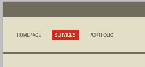
To create the menu, create first a new group you name « the links”. Use now the Text tool (T) to create the links of the menu (see picture below). Font used Helvetica Neue LT std, with the following color #706d5c , and a size of 20px.
To create the menu, create a new group the links. Now use the Text tool to create the text links for the menu (see the image below). LT std, color: #706d5c, font size: 20px. Depending on the situation, I scale it horizontally by 70%. To simulate the hover/active of the links, I created a red rectangle #d7281e just under of one of the links (but you can apply the color of your choice).
To simulate the hover/active of the links , I want to create a red (#d7281e) rectangle below a link (you can also add your own color)
Change the active link color under the red rectangle, select the background color: #e3dfc6
 Step 4: Add LOGO
For the logo, I used a resource available on the website of our partnership Shutterstock. Go to this page to download the vector file. Open the file using Illustrator. Go to this page to download the vector file. Use a file opened in Illustrator.
To create a copy of the red logo, select it and press the Ctrl/Tab + C keys. Go back to your document under Photoshop, then on Ctrl/Tab + V to insert the logo. Depending of the main color of the Template, you can choose another logo regarding this colour.
To create a copy of the red logo, select it and press Ctrl + C, go back to your PS document, Then press Ctrl + V to insert this LOGO. Based on the main color in the template, you can choose this color for this LOGO.
Use the Elipse tool (U) to create a round with same size of your logo and use same color than the one used for the background # e3dfc6.Use theEllipse Tool
(U) to create a circle the same size as your LOGO (416, 30, 168, 168), and use the same color as the background, color: #e3dfc6.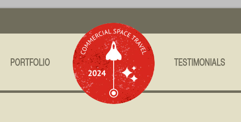
Place the circle layer below the red logo and press Ctrl + T Free transformation. In the upper options bar (in the horizontal bar at the top of the screen) change 100% to 110%, change the width and height to 185
. Press ENTER to confirm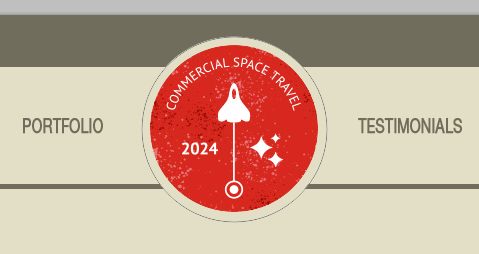
Go to the menu Layer>Layer Style>Stroke, then increase the stroke size to 5px and update the color with this value #706d5c.
Click on the menu: Layer> Layer Style> Stroke, then adjust the size of the stroke to 5px, and change the color to: #706d5c
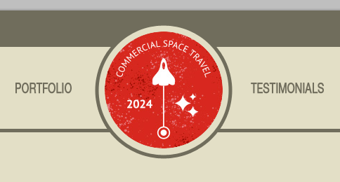
To finish the logo, create a new layer. Using now the Rectangular Marquee tool (M), create a rectangle under the logo with a height of 117px. Fill the selection using the Paint bucket tool ( G) and the background color #e3dfc6.
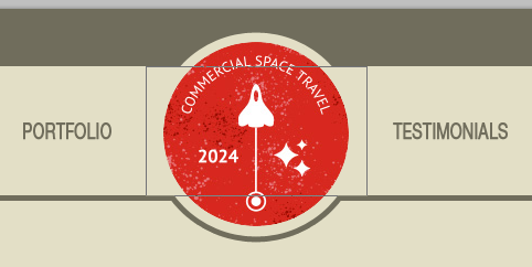
To complete the logo, create a new layer. Now use the Rectangular Marquee Tool to create a rectangle (400, 52, 200, 117) below the LOGO with a height of 117px. Use the Paint Bucket Tool to fill the selection with the background color: #e3dfc6
You can also use the Rectangle Tool to draw a rectangle (400, 52, 200, 117) , color: #e3dfc6

STEP 5 Contents of the left part
Step 5: Contents of the left part Content
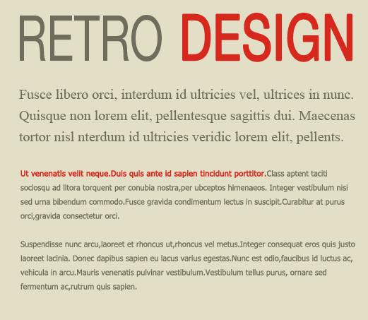
It's easier to create the contents, use the Text tool (T) to create the title. I used the two following colors: the gray #706d5c and the red # d7281e and the same font than the one used for the menu but with a size of 90px.The content section is very easy to create, use the text tool to create the title. I use the next two colors, gray: #706d5c, red: #d7281e, the font is the same as the font on the menu bar, but the font size is changed to 90px
Use same method to create the paragraphs, with the fonts Times New Roman et Tahoma and a size of 12px.Use the same method to create the paragraphs, with the fonts Times New Roman et Tahoma and a size of 12px.
; Use Tahoma as the font for the other section, The font size is 11px
Step 6: Right part partnership
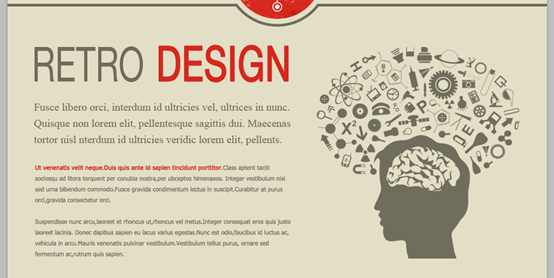
I used one more time a resource downloaded from our website Shutterstock. Download the vector file, and then open it under Illustrator. Copy and paste it into your Photoshop document. Change the height size regarding the number of text lines. Download resources. Download the vector file and open it in Illustrator. Copy and paste into your Photoshop file. Resize to the same size as the height of the text lines.
The result below must be what you get under Photoshop.
The result below must be what you get under Photoshop.
STEP 7 The spider
Step 7: Splitter
I created a sharing bar under the content; it helps to come back to the top of the page (if you want to create a landing page, check further in this tutorial).
I created a share bar under the content, which helps bring it back to the top of the page (if you want to create a landing page, check out the second half of this tutorial).
Duplicate the bar (the one with the size of 1000x5px we previously created), then place it under the contents. rectangle), and then place it below the content (0,716)

Go back to your first vector document under Illustrator, then select and copy the small round including the rocket. Copy the small logo into your Photoshop document. Put the round in the center of your picture (see the picture below).
Back to your page A vector document in Illustrator, then select and copy the small circle that contains the rocket. Copy the small logo to your PS document. Place it in the center of the circle in your picture (see image below)
Remember the method to place an element in the middle of your picture. Press on Cltr/Tab + A to create an active selection around aall your document. Select now the Move tool (V) and click on icon “Align the centers on the horizontal direction” (located in the options bar, on the top of your screen).
Remember how to place an element in your image. Press CLTR+A to select all your files. Now select the Move Tool (V) and click on the "Align Center Horizontally" icon (located in the options bar at the top of the screen).
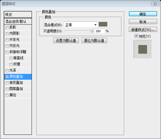
Add two layer styles on your logo: a color overlay and a stroke of 5px (use for both style, the color #e3dfc6).
your LOGO Add two layer styles: a color overlay and a 5px stroke (
Stroke style color: #e3dfc6),
See the result of the spider rocket.
View the results of split rocket

STEP 8 Create the footer
Regarding the footer, duplicate the first gray bar created in the first step. Use the Move tool (V) to move the copy at the bottom of your document.
For the footer, repeat the first gray bar created in step one. Use the Move Tool (V) to move it to (0,853) at the bottom of the document.
Duplicate the red logo and place the copy at the bottom of your document.
Duplicate the red logo and place the copy at the bottom of your document
Add a stroke of 5px using the layer styles (colour #e3dfc6).
Add a stroke of 5px using the layer styles (color: #e3dfc6)
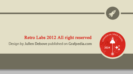
Use the Text tool (T) to create the Copyright of your website, on the left side of your logo. (I used the gray #706d5c and the red #d7281e as well as the fonts Times and Myriad).
Use the text tool to create the copyright information for your web page to the left of your logo. (The colors I use, gray: #706d5c, red: #d7281e, the best fonts are Times and Myriad)
Red font: Times New Roman; font size: 15px, bold; color: #d7281eGray font: Myriad Pro; Font size: 12px; Color: #706d5c
 ##
##
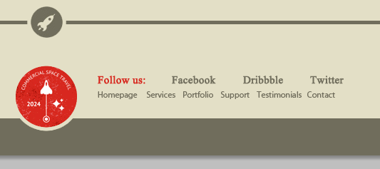
Same thing regarding the links to the social networks and the reminder of the top menu. Reserve place for free spaces between each social network links, to insert the regarding icons. The top menu does the same thing. Prepare space for social media links and insert relevant icons.
The two lines of text have the same font as the two lines of text on the left, colors: #d7281e and #706d5c
)
 ##We are already finished with The Template! As I told you at beginning of this tutorial, it was really easy.
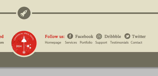 We have completed the template! Like I told you before, it's very easy
Here are some designs for creating other pages, You can refer to 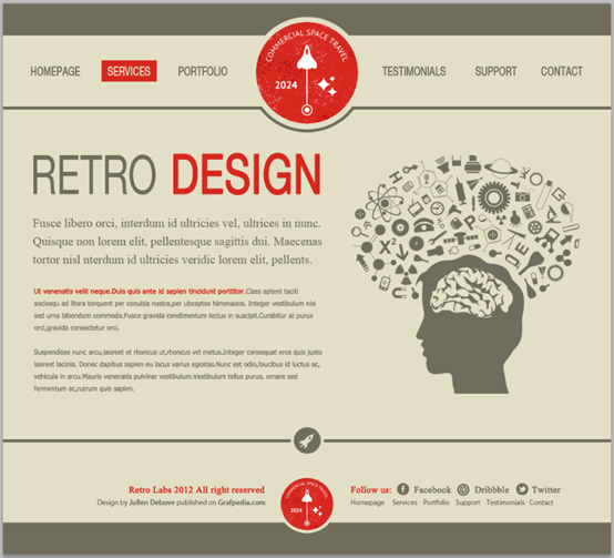
or
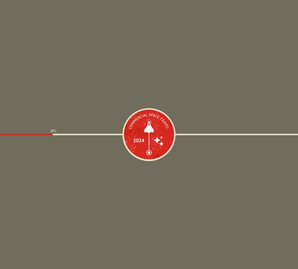 or
or
## Or 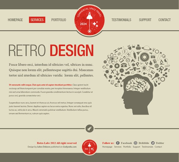

Hot AI Tools

Undresser.AI Undress
AI-powered app for creating realistic nude photos

AI Clothes Remover
Online AI tool for removing clothes from photos.

Undress AI Tool
Undress images for free

Clothoff.io
AI clothes remover

AI Hentai Generator
Generate AI Hentai for free.

Hot Article

Hot Tools

Notepad++7.3.1
Easy-to-use and free code editor

SublimeText3 Chinese version
Chinese version, very easy to use

Zend Studio 13.0.1
Powerful PHP integrated development environment

Dreamweaver CS6
Visual web development tools

SublimeText3 Mac version
God-level code editing software (SublimeText3)

Hot Topics
 How do I use Photoshop for creating social media graphics?
Mar 18, 2025 pm 01:41 PM
The article details using Photoshop for social media graphics, covering setup, design tools, and optimization techniques. It emphasizes efficiency and quality in graphic creation.
 How do I prepare images for web use in Photoshop (file size, resolution, color space)?
Mar 13, 2025 pm 07:28 PM
Article discusses preparing images for web use in Photoshop, focusing on optimizing file size, resolution, and color space. Main issue is balancing image quality with quick loading times.
 How do I use Photoshop's Content-Aware Fill and Content-Aware Move tools effectively?
Mar 13, 2025 pm 07:35 PM
Article discusses using Photoshop's Content-Aware Fill and Move tools effectively, offering tips on selecting source areas, avoiding mistakes, and adjusting settings for optimal results.
 How do I use Photoshop's video editing capabilities?
Mar 18, 2025 pm 01:37 PM
The article explains how to use Photoshop for video editing, detailing steps to import, edit, and export videos, and highlighting key features like the Timeline panel, video layers, and effects.
 How do I calibrate my monitor for accurate color in Photoshop?
Mar 13, 2025 pm 07:31 PM
Article discusses calibrating monitors for accurate color in Photoshop, tools for calibration, effects of improper calibration, and recalibration frequency. Main issue is ensuring color accuracy.
 How do I prepare images for web using Photoshop (optimize file size, resolution)?
Mar 18, 2025 pm 01:35 PM
Article discusses optimizing images for web using Photoshop, focusing on file size and resolution. Main issue is balancing quality and load times.
 How do I create animated GIFs in Photoshop?
Mar 18, 2025 pm 01:38 PM
Article discusses creating and optimizing animated GIFs in Photoshop, including adding frames to existing GIFs. Main focus is on balancing quality and file size.
 How do I prepare images for print using Photoshop (resolution, color profiles)?
Mar 18, 2025 pm 01:36 PM
The article guides on preparing images for print in Photoshop, focusing on resolution, color profiles, and sharpness. It argues that 300 PPI and CMYK profiles are essential for quality prints.


