This article mainly introduces the relevant information of the WeChat Mini Program Jiugongge example code. Friends who need it can refer to the
WeChat Mini Program Jiugongge
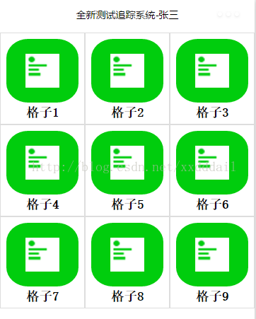
implementation renderings :

The mini program is developed on WeChat and is a mobile interface. In order to make it more convenient to use, we often want to use the nine-square grid interface as navigation. How to achieve this?
Based on a simple thinking, the Jiugong grid is three rows and three columns. If the row is regarded as a unit and each row is divided into three columns, is that okay? Let's practice it.
First consider the generation of nine-grid data. Each grid needs an icon, a title, and a route to facilitate jumping. We now have nine pages that day, so define a one-dimensional array that is Can. In order to better perform subsequent configuration, we separate this array into a file routes.js, then reference it in the index.js page, and put routes in the index directory.
var PageItems =
 [
  {
   text: '格子1',
   icon: '../../images/c1.png',
   route: '../c1/c1',
  },
  {
   text: '格子2',
   icon: '../../images/c2.png',
   route: '../c2/c2',
  },
   {
   text: '格子3',
   icon: '../../images/c3.png',
   route: '../c3/c3',
  },
  {
   text: '格子4',
   icon: '../../images/c4.png',
   route: '../c4/c4',
  },
  {
   text: '格子5',
   icon: '../../images/c5',
   route: '../c5/c5',
  },
  {
   text: '格子6',
   icon: '../../images/c6.png',
   route: '../c6/c6',
  },
  {
   text: '格子7',
   icon: '../../images/c7.png',
   route: '../c7/c7',
  },
  {
   text: '格子8',
   icon: '../../images/c8',
   route: '../c8/c8',
  },
  {
   text: '格子9',
   icon: '../../images/c9.png',
   route: '../c9/c9',
  }
 ];
module.exports = {
 PageItems: PageItems
}In the index.js page, we reference routes.js, and then get the data PageItems, but PageItems is a one-dimensional array, and we thought before It is necessary to use one row and three columns as a group, so this one-dimensional array needs to be reorganized. The most direct method is to generate an array. The elements of each array contain a one-dimensional array with only three elements. The code As follows
//index.js
//获取应用实例
var app = getApp()
var routes = require('routes');
Page({
data: {
userInfo: {},
cellHeight: '120px',
pageItems: []
},
//事件处理函数
onLoad: function () {
var that = this
console.log(app);
//调用应用实例的方法获取全局数据
app.getUserInfo(function (userInfo) {
wx.setNavigationBarTitle({
title: '全新测试追踪系统-' + userInfo.nickName,
success: function (res) {
// success
}
})
that.setData({
userInfo: userInfo
})
var pageItems = [];
var row = [];
var len = routes.PageItems.length;//重组PageItems
len = Math.floor((len + 2) / 3) * 3;
for (var i = 0; i < len; i++) {
if ((i + 1) % 3 == 0) {
row.push(indexs.PageItems[i]);
pageItems.push(row);
row = [];
continue;
}
else {
row.push(indexs.PageItems[i]);
}
}
wx.getSystemInfo({
success: function (res) {
var windowWidth = res.windowWidth;
that.setData({
cellHeight: (windowWidth / 3) + 'px'
})
},
complete: function () {
that.setData({
pageItems: pageItems
})
}
})
})
}
})In index.wxml, we lay out the interface. Since each grid is the same, but the data is different, we think of Presented using templates. To do this, we first make a cell template cell.wxml.
<template name="cell">
<navigator url="{{route}}" class="pages-item" style="height:{{cellHeight}}">
<view class="{{text==null||text.length==0?'pages-icon-wrapper-no-bg':'pages-icon-wrapper'}}" >
<image src="{{icon}}" class="pages-icon"></image>
</view>
<view class="pages-text-wrapper">
<text class="pages-text">{{text}}</text>
</view>
</navigator>
</template>Here we see that the two curly brackets are from The data passed in from the outside can then be subjected to simple logical judgments for better presentation. For example, when text==null, we want to present a grid with an empty background. When there is data, we want to present a grid with a background, so "{{text==null||text.length==0? 'pages-icon-wrapper-no-bg':'pages-icon-wrapper'}}".
Another point, since we use this interface file as a template, we must use Wrap it with the template tag and give it a name so that the call can be identified where the template is referenced.
Now we reference this template in index.wxml
<!--index.wxml-->
<import src="cell.wxml" />
<view class="pages-container">
 <scroll-view scroll-y="true" class="pages-wrapper">
  <view wx:for="{{pageItems}}" wx:key="{{text}}">
   <view class="pages-row">
    <template is="cell" data="{{...item[0],cellHeight}}" />
    <template is="cell" data="{{...item[1],cellHeight}}" />
    <template is="cell" data="{{...item[2],cellHeight}}" />
   </view>
  </view>
 </scroll-view>
</view>The template is referenced using import. Template and is are used where the call is made, where is specifies the name in cell.wxml. item[0], item[1], and item[2] are the data passed in the loop, and cellHeight is the data stored in the data of index.js. When data is passed into the template, the framework will expand it in the form of fields, that is, key-value pairs, so if you look at the cell.wxml file again, you will find that keys are used directly as data internally.
After presenting the data to the interface, we need a certain style to match it. The index.wxss code is as follows.
/**index.wxss**/

.pages-container {
 height: 100%;
 display: flex;
 flex-direction: column;
 box-sizing: border-box;
 padding-top: 10rpx;
 padding-bottom: 10rpx;
}

.pages-title-bg {
 width: 100%;
}

.pages-wrapper {

}


.pages-row {
 width: 100%;
 display: flex;
 flex-direction: row;
 justify-content: space-around;
}

.pages-item {
 position: relative;
 padding: 10rpx;
 width: 33%;
 background-color: #fff;
 border: #ddd solid 1px;
}

.pages-icon-wrapper {
 display: flex;
 justify-content: space-around;
 align-items: center;
 margin: 10rpx;
 border-radius: 30%;
 height: 75%;
 background:#00CD0D;
}

.pages-icon-wrapper-no-bg {
 display: flex;
 justify-content: space-around;
 align-items: center;
 margin: 10rpx;
 height: 75%;
}

.pages-icon {
 width: 100rpx;
 height: 100rpx;
}

.pages-text-wrapper {
 text-align: center;
}

.pages-text {
 font-weight: bolder;
}We use the navigator element in our template to present the grid, so each grid can naturally be navigated.
Thank you for reading, I hope it can help you, thank you for your support of this site!
For more articles related to the WeChat applet Jiugongge example code, please pay attention to the PHP Chinese website!


