
 Backend Development
XML/RSS Tutorial
FusionCharts 2D bar chart and line chart combination chart debugging error
Backend Development
XML/RSS Tutorial
FusionCharts 2D bar chart and line chart combination chart debugging error
FusionCharts 2D bar chart and line chart combination chart debugging error

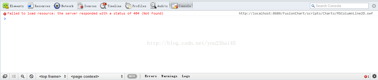
When designing the combination chart of FusionCharts 2D bar chart and line chart, I found that no matter how I restarted the server, the combination chart would not appear. Later, through debugging, I found that I had made a fatal mistake. Using my usual thinking, I thought that if 3D pictures had this type, then 2D would also have this type. For example, 3D combination diagram: MSColumnLine3D.swf, I take it for granted that 2D also has this type, 2D combination diagram: MSColumnLine2D.swf. As a result, I view FusionCharts API found that 3D has MSColumnLine3D.swf, but 2D has the same type: MSCombi2D.swf
# The above is the content of debugging errors in the combination chart of FusionCharts 2D bar chart and line chart. For more related content, please pay attention to the PHP Chinese website (www.php.cn)!

Hot AI Tools

Undresser.AI Undress
AI-powered app for creating realistic nude photos

AI Clothes Remover
Online AI tool for removing clothes from photos.

Undress AI Tool
Undress images for free

Clothoff.io
AI clothes remover

Video Face Swap
Swap faces in any video effortlessly with our completely free AI face swap tool!
Hot Article
Hot Tools

Notepad++7.3.1
Easy-to-use and free code editor

SublimeText3 Chinese version
Chinese version, very easy to use

Zend Studio 13.0.1
Powerful PHP integrated development environment

Dreamweaver CS6
Visual web development tools

SublimeText3 Mac version
God-level code editing software (SublimeText3)
Hot Topics
 1393
1393
 52
1206
24
52
1206
24

 How to make WPS table line chart, do you really know how to do it?
Mar 21, 2024 am 08:36 AM
How to make WPS table line chart, do you really know how to do it?
Mar 21, 2024 am 08:36 AM
Using wps tables to process a large amount of data can make our work more efficient. Of course, wps tables can not only process data, but can also formulate line charts and other data based on the data, so that it is more intuitive to view. But for some novices, they don’t know how to make a line chart in a WPS table. Today I will explain to you the detailed steps of making a line chart: 1. First, check [Use Scenarios of Line Charts]. 2. Production method: First select [Data Source-Insert Chart-Line Chart] and click [Chart Elements-Check Trend Line-A dotted line will appear in the chart]. 3. Then in [Insert a column for average in the data source] use [AVERAGE to find the average] drop-down filling method [copy and paste the value first - then fill in the drop-down]
 Implementation of column and line chart functions in Vue statistical charts
Aug 17, 2023 am 11:39 AM
Implementation of column and line chart functions in Vue statistical charts
Aug 17, 2023 am 11:39 AM
Implementation of bar and line chart functions in Vue statistical charts Introduction: In data visualization applications, statistical charts are a commonly used way to display data. Vue, as a popular JavaScript framework, provides rich functions and ease of use, and is very suitable for implementing statistical charts. This article will introduce the specific steps to implement bar charts and line charts using Vue, and attach code examples. 1. Bar chart implementation A bar chart is a chart that uses the height of a rectangle to represent the size of the data. The following is using Vue and echarts library
 Steps to create a mixed line and column chart in PPT
Mar 26, 2024 pm 09:26 PM
Steps to create a mixed line and column chart in PPT
Mar 26, 2024 pm 09:26 PM
1. Insert the data chart into the PPT and select [Clustered Column Chart] as the type. 2. Enter the source data and use only two columns of data. For example, the first column is monthly data and the second column is monthly cumulative data. 3. Change the chart type of the cumulative data series, click "Change Chart Type" under Chart Tools, click [Combine], select the line chart with data markers for the cumulative data, and check the secondary axis. 4. After clicking OK, you get Basic combination graphics. 5. Add data labels for column charts and line charts. And set different colors to show distinction. 6. Further beautify the data chart, delete unnecessary elements, highlight information, and get the final chart.
 Detailed explanation of the use of fusioncharts.js
Dec 08, 2023 pm 01:45 PM
Detailed explanation of the use of fusioncharts.js
Dec 08, 2023 pm 01:45 PM
fusioncharts.js provides rich chart types, data visualization and interactive functions to help developers create high-quality charts and instruments in web applications.
 Getting Started Tutorial: Learn to use matplotlib to draw a line chart
Jan 17, 2024 am 10:36 AM
Getting Started Tutorial: Learn to use matplotlib to draw a line chart
Jan 17, 2024 am 10:36 AM
Simple tutorial: Learn to use Matplotlib to draw line charts Introduction: Matplotlib is one of the commonly used drawing libraries in Python and can be used to draw various types of graphics, including line charts. Line charts are a commonly used data visualization method that can clearly show the changing trends of data. This article will introduce how to use Matplotlib to draw a line chart through specific code examples. 1. Install the Matplotlib library: Before using Matplotlib, you first need to install it.
 How to use line charts to display data trends in ECharts
Dec 17, 2023 am 11:12 AM
How to use line charts to display data trends in ECharts
Dec 17, 2023 am 11:12 AM
How to use line charts to display data trends in ECharts ECharts is an open source visualization library based on JavaScript, which is widely used in various data analysis and visual display projects. It provides rich chart types and interactive functions, making the presentation of data more intuitive and easy to understand. This article will introduce in detail how to use line charts in ECharts to display data trends and provide specific code examples. 1. Preparation Before starting to use ECharts to draw a line chart, we need to do
 How to implement data visualization techniques such as line charts and curve charts in Vue
Jun 25, 2023 am 11:34 AM
How to implement data visualization techniques such as line charts and curve charts in Vue
Jun 25, 2023 am 11:34 AM
Vue is a popular JavaScript framework that is widely used to build modern web applications. Data visualization is one of the essential technologies in web applications, and line charts and curve charts are one of the common data visualization techniques. In this article, I will introduce how to use Vue to implement line charts and curve charts. 1. Use third-party chart libraries Vue has many third-party chart libraries that can be used. These chart libraries provide a wealth of chart types and configuration options, making it very easy to implement line charts and curve charts.
 Create data visualization charts using PHP and FusionCharts
May 11, 2023 am 09:40 AM
Create data visualization charts using PHP and FusionCharts
May 11, 2023 am 09:40 AM
As modern business becomes increasingly digital, data processing and visualization are increasingly important. Many companies rely on data visualization to understand their business and make strategic decisions. In this article, we will discuss how to create data visualization charts using PHP and FusionCharts. FusionCharts is a set of JavaScript libraries for creating beautiful, dynamic, interactive charts. It supports many types of charts, including linear charts, pie charts, bar charts, scatter charts, and more. FusionChart
