div+css image list layout (1)
When cutting pictures on the front end, we often encounter picture layout, which may be unfamiliar to beginners. Next, I will use a picture list with 3 rows and 3 columns as an example to introduce two commonly used picture cutting schemes:
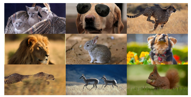
float layout
display:inline-block layout
First let’s talk about the float layout method
float layout
It’s very simple. Generally I will use ul li layout
    <ul>
        <li><img src="./images/1.jpg"></li>
        <li><img src="./images/2.jpg"></li>
        <li><img src="./images/3.jpg"></li>
        <li><img src="./images/4.jpg"></li>
        <li><img src="./images/5.jpg"></li>
        <li><img src="./images/6.jpg"></li>
        <li><img src="./images/7.jpg"></li>
        <li><img src="./images/8.jpg"></li>
        <li><img src="./images/9.jpg"></li>
    </ul>
and then set a width for each li element and float it to the left. Here, each row needs to display 3 pictures, so the width of each picture can be calculated using a percentage: 100/3=33.3%.
li {
    list-style: none;
    float: left;
    width: 33.3%;/*三列图片排列*/
}The width of each img tag is set to 100%, occupying the entire width of li. In order to prevent the image from deforming, the height is adaptive
li {
    list-style: none;
    float: left;
    width: 33.3%;/*三列图片排列*/
}

li img {
    width: 100%;
}Okay, let's take a look at the effect.

Why is it different from what we thought? At this point the list is confusing. Don't worry, it's because the images come in different sizes. If the size of the images in the project is too different, it is recommended to set a fixed height on the parent element and set it beyond hiding. However, if the image sizes are not very different, it is recommended to set height: auto; to achieve highly adaptive purposes.
li {
    list-style: none;
    float: left;
    width: 33.3%;/*三列图片排列*/
    height: 100px;/*当图片尺寸不一的时候,设置一个高度*/
    overflow: hidden;/*超出隐藏*/
}Hmm~ It’s almost the same as our needs

At this time, the product may require you to center the picture up and down
li img {
    position: relative;
    width: 100%;
    top: 50%;/*li高度的一半*/
    transform: translateY(-50%); /*再向上移动自身的50%*/
}Yes Students may think of using margin-top instead of top. It should be noted here that the percentages of margin-top and margin-bottom are generally calculated based on the width of the container element rather than the height. The same is true for padding

Here, A basic image layout with three rows and three columns is basically completed.
But be careful, there is a hidden problem that novices may overlook: the parent container collapses after the child element is floated. Sometimes this feature will seriously affect our layout. Let's test it. Add a p element before and after the ul element
.red{
    width: 100%;
    height: 30px;
    border: 1px solid red;
}
.blue{
    width: 100%;
    height: 30px;
    border: 1px solid blue;
}

<p class="red"></p>
<ul>...</ul>
<p class="blue"></p>You can see that the .blue element is next to the .red element, and the ul element behaves as if it does not exist
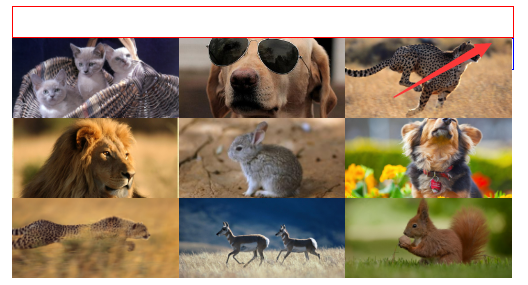
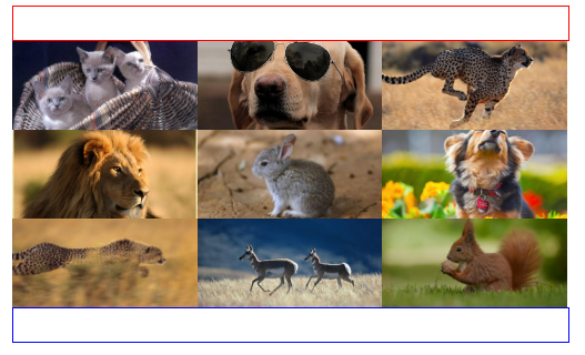
This is because the element is separated from the document flow after floating. For the principle of floating, you can refer to w3school’s CSS floating and CSS floating attribute Float for details, which will not be repeated here. There are many ways to clear floats. Here we recommend adding: after pseudo-element to remove floats
.clearfix:after{
    position: relative;
    content: '';
    display: block;
    width: 0;
    height: 0;
    visibility: hidden;
    clear: both;
}

<p class="red"></p>
<ul class="clearfix">...</ul>
<p class="blue"></p>Let’s see the effect again, the performance will be normal
display:inline -block layout
is similar to float layout, except that we have to replace float: left; with display: inline-block;
li {
    list-style: none;
    display: inline-block;
    width: 33.3%;
    /*三列图片排列*/
    height: 100px;
    /*当图片尺寸不一的时候,需要设置一个最大高度*/
    text-align: center;
    /*内容居中*/
    overflow: hidden;
    /*超出隐藏*/
}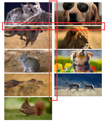
to see the effect , a gap appeared, and it was squeezed into two lines. what happened? ~
Note that there will be gaps between inline-block elements. Please refer to Zhang Xinxu’s blog for details. Here we use the font-size: 0; method to clear the gaps between elements
ul {
    width: 100%;
    margin: 0 auto;
    font-size: 0;
}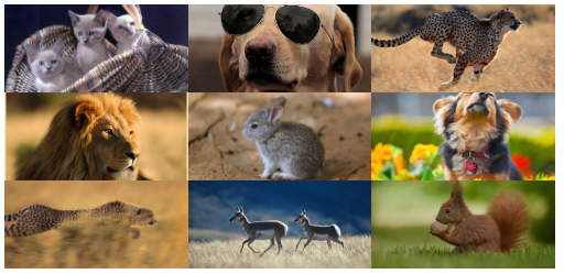
In this way, the effect we want is completed. Isn’t it very simple?
More div+css image list layout (1) For related articles, please pay attention to the PHP Chinese website!

Hot AI Tools

Undresser.AI Undress
AI-powered app for creating realistic nude photos

AI Clothes Remover
Online AI tool for removing clothes from photos.

Undress AI Tool
Undress images for free

Clothoff.io
AI clothes remover

Video Face Swap
Swap faces in any video effortlessly with our completely free AI face swap tool!

Hot Article

Hot Tools

Notepad++7.3.1
Easy-to-use and free code editor

SublimeText3 Chinese version
Chinese version, very easy to use

Zend Studio 13.0.1
Powerful PHP integrated development environment

Dreamweaver CS6
Visual web development tools

SublimeText3 Mac version
God-level code editing software (SublimeText3)

Hot Topics
 1386
1386
 52
52
 How to use bootstrap in vue
Apr 07, 2025 pm 11:33 PM
Using Bootstrap in Vue.js is divided into five steps: Install Bootstrap. Import Bootstrap in main.js. Use the Bootstrap component directly in the template. Optional: Custom style. Optional: Use plug-ins.
 The Roles of HTML, CSS, and JavaScript: Core Responsibilities
Apr 08, 2025 pm 07:05 PM
HTML defines the web structure, CSS is responsible for style and layout, and JavaScript gives dynamic interaction. The three perform their duties in web development and jointly build a colorful website.
 How to write split lines on bootstrap
Apr 07, 2025 pm 03:12 PM
There are two ways to create a Bootstrap split line: using the tag, which creates a horizontal split line. Use the CSS border property to create custom style split lines.
 Understanding HTML, CSS, and JavaScript: A Beginner's Guide
Apr 12, 2025 am 12:02 AM
WebdevelopmentreliesonHTML,CSS,andJavaScript:1)HTMLstructurescontent,2)CSSstylesit,and3)JavaScriptaddsinteractivity,formingthebasisofmodernwebexperiences.
 How to set up the framework for bootstrap
Apr 07, 2025 pm 03:27 PM
To set up the Bootstrap framework, you need to follow these steps: 1. Reference the Bootstrap file via CDN; 2. Download and host the file on your own server; 3. Include the Bootstrap file in HTML; 4. Compile Sass/Less as needed; 5. Import a custom file (optional). Once setup is complete, you can use Bootstrap's grid systems, components, and styles to create responsive websites and applications.
 How to insert pictures on bootstrap
Apr 07, 2025 pm 03:30 PM
There are several ways to insert images in Bootstrap: insert images directly, using the HTML img tag. With the Bootstrap image component, you can provide responsive images and more styles. Set the image size, use the img-fluid class to make the image adaptable. Set the border, using the img-bordered class. Set the rounded corners and use the img-rounded class. Set the shadow, use the shadow class. Resize and position the image, using CSS style. Using the background image, use the background-image CSS property.
 How to resize bootstrap
Apr 07, 2025 pm 03:18 PM
To adjust the size of elements in Bootstrap, you can use the dimension class, which includes: adjusting width: .col-, .w-, .mw-adjust height: .h-, .min-h-, .max-h-
 How to use bootstrap button
Apr 07, 2025 pm 03:09 PM
How to use the Bootstrap button? Introduce Bootstrap CSS to create button elements and add Bootstrap button class to add button text


