CSS3 3D small demo that everyone can understand
css3 3d case summary
I recently got into Web animation, so I will record my learning process and share it with everyone. Let me share with you what I have done recently
1. Rotating puzzle
First look at the effect

The code mainly consists of HTML and CSS3, which should be said to be relatively simple.
The first is the HTML code:
  <p class="camera" id="camera">
    <p class="kuai">
      <p class="mian"></p>
      <p class="mian"></p>
      <p class="mian"></p>
      <p class="mian"></p>
      <p class="mian"></p>
      <p class="mian"></p>
    </p>

    <p class="kuai">
      <p class="mian"></p>
      <p class="mian"></p>
      <p class="mian"></p>
      <p class="mian"></p>
      <p class="mian"></p>
      <p class="mian"></p>
    </p>

    <p class="kuai">
      <p class="mian"></p>
      <p class="mian"></p>
      <p class="mian"></p>
      <p class="mian"></p>
      <p class="mian"></p>
      <p class="mian"></p>
    </p>

    <p class="kuai">
      <p class="mian"></p>
      <p class="mian"></p>
      <p class="mian"></p>
      <p class="mian"></p>
      <p class="mian"></p>
      <p class="mian"></p>
    </p>

    <p class="kuai">
      <p class="mian"></p>
      <p class="mian"></p>
      <p class="mian"></p>
      <p class="mian"></p>
      <p class="mian"></p>
      <p class="mian"></p>
    </p>
  </p>
A 3-layer p HTML framework is used here, and the level is very clear.
The next focus is on the CSS code, how to use the features of CSS3 to achieve 3D and scrolling effects, so that it always looks 3D.
body{  background: red;}/*对于相机元素*/.camera{  perspective: 800px;/*这个属性是视距(景深),就是目测的距离*/
width: 500px; height: 300px; margin: auto; transform-style: preserve-3d;/*该属性规定如何在 3D 空间中呈现被嵌套的元素。preserve-3d子元素将保留其 3D 位置。*/}/*对于模块元素*/.kuai{ width: 100px; height: 300px; margin: 50px auto; float: left; transform-style: preserve-3d; position: relative; transition:transform 1s; margin-left: -1px;}/*对于模块的每个面元素*/.kuai:nth-of-type(2)>.mian{ background-position: -100px 0;}.kuai:nth-of-type(3)>.mian{ background-position: -200px 0;}.kuai:nth-of-type(4)>.mian{ background-position: -300px 0;}.kuai:nth-of-type(5)>.mian{ background-position: -400px 0;}.kuai:nth-of-type(6)>.mian{ background-position: -500px 0;}.mian{ width: 100px; height: 300px; position: absolute; font-size:100px; text-align: center; line-height: 300px; transform-style: preserve-3d; background-color: black; backface-visibility: hidden;}.mian:nth-of-type(1){ transform: translateZ(150px); background:url(../images/pic1.jpg) no-repeat; background-size: 500px 100%;}.mian:nth-of-type(2){ transform: translateZ(-150px) rotateX(180deg); background:url(../images/pic2.png) no-repeat; background-size: 500px 100%;}.mian:nth-of-type(3){ width: 300px; transform: rotateY(-90deg) translateZ(150px);/*3d中transform属性是关键的,它主要是靠旋转 移动 缩放来变形实现的*/}.mian:nth-of-type(4){ width: 300px; transform: rotateY(90deg) translateZ(-50px);}.mian:nth-of-type(5){ transform: rotateX(90deg) translateZ(150px); background:url(../images/pic3.jpg) no-repeat; background-size: 500px 100%;}.mian:nth-of-type(6){ transform: rotateX(-90deg) translateZ(150px); background:url(../images/pic4.jpg) no-repeat; background-size: 500px 100%;}The last thing is js
window.onload=function() {  var camera=document.getElementById('camera');  var kuais=camera.getElementsByClassName('kuai');  var chishu=0;  var geshu=5;
  camera.onclick=function() {
    chishu++;    for(var i=0;i<geshu;i++){
      kuais[i].style="transition:transform 1s "+100*i+"ms;transform:rotateX("+chishu*90+"deg)";
    }
  }
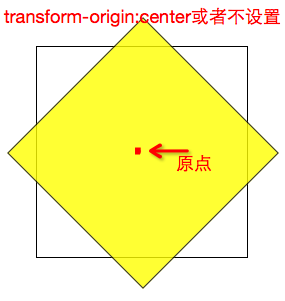
}There is an attribute here that is not used for transform-origin. It is used to change the origin position of the element and does not need to be set. As shown in the figure 
Similarly, it can also be set to: transform-origin:top right (the upper right corner is the origin), transform-origin:bottom right (the lower right corner is the origin), transform-origin:bottom left (the lower left corner is the origin)
Summary
In short, in the process of learning CSS3, I saw a lot of new features and learned how to use them, but what I want to say is No matter how we learn how to use it, we also need to understand why each line of code produces the corresponding effect. Especially for 3D transform, we need to fundamentally understand the 3D space in order to better grasp what each of its attribute values can bring. come effect.
For more articles related to css3 3d small demo that everyone can understand, please pay attention to the PHP Chinese website!

Hot AI Tools

Undresser.AI Undress
AI-powered app for creating realistic nude photos

AI Clothes Remover
Online AI tool for removing clothes from photos.

Undress AI Tool
Undress images for free

Clothoff.io
AI clothes remover

AI Hentai Generator
Generate AI Hentai for free.

Hot Article

Hot Tools

Notepad++7.3.1
Easy-to-use and free code editor

SublimeText3 Chinese version
Chinese version, very easy to use

Zend Studio 13.0.1
Powerful PHP integrated development environment

Dreamweaver CS6
Visual web development tools

SublimeText3 Mac version
God-level code editing software (SublimeText3)

Hot Topics
 Demystifying Screen Readers: Accessible Forms & Best Practices
Mar 08, 2025 am 09:45 AM
This is the 3rd post in a small series we did on form accessibility. If you missed the second post, check out "Managing User Focus with :focus-visible". In
 Create a JavaScript Contact Form With the Smart Forms Framework
Mar 07, 2025 am 11:33 AM
This tutorial demonstrates creating professional-looking JavaScript forms using the Smart Forms framework (note: no longer available). While the framework itself is unavailable, the principles and techniques remain relevant for other form builders.
 Adding Box Shadows to WordPress Blocks and Elements
Mar 09, 2025 pm 12:53 PM
The CSS box-shadow and outline properties gained theme.json support in WordPress 6.1. Let's look at a few examples of how it works in real themes, and what options we have to apply these styles to WordPress blocks and elements.
 Working With GraphQL Caching
Mar 19, 2025 am 09:36 AM
If you’ve recently started working with GraphQL, or reviewed its pros and cons, you’ve no doubt heard things like “GraphQL doesn’t support caching” or
 Making Your First Custom Svelte Transition
Mar 15, 2025 am 11:08 AM
The Svelte transition API provides a way to animate components when they enter or leave the document, including custom Svelte transitions.
 Classy and Cool Custom CSS Scrollbars: A Showcase
Mar 10, 2025 am 11:37 AM
In this article we will be diving into the world of scrollbars. I know, it doesn’t sound too glamorous, but trust me, a well-designed page goes hand-in-hand
 Show, Don't Tell
Mar 16, 2025 am 11:49 AM
How much time do you spend designing the content presentation for your websites? When you write a new blog post or create a new page, are you thinking about
 What the Heck Are npm Commands?
Mar 15, 2025 am 11:36 AM
npm commands run various tasks for you, either as a one-off or a continuously running process for things like starting a server or compiling code.


