

Front-end Summary·Basics·CSS Layout

This is the first article in the series "Front-end Summary·Basics·CSS", which mainly summarizes the basic knowledge of layout.
一、显示(display)
    1.1 盒模型(box-model)
    1.2 行内元素(inline) & 块元素(block)
    1.3 行内块元素(inline-block IE8+ IE6-7/tools)
    1.4 flex(IE11+ IE10/-ms-)
    1.5 none
二、位置(position)
三、补充
    3.1 浮动(float)
    3.2 层叠(z-index)
    3.3 溢出(overflow)
    3.4 resize(notIE)(CSS3)
    3.5 分栏(column)(IE10+ notOperaMini)(CSS3)
1. Display
1.1 Box-model
Look at the picture to understand the box model

The box model includes content, padding, border, and margin. The height we set for the element is the height of the content. Add padding to the element to make it appear taller.
The following is a demonstration example of a box model. To view the box model in Google Chrome, you can use the right-click>Properties>Computed method to view it.
<p class="box-model">box-model</p>

.box-model {
    border: 1px solid red;
    padding: 20px;
}Box model bounded by borders
Sometimes, we don’t want the height of the element to change when adding padding to it, which is not conducive We do the layout. You can set the element's box model to a box model bounded by a border (box-sizing: border-box;). In IE's weird mode, this box model is used by default.
Here is an example.

<p class="box-model">box-model</p>

.box-model {
    box-sizing: border-box;  /* 设置成以边框为界的盒模型 */
    border: 1px solid red;
    height: 80px;
    padding: 10px;
}1.2 Inline elements (inline) & block elements (block)
Block elements are generally used for layout
The block element can set the width and height, and occupies one line by default. The width and height of inline elements cannot be set, and the width is determined by its content.
Block elements have no height by default and will only have height if there is content. Inline elements have no height and width by default, they will only be there if there is content. Although the width and height cannot be set for inline elements, the width and height can be set after they are set to absolute positioning. (Positioning is discussed in the second section)

块元素:p p ul li table form html5(header section footer)。
行内元素:a font(em strong i) img span。
Block elements can be turned into inline elements
We usually turn li into inline elements Element to create navigation bar.
<ul class="nav">
    <li>首页</li>
    <li>文章</li>
    <li>留言</li>
</ul>

.nav li {
    display: inline;
}There is only one block element per line
However, there can be multiple inline elements.
The empty block element will disappear in the layout
When debugging the page and want to display the position of the element in the layout, we usually add a height to the element .
If the inline element content is empty, it will disappear in the layout (empty is not recommended).
1.3 Inline-block IE8+ IE6-7/tools)
Compatibility is supported >= IE8, IE6-7 please refer to Focus on WEB front-end development.
Clear the gap between two elements
The gap between two elements comes from the space between elements, and can be eliminated by splicing the elements together. You can also use templates to eliminate them. For more discussion, please see Zhihu.
<ul class="nav">
    <li>首页</li><li>
    文章</li><li>
    留言</li>
</ul>
Alignment of elements under special circumstances
Three li's are juxtaposed and set to inline-block. When display:none; is set to the leftmost element, the other two li will sink to the bottom of the container. At this time, you need to set top alignment (vertical-align:top;) for these two li.
<ul class="nav" id="nav">
    <li class="left"><p class="hidden">首页</p></li>
    <li class="center"><p>文章</p></li>
    <li class="right"><p>留言</p></li>
</ul>

.hidden {display: none;}
.left {height: 50px;}
.center,.right {vertical-align: top;}1.4 Flexible box (flex IE11+ IE10/-ms-)
Compatibility is to support >=IE11, IE10 needs to add the browser private prefix (-ms-).
Use elastic layout
If elastic layout is used, float clear vertical will be invalid. For more information, please see Ruan Yifeng’s blog.
display:flex;  // 块元素用
display:inline-flex;  // 行内元素用
Flexible Layout Settings
Let’s just treat these as a reference manual for now.
flex-direction:row/row-reverse/column/column-reverse;  // 方向
flex-wrap:nowrap/wrap/wrap-reverse;  // 换行
flex-flow:direction/wrap;  // 方向和换行的简写,默认为flex-flow:row nowrap;
justify-content:flex-start/center/flex-end/space-between/space-around;  // 主轴(默认为水平轴)
align-items:flex-start/center/flex-end/baseline/stretch;  // 交叉轴
align-contents:flex-start/center/flex-end/space-between/space-around/stretch;  // 多条轴线的对齐方式(单条无效)
order:number;  // 顺序(默认为0)
flex-grow:number;  // 宽度有余时放大比例(默认为0)
flex-shrink:number;  // 宽度有余时缩小比例(默认为1)
flex-basis:number/auto;  // 分配多余空间前,项目占据的主轴空间(默认auto)
flex:grow/shrink/basis;  // grow shrink basis三个属性的缩写
align-self:auto/flex-start/center/flex-end/baseline/stretch;;  // 单个项目的对齐方式,可覆盖align-items(默认auto)
The main axis (justify-content) can only center single-line elements
What about multiple lines? We can nest multiple rows in a p to construct a single row element.
The following is an example of horizontal and vertical centering.
<p class="parent">
    <p class="child">
        <p>两行都会</p>
        <p>居中</p>
    </p>
</p>

.parent {
    display: flex;  /* 使用flex布局 */
    align-items: center;  /* 交叉轴居中 */
    justify-content: center;  /* 主轴(默认为水平轴)居中 */
    background: red;
    height: 200px;
}1.5 none
Hide elements
The following two methods can hide elements, but display:none; will clear the originally occupied layout space .
visibility:hidden;  // 隐藏元素
display:none;  // 隐藏元素并清除原本占用的布局空间
2. Position
Absolute, relative and fixed positioning can all use top, right, left and bottom elements. But the meanings expressed are different.
Clear the positioning of the layout space (absolute fixed)
Fixed positioning (fixed) will not change position as the mouse scrolls. It really fixes a certain position on the screen. The more common one is the advertisement in the lower right corner of the web page.
The positioning origin of absolute positioning (absolute) is the parent node of non-default positioning (static). It can be absolute fixed relative. If the parent node does not have these, the positioning origin is the body. Using one of these two positionings, the layout space originally occupied by the element will disappear (taken out of the document flow).
The following is an example of absolute positioning. The picture on the left is the default layout, and the picture on the right is after using absolute positioning (the original layout space of the element is cleared).


<p class="border">I'm in front of you.</p>
<p class="parent">Hello</p>
<p class="border">I'm next to you.</p>

.border {
    border: 1px solid blue;
}
.parent {
    position: absolute;
    left: 20px;
    top: 20px;
    background-color: red;
    padding: 5px;
}保留布局空间的定位(relative)
元素原本占用的布局空间依旧保留在文档流中。

相对定位(relative)相对原有位置定位。把上例中的absolute改成relative即可看到效果。使用这种方法,元素原本占用的布局会保留。
默认定位
默认定位为static。
巧用relative+absolute定位
父级采用relative,子代采用absolute。则子代的定位原点变为父级元素的左上角。
三、补充
3.1 浮动(float)
刚开始做页面的时候,还不知道浮动用了之后得清除,只气的想要砸键盘。现在好多了,知道了点技巧。更多技巧请见Tomson。
清除浮动(.clear)
这种方法需要在浮动元素后面添加一个空的节点,然后写上clear属性。兼容IE6需要添加zoom:1;。
<ul class="nav">
    <li>首页</li>
    <li>文章</li>
    <li>留言</li>
</ul>
<p class="clear"></p> <!--用来清楚浮动的空元素-->
<p>我是另外一行</p>

.nav li {
    background-color: red;
    float: left;
    list-style-type: none;
}
.clear {
    clear: both;
    zoom:1;  /* IE 6 */
}清除浮动(overflow:hidden;)
使用这种方法意味着,浮动元素得有一个父元素,并给父元素添加overflow:hidden;属性。
<ul class="nav">
    <li>首页</li>
    <li>文章</li>
    <li>留言</li>
</ul>
<p>我是另外一行</p>

.nav li {
    background-color: red;
    float: left;
    list-style-type: none;
}
.nav {
    overflow: hidden;
}文字环绕
浮动元素的另外一个妙用是实现文字环绕。

<p class="article">
    <p class="photo"></p>
    <p>这段文字很长,是用来测试文字环绕的。图片的占位将用p块来模拟。这段文字很长,是用来测试文字环绕的。图片的占位将用p块来模拟。</p>
</p>

.article {
    width: 200px;
}
.photo {
    width: 60px;
    height: 60px;
    background-color: red;
    float: right;
}3.2 层叠(z-index)
层叠可以控制元素的上下放置关系。值越大越上面。

<p class="z zOne"></p>
<p class="z zTwo"></p>

.z {
    position: absolute;
    top: 200px;
    left: 200px;
    width: 60px;
    height: 60px;
    background-color: red;
    opacity: .5;  /* 设置透明度为0.5 */
}
.zTwo {
    top: 220px;  /* 和第一个块错开以看到效果 */
    left: 220px;
    background-color: blue;
    opacity: .5;
}3.3 溢出(overflow)
当页面内存在多个业内选项卡的时候,从一个没有右边滚动条的页面达到一个有滚动条的页面,将会产生页面跳动。解决办法是默认设置显示右边的滚动条。
overflow-x:visibility;
3.4 resize(notIE)(CSS3)
定义用户是否可调整当前元素的边框大小。
resize: horizontal(水平)/vertical(垂直)/both/none/inherit;
3.5 分栏(column)(IE10+ notOperaMini)(CSS3)
兼容性是IE>=10,不支持opera mini。更多请见菜鸟教程。
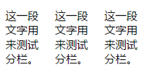
<p>这一段文字用来测试分栏。这一段文字用来测试分栏。这一段文字用来测试分栏。</p>

p {
    width: 200px;  /* 把段落的宽度设短一点,便于效果的展现 */
    column-count: 3;  /* 设定需要分几栏 */
    column-gap: 20px;  /* 设定两栏间隔 */
}结语
这一节主要参考了学习CSS布局,阮一峰的博客,Tomson,专注WEB前端开发,菜鸟教程,知乎和我在看的一本书《CSS设计指南》。
第一次写前端方面的长文章。写了改,改了写,然后继续改,又继续写。如此循环往复,只为让用词用句更加恰当一些。文中有什么不恰当的地方,还望指出。
更多前端总结·基础篇·CSS布局 相关文章请关注PHP中文网!

Hot AI Tools

Undresser.AI Undress
AI-powered app for creating realistic nude photos

AI Clothes Remover
Online AI tool for removing clothes from photos.

Undress AI Tool
Undress images for free

Clothoff.io
AI clothes remover

Video Face Swap
Swap faces in any video effortlessly with our completely free AI face swap tool!

Hot Article
Hot Tools

Notepad++7.3.1
Easy-to-use and free code editor

SublimeText3 Chinese version
Chinese version, very easy to use

Zend Studio 13.0.1
Powerful PHP integrated development environment

Dreamweaver CS6
Visual web development tools

SublimeText3 Mac version
God-level code editing software (SublimeText3)
Hot Topics
 1386
1386
 52
52

 Questions frequently asked by front-end interviewers
Mar 19, 2024 pm 02:24 PM
Questions frequently asked by front-end interviewers
Mar 19, 2024 pm 02:24 PM
In front-end development interviews, common questions cover a wide range of topics, including HTML/CSS basics, JavaScript basics, frameworks and libraries, project experience, algorithms and data structures, performance optimization, cross-domain requests, front-end engineering, design patterns, and new technologies and trends. . Interviewer questions are designed to assess the candidate's technical skills, project experience, and understanding of industry trends. Therefore, candidates should be fully prepared in these areas to demonstrate their abilities and expertise.
 Methods and techniques on how to implement waterfall flow layout through pure CSS
Oct 20, 2023 pm 06:01 PM
Methods and techniques on how to implement waterfall flow layout through pure CSS
Oct 20, 2023 pm 06:01 PM
Methods and techniques on how to implement waterfall flow layout through pure CSS. Waterfall layout (Waterfall Layout) is a common layout method in web design. It arranges content in multiple columns with inconsistent heights to form an image. Waterfall-like visual effects. This layout is often used in situations where a large amount of content needs to be displayed, such as picture display and product display, and has a good user experience. There are many ways to implement a waterfall layout, and it can be done using JavaScript or CSS.
 The evolution and application of CSS layout units: from pixels to relative units based on the font size of the root element
Jan 05, 2024 pm 05:41 PM
The evolution and application of CSS layout units: from pixels to relative units based on the font size of the root element
Jan 05, 2024 pm 05:41 PM
From px to rem: The evolution and application of CSS layout units Introduction: In front-end development, we often need to use CSS to implement page layout. Over the past few years, CSS layout units have evolved and developed. Initially we used pixels (px) as the unit to set the size and position of elements. However, with the rise of responsive design and the popularity of mobile devices, pixel units have gradually exposed some problems. In order to solve these problems, the new unit rem came into being and was gradually widely used in CSS layout. one
 CSS Layout Tips: Best Practices for Implementing Circular Grid Icon Layout
Oct 20, 2023 am 10:46 AM
CSS Layout Tips: Best Practices for Implementing Circular Grid Icon Layout
Oct 20, 2023 am 10:46 AM
CSS Layout Tips: Best Practices for Implementing Circular Grid Icon Layout Grid layout is a common and powerful layout technique in modern web design. The circular grid icon layout is a more unique and interesting design choice. This article will introduce some best practices and specific code examples to help you implement a circular grid icon layout. HTML structure First, we need to set up a container element and place the icon in this container. We can use an unordered list (<ul>) as a container, and the list items (<l
 CSS Positions layout method to implement responsive image layout
Sep 26, 2023 pm 01:37 PM
CSS Positions layout method to implement responsive image layout
Sep 26, 2023 pm 01:37 PM
CSSPositions layout method to implement responsive image layout In modern web development, responsive design has become an essential skill. In responsive design, image layout is one of the important considerations. This article will introduce how to use CSSPositions layout to implement responsive image layout and provide specific code examples. CSSPositions is a layout method of CSS that allows us to position elements arbitrarily in the web page as needed. In responsive image layout,
 CSS Layout Tips: Best Practices for Implementing the Stacked Card Effect
Oct 22, 2023 am 08:19 AM
CSS Layout Tips: Best Practices for Implementing the Stacked Card Effect
Oct 22, 2023 am 08:19 AM
CSS Layout Tips: Best Practices for Achieving Stacked Card Effects In modern web design, card layout has become a very popular design trend. Card layout can effectively display information, provide a good user experience, and facilitate responsive design. In this article, we’ll share some of the best CSS layout techniques for achieving a stacked card effect, along with specific code examples. Layout using Flexbox Flexbox is a powerful layout model introduced in CSS3. It can easily achieve the effect of stacking cards
 CSS Layout Tutorial: The Best Way to Implement Holy Grail Layout
Oct 19, 2023 am 10:19 AM
CSS Layout Tutorial: The Best Way to Implement Holy Grail Layout
Oct 19, 2023 am 10:19 AM
CSS Layout Tutorial: The Best Way to Implement Holy Grail Layout, with Code Examples Introduction: In web development, layout is a very important part. A good layout can make a web page more readable and accessible. Among them, the Holy Grail layout is a very classic layout method. It can center the content and maintain an elegant display effect while achieving adaptability. This article will introduce how to use the best method to implement the Holy Grail layout and give specific code examples. 1. What is the Holy Grail layout? The Holy Grail layout is a common three-column layout.
 CSS layout tutorial: The best way to implement a two-column responsive layout
Oct 18, 2023 am 11:04 AM
CSS layout tutorial: The best way to implement a two-column responsive layout
Oct 18, 2023 am 11:04 AM
CSS Layout Tutorial: The Best Way to Implement Two-Column Responsive Layout Introduction: In web design, responsive layout is a very important technology that allows web pages to automatically adjust their layout according to the screen size and resolution of the user's device, providing Better user experience. In this tutorial, we'll show you how to use CSS to implement a simple two-column responsive layout, and provide specific code examples. 1. HTML structure: First, we need to create a basic HTML structure, as shown below: <!DOCTYPEht
