How to use CSS to layout quickly—layout elements in detail
To quickly perform web page layout, you must have a clear understanding of the elements of the layout so that you will not always make mistakes in details. This article first explains in detail the factors related to layout as the basis of layout: block-level elements and inline elements, box model, accurate positioning, element alignment, and style inheritance. The next article focuses on describing quick layout ideas.
1. What are block-level elements and inline elements?
1. Block-level elements:
display: The characteristic of block is folding Yes, generally speaking, it can contain block-level elements and inline elements;
Exception:
P elements can only contain inline elements, not block-level elements.
The "form" block element is special. It can only be used to accommodate other block elements.
2, inline elements:
display:inline does not show line breaks, and can only contain inline elements.
Inline elements like "span" do not have their own independent space. They are dependent on other block-level elements. Therefore, setting attributes such as height, width, and inner and outer margins for inline elements is Invalid. In fact, the inline elements you need to know are span and a
3. Floating elements are automatically set to "block" elements
After defining float whether it is block or inline, Height and width can be defined.
If float:left is added, the height and width can be defined. The whole block responds to the mouse, but it is a horizontal menu.
Set display:inline; This attribute can fix the famous IE double floating border problem. ↓(It seems that this problem only exists in IE6?)
http://www.zzzszy.com/a/2016/0927/896160.html
| Block element | Inline element |
|
* address - address * blockquote - block quote * center - center alignment block * dir - directory list * p - commonly used block level is also the main tag of css layout * dl - definition list * fieldset - form control group * form- interactive form * h1 - main title * h2 - subtitle * h3 - level 3 title * h4 - Level 4 heading * h5 - Level 5 heading * h6 - Level 6 heading * hr - Horizontal divider * isindex - input prompt * menu - menu list * noframes - frames optional content, (display this block content for browsers that do not support frames * noscript - ) optional script content (display this content for browsers that do not support script) * ol - sort form * p - paragraph * pre - Formatted text * table - table * ul - unsorted list |
* a - anchor * abbr - abbreviation * acronym - first letter * b - bold (not recommended) * bdo - bidi override * big - big font * br - line break * cite - quote * code - computer code (required when citing source code ) * dfn - Define fields * em - Emphasis * font - Font settings (not recommended) * i - Italics * img - picture * input - input box * kbd - define keyboard text * label - table label * q - short quote * s - underscore (not recommended) * samp - definition sample computer code * select - item selection * small - small font text * span - commonly used inline container, defining blocks within text * strike - underline * strong - bold emphasis * sub - subscript * sup - superscript * textarea - multi-line text Input box * tt - telex text * u - underline * var - defined variable |
4, variable elements
Variable elements determine whether the element is a block element or an inline element based on the context. .
* applet - java applet
* button - button
* del - delete text
* iframe - inline frame
* ins - inserted text
* map - image block (map)
* object - object object
* script - client script
5, display: inline-block;
Maintain block-level elements to set the width and height, but they can also be combined with other inline elements like inline elements. Place on one line.
2. Box model
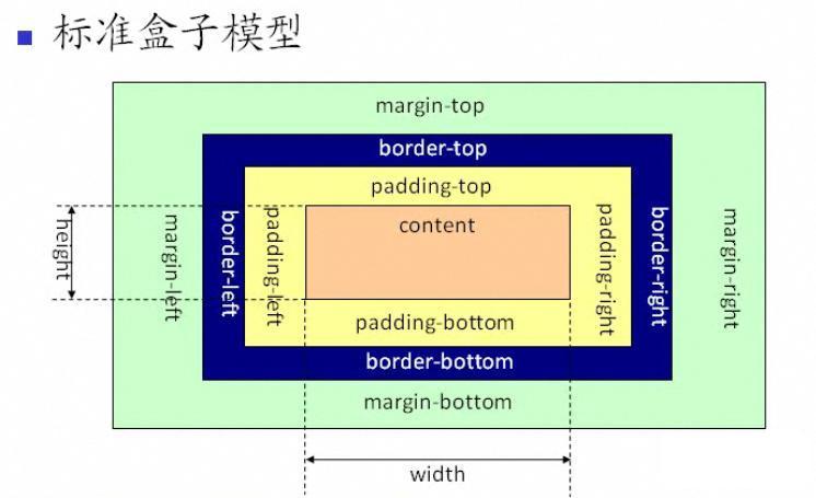
3. How to position - relative positioning, absolute positioning, floating
Relative positioning: refers to positioning relative to other defined element positions in the document flow.
static (default value): If you use the default value, the top, left, right, bottom.z-index defined for the element in CSS will not take effect.
relative: Move relative to the element itself.
Absolute positioning: will break away from the normal document flow and no longer occupy space.
absolute: Absolute positioning relative to a parent element that is not static. If the position of the parent element is not specified, absolute positioning will be absolute relative to the entire HTML document. It will be displayed first in normal document flow positioned elements and float elements.
fixed: Positioned relative to the browser window, the element always stays at a certain position on the screen no matter how the web page is scrolled.
Float: float
Out of document Flow - Position relative to the size of the parent element. If the width of the parent element is 100 and the width of the two child elements is 200 respectively, it will still be displayed as top and bottom hierarchies instead of left and right.
Outer box - will be displayed first in normal document flow positioned elements. Inner box - weaker than block-level elements, stronger than inline elements
Key point! Positioning element and document flow display relationship
1, Internal and external box display relationship between normal document flow:
1 2 |
|
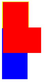
The yellow and blue ones are the external document flows, and the red ones are the two internal document flows of the yellow block.

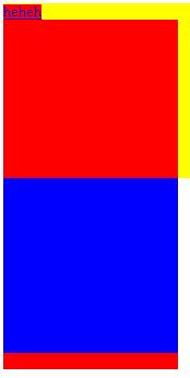
##The outer box is an external document flow, and the inner box has its own document flow , do not interfere with each other, but the external document flow (not its own parent element) will be displayed first over the internal document flow. 
Inline elements and Priority of floating elements:

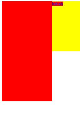

is the same). As follows:

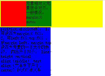

-
Priority of block-level elements and floating elements
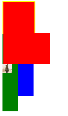
The green block and picture are the internal elements of the blue block. It is visible that the block-level elements are displayed according to the normal document flow. But the inline element img will still give way to floated elements, even if they are floated elements in the external document flow.

4, priority relationship between absolute positioning and floating of sibling elements
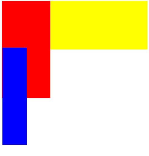
Blue block Position the element absolutely for the yellow inner block, and set p before the red block. The red block is a Float positioned element and is covered by absolute.

5. The priority relationship between absolute positioning and document flow elements & the priority relationship between relative positioning elements
Absolute positioning position: absolute.
1, perform absolute positioning relative to a parent element that is not static. If the position of the parent element is not specified, absolute will perform absolute positioning relative to the entire HTML document.
2. If top\left\bottom\right is not set, the top and left sides will be consistent with the position of the original document flow (that is, it will be the same as if position is not set), but it will cover the inside of the external document flow. There is too much floating element.
The picture below shows the blue block setting position:absolute;
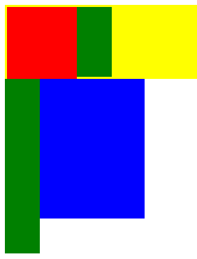
 (Note: the yellow block (contains red and green sub-elements) and The blue block (containing green sub-elements) is a sibling element)
Change the order. The blue block first sets p and position to absolute. The yellow block has no position set, which means it defaults to static. Because it is separated from the document flow, absolute elements are displayed first.
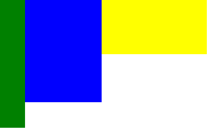

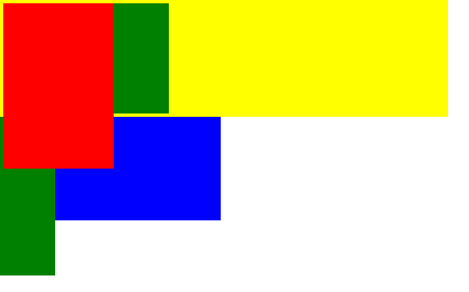
Set the position of the yellow block to relative, and the yellow block covers the absolutely positioned element. That is, when a relatively positioned element is positioned after an absolutely positioned element, the relatively positioned element is displayed first.

Summary:
1, normal document flow, external box priority Displayed within the inner box of the previously defined element (will be overwritten if exceeded). Block-level elements and inline elements will not be on the same line.

2. For internal and external document flows, floating elements are separated from the document flow, and elements defined first are displayed according to the normal document flow (make way for block level, squeeze out inline) , which does not affect the layout of later-defined elements, but affects the display of inline elements in the normal document flow. Inline elements will still be "squeezed out" by floating elements (no matter where the inline elements are, they will not be overwritten) Below floating elements)


#3, absolutely positioned elements are displayed first over floating elements.

4. Absolutely positioned elements that do not set specific values will be arranged according to the normal document flow, but will be separated from the document flow and will not affect the later defined elements.

5, if the sibling element is set to position:relative; when defined before the absolutely positioned element, the absolutely positioned element will be displayed first over the relatively positioned element.
When defined after an absolutely positioned element, the relative positioned element takes precedence over the absolutely positioned element.


4. How to center alignment
Horizontal centering:
1. Implementation Centering of inline elements. Method: Add: text-align:center;
2. Achieve horizontal centering of block-level elements in the style of the block element outside the inline element.
Method 1: margin:0 auto;
Note: If the block-level element is a direct child element of the body and the width is not set, the default is 100% , no effect is seen; if the height is not set, and there is no content in p, the height defaults to 0. Therefore, be sure to set the width and height of block-level elements at the same time to see the effect. This method can also be used if another p within a p wants to be centered, because the margin at this time is relative to its parent element.
Method 2:Use absolute positioning and negative margins.
position:absolute; Half of its own width
Vertical centering
1. Vertical centering of inline elementsMethod 1: Center the font vertically and set line-height to the height of the parent element.
Method 2:Set padding to center it vertically.
Method 3: The parent element sets line-height, and the inline element sets vertical-align:middle.
2. Vertical centering of block-level elements.
Method 1: Use absolute positioning and negative margins.
Method 2:Add display:flex;align-items:center; to the parent element to achieve vertical centering.
Achieve horizontal and vertical centering
Method one:Use absolute positioning and negative margins
Method two :Use display: flex
Add display: flex in the style of the parent element; align-items: center to achieve vertical centering, justify-content: center; to achieve horizontal centering .
Method three: Also use display:flex.
Set display:flex in the parent element; set margin:auto in the child element.Method 4: Use css3 attributes-translate() transformation function
position: absolute; top:50%; left:50%; transform: translate(-50%,-50%);
5. About style inheritance
Box model styles are not inheritable, such as width, height (width and height) , border (border), margin (margin), padding (padding) and background, etc.
vertical-align is not inheritable
Inheritable attributes
color
cursor
direction
font
letter-spacing
line-height
list-style
text-align
text-indent
text-shadow
text-transform
whitewhite-space
word-break
word-spacing
word-wrap
writing-mode
More how to use CSS to quickly layout — For detailed layout elements, please pay attention to the PHP Chinese website for related articles!

Hot AI Tools

AI Clothes Remover
Online AI tool for removing clothes from photos.

Undress AI Tool
Undress images for free

Clothoff.io
AI clothes remover

Video Face Swap
Swap faces in any video effortlessly with our completely free AI face swap tool!

Hot Article

Hot Tools

Notepad++7.3.1
Easy-to-use and free code editor

SublimeText3 Chinese version
Chinese version, very easy to use

Zend Studio 13.0.1
Powerful PHP integrated development environment

Dreamweaver CS6
Visual web development tools

SublimeText3 Mac version
God-level code editing software (SublimeText3)

Hot Topics
 1664
1664
 14
14
 1422
1422
 52
52
 1316
1316
 25
25
 1268
1268
 29
29
 1240
1240
 24
24
 Google Fonts Variable Fonts
Apr 09, 2025 am 10:42 AM
I see Google Fonts rolled out a new design (Tweet). Compared to the last big redesign, this feels much more iterative. I can barely tell the difference
 How to Create an Animated Countdown Timer With HTML, CSS and JavaScript
Apr 11, 2025 am 11:29 AM
Have you ever needed a countdown timer on a project? For something like that, it might be natural to reach for a plugin, but it’s actually a lot more
 HTML Data Attributes Guide
Apr 11, 2025 am 11:50 AM
Everything you ever wanted to know about data attributes in HTML, CSS, and JavaScript.
 A Proof of Concept for Making Sass Faster
Apr 16, 2025 am 10:38 AM
At the start of a new project, Sass compilation happens in the blink of an eye. This feels great, especially when it’s paired with Browsersync, which reloads
 How We Created a Static Site That Generates Tartan Patterns in SVG
Apr 09, 2025 am 11:29 AM
Tartan is a patterned cloth that’s typically associated with Scotland, particularly their fashionable kilts. On tartanify.com, we gathered over 5,000 tartan
 How to Build Vue Components in a WordPress Theme
Apr 11, 2025 am 11:03 AM
The inline-template directive allows us to build rich Vue components as a progressive enhancement over existing WordPress markup.
 While You Weren't Looking, CSS Gradients Got Better
Apr 11, 2025 am 09:16 AM
One thing that caught my eye on the list of features for Lea Verou's conic-gradient() polyfill was the last item:
 A Comparison of Static Form Providers
Apr 16, 2025 am 11:20 AM
Let’s attempt to coin a term here: "Static Form Provider." You bring your HTML


