This article mainly introduces the css attribute box-sizing. The box-sizing attribute was introduced in CSS3. Some people explain that it can specify whether the width and height values specified with the width attribute and height attribute respectively include the inside of the element. The padding area, and the width and height of the border.
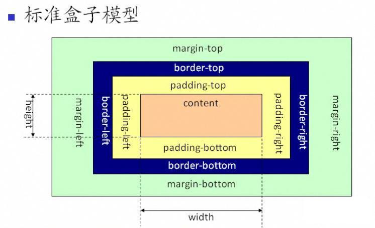
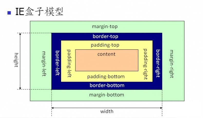
Before understanding box-sizing, let us briefly review the box model. The model is divided into: standard box model + IE box model. So what's the difference? See the picture:
As you can see from the above picture, the scope of the standard w3c box model includes margin, border, padding, and content, and the content part does not include other parts.

As you can see from the above figure, the scope of the IE box model also includes margin, border, padding, and content. The difference from the standard w3c box model is: the content of the IE box model The part includes borders and padding.

Of course, front-end engineers should adopt the standard box model when writing page layouts (you need to add a doctype statement to the page html declaration), telling the browser to follow the standard The page is rendered using the box model. On the contrary, the page will be parsed according to different browsers. IE will use IE's box model for rendering. Firefox and GOOGLE will render according to the standard mode, which is obviously unreasonable.
So in order to make the web pages we write compatible with various browsers, it is best to use the standard w3c box model.
After talking about the box model, let’s get into our understanding of the css attribute box-sizing.
The three attribute values of box-sizing: content-box draws the element's padding and borders outside the width and height | border-box Any padding and borders specified for the element will be outside the width and height. Draw within a set width and height | inherit specifies that the value of the box-sizing attribute should be inherited from the parent element; the box-sizing attribute allows you to define a specific element that matches a certain area in a specific way.
ie8+ browser supports content-box and border-box;
ff supports all three values.
<!doctype html public "-//w3c//dtd xhtml 1.0 transitional//en" "http://www.w3.org/tr/xhtml1/dtd/xhtml1-transitional.dtd">
<html lang="en">
    <head>
        <meta charset="utf-8">
        <title>box-sizing事项</title>
        <style type="text/css">
            *{padding: 0;margin: 0;font-family: "微软雅黑";box-sizing:border-box;-moz-box-sizing:border-box; /* Firefox */
-webkit-box-sizing:border-box; /* Safari */}
            .content{width: 800px;height: 500px;margin: 30px auto;border: 5px solid #e2e2e2;padding: 10px}
        </style>
    </head>
    <body>
        <p class="content">
            这是内容@!
        </p>
    </body>
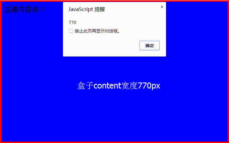
</html>After modifying the box-sizing attribute, the width of the box is: 770px = 800px - 10px -20px;
means that the inner padding and border are drawn inside the 800 pixels of the content box that has been set, resulting in a width of 770 in the content box.
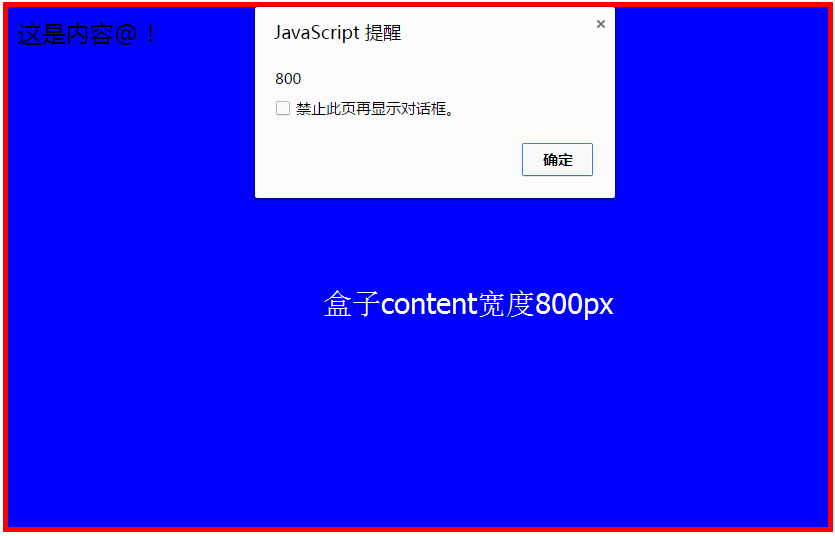
The width of the box after not modifying the box-sizing attribute is: 800px;


