SVG can achieve very cool line animation

Even such a web portal
We can first implement a simple SVG line animation
Like this

Don’t worry, before we do this we need to understand some attribute values
The dotted line attribute includes two stroke-dasharray and stroke-dashoffset
Let’s take a look at the following example
 <svg width=300 height=300 viewbox="0 0 30 30">
    <path id="path_a" d="M 5 10 L 25 10"></path>
    <path id="path_b" d="M 5 15 L 25 15"></path>
<path id="path_c" d="M 5 20 L 25 20"></path></svg>path {
stroke: #000;}#path_a {
stroke-dasharray: 1;}#path_b {
stroke-dasharray: 1 2;}#path_c {
stroke-dasharray: 1 2 3;}I set different stroke-dasharray for the three line segments respectively

I believe you can already understand what this attribute is used for
A value, the dotted line is drawn at 1px -Empty 1px-Draw 1px-Empty 1px-……
Two values, dotted line to draw 1px-Empty 2px-Draw 1px-Empty 2px-……
Three values, dotted line to draw 1px-Empty 2px-Draw 3px -Empty 1px-......
There is a loop inside
This property is to adjust the position of the dash line
<svg width=300 height=300 viewbox="0 0 30 30">
    <path id="path_a" d="M 5 10 L 25 10"></path>
    <path id="path_b" d="M 5 15 L 25 15"></path>
<path id="path_c" d="M 5 20 L 25 20"></path></svg>path {
stroke: #000;
stroke-dasharray: 5;
}#path_a {
stroke-dashoffset: 2;}#path_b {
stroke-dashoffset: 0;}#path_c {
stroke-dashoffset: -2;}
If the value is a positive number, then the dotted line moves backward
If the value is a negative number, the dotted line moves forward
The px unit can be written or not
After understanding the above dotted line related properties
, we can easily implement the simplest line animation above with CSS
And no JS (nor SMIL animation is required)
The principle is to modify the stroke-dashoffset The value allows the path to slowly appear
<svg width=300 height=300 viewbox="0 0 30 30">
<path d="M 5 15 L 25 15"></path></svg>path {
stroke: #000;
stroke-dasharray: 20px;
stroke-dashoffset: 20px;
animation: act 1s linear infinite alternate;}@keyframes act {
100% {
stroke-dashoffset: 0; }}
Initially set the length of the stroke-dashoffset and stroke-dasharray line segments
In this way, the line segments cannot be seen
When When using animation animation, the stroke-dashoffset gradually changes to 0
If you use the forwards attribute value here, you can realize the line drawing animationanimation: act 1s linear forwards;
It is indeed very clever Method
Although our small example above did not use js
But in fact we still need to cooperate with js to achieve more gorgeous and complex effects
Another example In our small example, the length of the path is easy to know
But what should we do if the path length is unknown
This requires js
var char = 'http://www.w3.org/2000/svg';var path = document.getElementsByTagNameNS(char, 'path')[0];
console.log(path.getTotalLength()); //20
In addition, there is a getPointAtLength(x) You can get the coordinates of the distance from the starting point
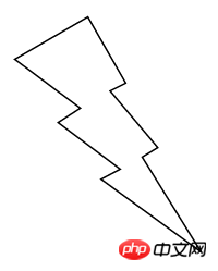
##Draw a lightning first
<svg width="580" height="400">
    <path d="m262.59622,90.56177l34.74561,60.80042l-14.32703,7.17541l43.75135,52.09264l-14.32061,
8.69967l54.08581,87.23186l-91.73919,-66.84884l17.49797,-9.28344l-57,-42.81731l20.425,-13.23194l-60.18379,-44.91723l67.06487,-38.90124z"></svg>path { stroke: #000; fill: transparent; stroke-width: 1.5px;}@keyframes act {
100% { stroke-dashoffset: 0; }}You need to write the @keyframes rules in advance
What we have to do is get the js script Path length
Then add stylevar char = 'http://www.w3.org/2000/svg',
path = document.getElementsByTagNameNS(char, 'path')[0], len = path.getTotalLength();
path.style.strokeDasharray = len;
path.style.strokeDashoffset = len;
path.style.animation = 'act 2s linear forwards';
Of course, if you want to achieve more complex and cool line animation
For example, the following one
 The above is the SVG (Scalable Vector Graphics) dotted line related attributes and line animation principle: a line will move The content of the line, for more related content, please pay attention to the PHP Chinese website (www.php.cn)!


