3D cube rotation animation
This article introduces an attractive example of HTML5+CSS3: 3D cube rotation animation example, the details are as follows
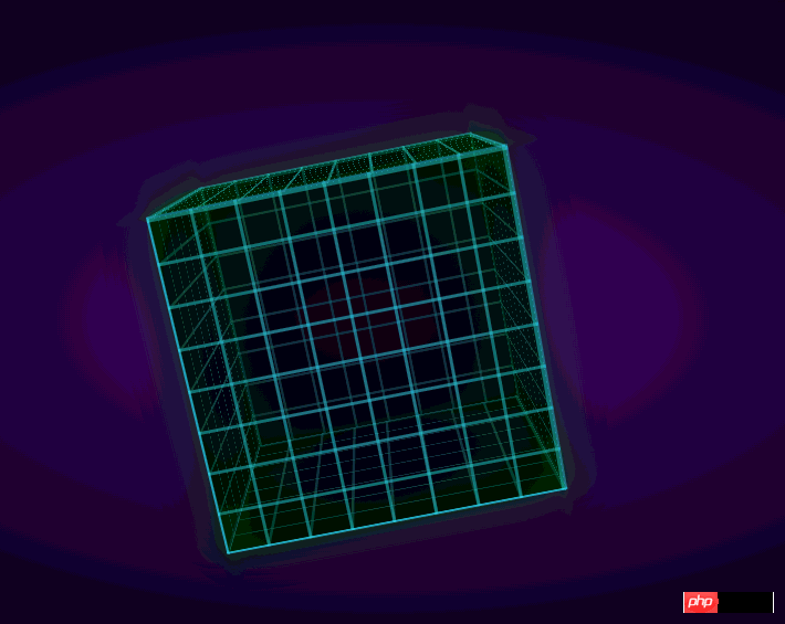
Rendering:

Knowledge points:
1. Review of perspective and transform
2. CSS3 backgroud realizes the grid background, that is, the small grid on the surface
3. @-webkit-keyframes implement animation
HTML:
<body>
 <p class="stage">
    <p class="cube">
        <p class="font"></p>
        <p class="back"></p>
        <p class="left"></p>
        <p class="right"></p>
        <p class="top"></p>
        <p class="bottom"></p>
    </p>
  </p>
</body>We have already mentioned how to make it in the previous 3D product display It's a cube, and there are numbers on it. Theoretically, it's more complicated than this, although it's not that cool~ I won't go into details here.
CSS:
html
       {
           background: -webkit-radial-gradient(center, ellipse, #430d6d 0%, #000000 100%);
           background: radial-gradient(ellipse at center, #430d6d 0%, #000000 100%);
           height: 100%;
       }

       .stage
       {
           -webkit-perspective: 1000px;
           width: 20em;
           height: 20em;
           left: 50%;
           top: 50%;
           margin-left: -10em;
           margin-top: -10em;
           position: absolute;
       }

       .cube
       {
           position: absolute;
           width: 100%;
           height: 100%;
           -webkit-transform-style: preserve-3d;
           -webkit-transform: rotateX(-20deg) rotateY(-20deg);
       }

       .cube *
       {
           background: -webkit-linear-gradient(left, rgba(54, 226, 248, 0.5) 0px, rgba(54, 226, 248, 0.5) 3px, rgba(0, 0, 0, 0) 0px), -webkit-linear-gradient(top, rgba(54, 226, 248, 0.5) 0px, rgba(54, 226, 248, 0.5) 3px, rgba(0, 0, 0, 0) 0px);
           -webkit-background-size: 2.5em 2.5em;

           background-color: rgba(0, 0, 0, 0.5);
           position: absolute;
           width: 100%;
           height: 100%;
           border: 2px solid rgba(54, 226, 248, 0.5);
           -webkit-box-shadow: 0 0 5em rgba(0, 128, 0, 0.4);

       }

       .font
       {
           -webkit-transform: translateZ(10em);
       }

       .back
       {
           -webkit-transform: rotateX(180deg) translateZ(10em);
       }

       .left
       {
           -webkit-transform: rotateY(-90deg) translateZ(10em);
       }

       .right
       {
           -webkit-transform: rotateY(90deg) translateZ(10em);
       }

       .top
       {
           -webkit-transform: rotateX(90deg) translateZ(10em);
       }

       .bottom
       {
           -webkit-transform: rotateX(-90deg) translateZ(10em);
}Similarly: stage serves as the stage, cube sets the effect of the child element to 3d, and then each face is rotated and Set translateZ and then form a cube.
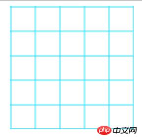
Set the backgroud for each surface and set the code for small grids:
background: -webkit-linear-gradient(
           left,
           rgba(54, 226, 248, 0.5) 0px,
           rgba(54, 226, 248, 0.5) 3px,
           rgba(0, 0, 0, 0) 0px),
                   -webkit-linear-gradient(
           top,
           rgba(54, 226, 248, 0.5) 0px,
           rgba(54, 226, 248, 0.5) 3px,
           rgba(0, 0, 0, 0) 0px);

-webkit-background-size: 2.5em 2.5em;Background settings, 3 pixel strips from left to right , a 3-pixel strip from top to bottom; then set the background size to 2.5em 2.5em, and then repeat the background, the effect is as follows (I added a border):

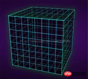
Now the complete effect:

You can see that the cube has been formed, and finally add animation. Don’t think the animation is complicated, it is actually very simple~
Define an animation frame:
@-webkit-keyframes spin
       {
           from
           {
               -webkit-transform: translateZ(-10em) rotateX(0) rotateY(0deg);
               transform: translateZ(-10em) rotateX(0) rotateY(0deg);
           }

           to
           {
               -webkit-transform: translateZ(-10em) rotateX(360deg) rotateY(360deg);
               transform: translateZ(-10em) rotateX(360deg) rotateY(360deg);
           }
}The name is spin, at the beginning translateZ(-10em) rotateX(0) rotateY(0deg); at the end: translateZ(-10em) rotateX(360deg) rotateY(360deg); That is, rotate 360 degrees around the x and y axes at the same time.
Finally add this animation attribute to our cube:
.cube
      {
          -webkit-animation: 6s spin linear infinite;
          position: absolute;
          width: 100%;
          height: 100%;
          -webkit-transform-style: preserve-3d;
          -webkit-transform: rotateX(-20deg) rotateY(-20deg);
}Set the time to animation time 6s, animation spin, and speed to uniform linear , infinite loop infinite;
For more detailed parameter settings, you can refer to w3cSchool~In the future, I will also write a separate blog introducing the properties of CSS3~
Okay, the final effect has been completed ~
There is a slight difference in the appearance of the original website:
Because it adds an additional radial gradient to each face, then we add:
.cube *:before
    {
        display: block;
        background: -webkit-radial-gradient(center, ellipse, rgba(0, 0, 0, 0) 30%, rgba(0, 128, 0, 0.2) 100%);
        background: radial-gradient(ellipse at center, rgba(0, 0, 0, 0) 30%, rgba(0, 128, 0, 0.2) 100%);
        content: '';
        height: 100%;
        width: 100%;
        position: absolute;
}Use the before pseudo-element, and then set the radial gradient~~Now it is finally consistent~
Click to download the source code: demo
The above is I hope that the entire content of this article will be helpful to everyone's learning, and I also hope that everyone will support the PHP Chinese website.
For more articles related to 3D cube rotation animation, please pay attention to the PHP Chinese website!

Hot AI Tools

Undresser.AI Undress
AI-powered app for creating realistic nude photos

AI Clothes Remover
Online AI tool for removing clothes from photos.

Undress AI Tool
Undress images for free

Clothoff.io
AI clothes remover

AI Hentai Generator
Generate AI Hentai for free.

Hot Article

Hot Tools

Notepad++7.3.1
Easy-to-use and free code editor

SublimeText3 Chinese version
Chinese version, very easy to use

Zend Studio 13.0.1
Powerful PHP integrated development environment

Dreamweaver CS6
Visual web development tools

SublimeText3 Mac version
God-level code editing software (SublimeText3)

Hot Topics
 1385
1385
 52
52
 Working With GraphQL Caching
Mar 19, 2025 am 09:36 AM
If you’ve recently started working with GraphQL, or reviewed its pros and cons, you’ve no doubt heard things like “GraphQL doesn’t support caching” or
 Building an Ethereum app using Redwood.js and Fauna
Mar 28, 2025 am 09:18 AM
With the recent climb of Bitcoin’s price over 20k $USD, and to it recently breaking 30k, I thought it’s worth taking a deep dive back into creating Ethereum
 Vue 3
Apr 02, 2025 pm 06:32 PM
It's out! Congrats to the Vue team for getting it done, I know it was a massive effort and a long time coming. All new docs, as well.
 Can you get valid CSS property values from the browser?
Apr 02, 2025 pm 06:17 PM
I had someone write in with this very legit question. Lea just blogged about how you can get valid CSS properties themselves from the browser. That's like this.
 A bit on ci/cd
Apr 02, 2025 pm 06:21 PM
I'd say "website" fits better than "mobile app" but I like this framing from Max Lynch:
 Comparing Browsers for Responsive Design
Apr 02, 2025 pm 06:25 PM
There are a number of these desktop apps where the goal is showing your site at different dimensions all at the same time. So you can, for example, be writing
 Using Markdown and Localization in the WordPress Block Editor
Apr 02, 2025 am 04:27 AM
If we need to show documentation to the user directly in the WordPress editor, what is the best way to do it?
 Stacked Cards with Sticky Positioning and a Dash of Sass
Apr 03, 2025 am 10:30 AM
The other day, I spotted this particularly lovely bit from Corey Ginnivan’s website where a collection of cards stack on top of one another as you scroll.


