Usually when we want to achieve the effect of reflection, the general approach is to use multiple DOM elements to absolutely position + scale (minus -1) or rotate. The disadvantage of this method is that it takes up space and has too many DOM elements.
In browsers using the webkit kernel (chrome, safari, mobile browsers), you can use the -webkit-box-reflect attribute to implement reflection. The syntax is as follows
[above | below | right | left ]?
This value contains three parts: orientation + offset + mask layer
Orientation It is essential; when using the mask layer, the offset is indispensable. If not, use zero instead of
! ! ! Important: The effect of the mask layer has nothing to do with color. For example, if you use a gradient color as a mask, if it is a solid color, it will be transparent, and if it is transparent, the original color will be exposed.
Usage examples are as follows:
<!DOCTYPE html>
<html>
<head>
  <meta charset="utf-8">
  <meta name="viewport" content="width=device-width">
  <title>JS Bin</title>
  <style type="text/csss">
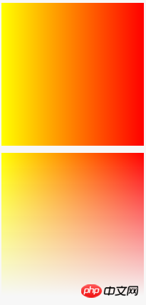
    .box{ width:200px; height:200px; margin-bottom:20px;transform:scale(-1,1); background-image:linear-gradient(90deg,red,yellow);-webkit-box-reflect:below 10px linear-gradient(180deg,transparent,#000); }
  </style>
</head>
<body>
  <p class="box"></p>
</body>
</html>The effect is as follows:

If you need to achieve similar effects in firefox, you can use -moz-element( ) function, but the effect is quite different under rotation, as shown below.
<!DOCTYPE html>
<html>
<head>
  <meta charset="utf-8">
  <meta name="viewport" content="width=device-width">
  <title>JS Bin</title>
  <style type="text/css">
    .box{ width:200px; height:200px; margin:100px 0 0 100px; }
    .box1{ background-image:linear-gradient(180deg,red,yellow); transform:scale(1,-1) rotate(45deg)}
    .box2{ background-image:-moz-element(#box1); }
  </style>
</head>
<body>
  <p class="box box1" id="box1"></p>
  <p class="box box2" id="box2"></p>
</body>
</html>
The effect of using -webkit-box-reflect under chrome is like this

If you want to be compatible with IE browser, you can also use SVG or canvas. SVG mainly uses pattern+mask+linearGradient+scale, and canvas uses scale+globalCompositeOperation.
The code for the SVG example is as follows:
<svg width="200" height="200">
    <defs>
      <linearGradient id="a" x1="0" y1="0" x2="0" y2="1">
        <stop offset="0%" style="stop-color:yellow"/>
        <stop offset="100%" style="stop-color:red"/>
      </linearGradient>
      <linearGradient id="b" x1="0" y1="0" x2="0" y2="100%">
        <stop offset="0%" style="stop-color:rgba(255,255,255,0)"/>
        <stop offset="100%" style="stop-color:rgba(255,255,255,1)"/>
      </linearGradient>
      <mask id="c" x="0" y="0" width="1" height="1">
        <rect x="0" y="0" width="100%" height="100%" style="fill:url(#b)" />
      </mask>
    </defs>
    <rect x="0" y="0" width="200" height="200" style="fill:url(#a);" mask="url(#c)">
</svg>The code for the canvas example is as follows
var canvas = document.getElementById('canvas'),
    ctx = canvas.getContext('2d');

var linearGradient1 = ctx.createLinearGradient(0,0,0,200);
linearGradient1.addColorStop(0,"red");
linearGradient1.addColorStop(1,"yellow");

var linearGradient2 = ctx.createLinearGradient(0,0,0,200);
linearGradient2.addColorStop(0,"transparent");
linearGradient2.addColorStop(1,"#ffffff");

ctx.fillStyle = linearGradient1;
ctx.fillRect(0,0,200,200);

ctx.globalCompositeOperation = 'destination-out';

ctx.fillStyle = linearGradient2;
ctx.fillRect(0,0,200,200);The above are the various methods of reflection implementation. In comparison, it is better to use css3's -webkit-box-reflect to achieve the simplest effect. I hope it will be helpful to everyone's learning, and I also hope that everyone will support the PHP Chinese website.
For more CSS3 Notes: -webkit-box-reflect implementation of reflection related articles, please pay attention to the PHP Chinese website!


