CSS3 achieves text wavy line effect
Preface
The css design is ingenious and the implementation is exquisite. If you think about it carefully, it is extraordinary and wonderful. This wavy line cleverly uses the linear-gradient attribute to integrate angle, color, and position. Together with background-size and background-repeat, it turns one into many and makes a smooth transition. Wow, the final effect is so clever! There are no words to describe it...
Implementation method
Syntax: linear-gradient(direction, color-stop 1 , color-stop 2,...)

Simple usage: background-image: linear-gradient(red, transparent);

Add angle, linear-gradient(45deg, red, transparent)

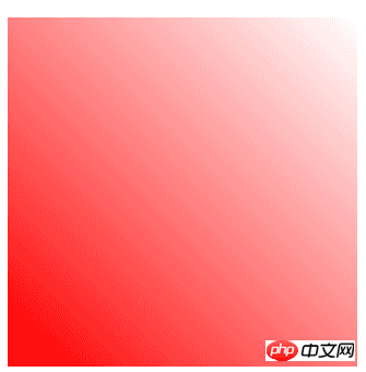
Add a position: linear-gradient(45deg, red, transparent 45%)

Add a colorlinear-gradient(45deg, red, transparent 45%,red)
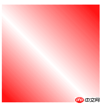
I don’t know if everyone saw this, as if they saw a mirror and had an epiphany.

linear-gradient(45deg, transparent 45%, red 55%, transparent 60%)

linear-gradient(135deg , transparent 45%, red 55%, transparent 60%)
Combine these two lines.

Combined
Seeing this, do you know how to achieve the wavy line effect? ^_^

The height is 1/2 of the original
Final code:

Text wavy line effect
Summary
Okay, this is it. The above is the entire content of this article. I hope it will help everyone learn or use CSS3 It can be helpful. If you have any questions, you can leave a message to communicate.
For more articles related to CSS3 realizing text wavy line effect, please pay attention to the PHP Chinese website!

Hot AI Tools

Undresser.AI Undress
AI-powered app for creating realistic nude photos

AI Clothes Remover
Online AI tool for removing clothes from photos.

Undress AI Tool
Undress images for free

Clothoff.io
AI clothes remover

AI Hentai Generator
Generate AI Hentai for free.

Hot Article

Hot Tools

Notepad++7.3.1
Easy-to-use and free code editor

SublimeText3 Chinese version
Chinese version, very easy to use

Zend Studio 13.0.1
Powerful PHP integrated development environment

Dreamweaver CS6
Visual web development tools

SublimeText3 Mac version
God-level code editing software (SublimeText3)

Hot Topics
 1378
1378
 52
52
 How to achieve wave effect with pure CSS3? (code example)
Jun 28, 2022 pm 01:39 PM
How to achieve wave effect with pure CSS3? This article will introduce to you how to use SVG and CSS animation to create wave effects. I hope it will be helpful to you!
 How to make round pictures and text in ppt
Mar 26, 2024 am 10:23 AM
First, draw a circle in PPT, then insert a text box and enter text content. Finally, set the fill and outline of the text box to None to complete the production of circular pictures and text.
 How to add dots to text in word?
Mar 19, 2024 pm 08:04 PM
When we create Word documents on a daily basis, we sometimes need to add dots under certain words in the document, especially when there are test questions. To highlight this part of the content, the editor will share with you the tips on how to add dots to text in Word. I hope it can help you. 1. Open a blank word document. 2. For example, add dots under the words "How to add dots to text". 3. We first select the words "How to add dots to text" with the left mouse button. Note that if you want to add dots to that word in the future, you must first use the left button of the mouse to select which word. Today we are adding dots to these words, so we have chosen several words. Select these words, right-click, and click Font in the pop-up function box. 4. Then something like this will appear
 Use CSS skillfully to realize various strange-shaped buttons (with code)
Jul 19, 2022 am 11:28 AM
This article will show you how to use CSS to easily realize various weird-shaped buttons that appear frequently. I hope it will be helpful to you!
 How to hide elements in css without taking up space
Jun 01, 2022 pm 07:15 PM
Two methods: 1. Using the display attribute, just add the "display:none;" style to the element. 2. Use the position and top attributes to set the absolute positioning of the element to hide the element. Just add the "position:absolute;top:-9999px;" style to the element.
 Golang Image Processing: Learn How to Add Watermarks and Text
Aug 17, 2023 am 08:41 AM
Golang Image Processing: Learn How to Add Watermarks and Text Quotes: In the modern era of digitalization and social media, image processing has become an important skill. Whether for personal use or business operations, adding watermarks and text are common needs. In this article, we will explore how to use Golang for image processing and learn how to add watermarks and text. Background: Golang is an open source programming language known for its concise syntax, efficient performance and powerful concurrency capabilities. it has become the subject of many developments
 How to modify text on pictures
Aug 29, 2023 am 10:29 AM
Modifying the text on the image can be done by using image editing software, online tools or screenshot tools. The specific steps are: 1. Open the picture editing software and import the picture that needs to be modified; 2. Select the text tool; 3. Click the text area on the picture to create a text box; 4. Enter the text you want in the text box. 5. If you just want to delete the text on the picture, you can use the eraser tool or the selection tool to select and delete the text area.
 How to implement lace borders in css3
Sep 16, 2022 pm 07:11 PM
In CSS, you can use the border-image attribute to achieve a lace border. The border-image attribute can use images to create borders, that is, add a background image to the border. You only need to specify the background image as a lace style; the syntax "border-image: url (image path) offsets the image border width inward. Whether outset is repeated;".


