 WeChat Applet
 Mini Program Development
 Detailed introduction to WeChat mini program development
Detailed introduction to WeChat mini program development
1: Flex layout
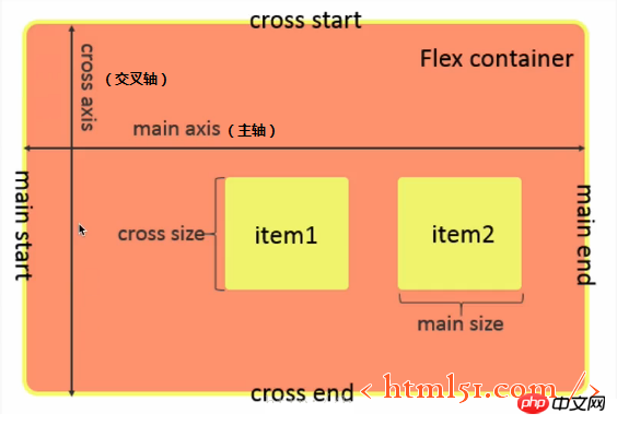
##Flex layout is shown in Figure 1
figure 1
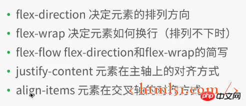
1.1 Flex container properties
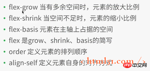
##1.2 Flex container Inner element attributes
WeChat In the mini program development project, create a new file layout, and then create various files (named after layout),
Add the following code to layout.wxml:1 2 3 4 5 6 7 8 9 10 11 12 13 14 15 16 17 18 19 |
|
1 2 3 4 5 6 7 8 9 10 11 12 13 |
|
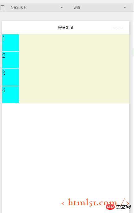
##Modify .container1 as follows: (Add display:flex;) The compilation and running are shown in Figure 3: It can be seen that the flex layout is the default horizontal arrangement of elements
1 2 3 4 5 6 |
|
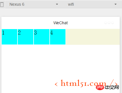 ##1.1.1 Containers Attributes: flex-direction
Add the following code in .container1: It means setting the flex layout to arrange the elements vertically (from left to right for the cross axis, from From top to bottom as the main axis), as shown in Figure 2. (row: flex layout arranges elements horizontally --- from left to right as the main axis, from top to bottom as the cross axis)
flex-direction :column
1.1.2 Container properties: flex-wrap
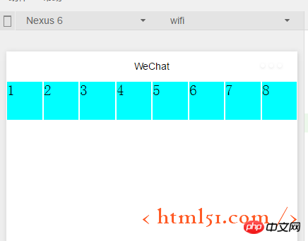
Add the following code to .container1: At the same time Copy the element code in layout.wxml to the 8 element views, compile and run, and the effect is shown in Figure 4. It can be seen that the original height and width are 100rpx, and the square view has been transformed into a rectangle.
flex-wrap:nowrap
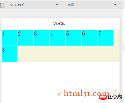
##If modified to the following code: Compile and run as shown in Figure 5: Ensure that each subview is square, and then put the 8th subview that cannot fit on the next line
flex-wrap:wrap
##1.1.3 Container properties: flex-flow
##flex-flow: wrap row ,Compilation and running results: As shown in Figure 5, flex-flow is equivalent to the combination of the two attributes flex-direction and flex-wrap
1.1 .4 Container attributes: justify-content
## Add the following code to .container1 : Compile and run as shown in Figure 6. Indicates the alignment on the main axis. Since we set
flex-flow: wrap row---in the above code, it is equivalent to the main axis being from left to right, so the 8th element that cannot be displayed on one line is displayed in the center of the next line. , and the first seven subviews are also displayed in the middle of a row, with blank margins on the left and right sides##justify-content:center
justify-content:flex-end (When the main axis is left to right: right-aligned)
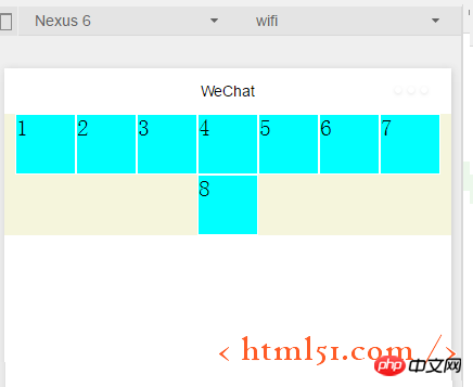
The compilation and running effect is shown in Figure 7:
##justify-content:flex-start (when the main axis is left to right: align left) Shown without examples 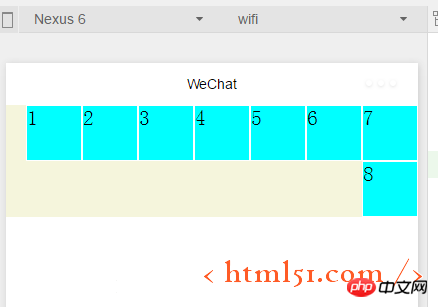
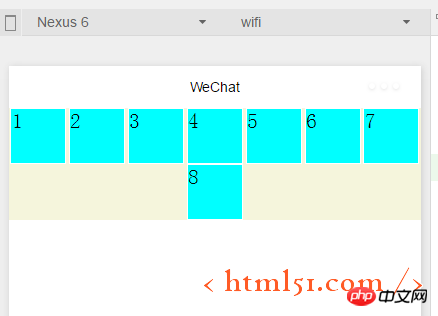
##justify-content:space-around ---The effect is shown in Figure 8. There are left edges on the left and right of each subview
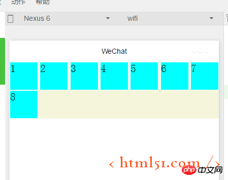
#justify-content:space-between---The effect is shown in Figure 9 , each subview has left and right edges, but the first and last two views are aligned left and right without leaving any edges
1.1.5容器属性:align-items
上面已经很详细讲解主轴上的对齐方式,这里关于这个交叉轴上的对齐方式同理很简单,就不详细展开了。
1.2.1 容器内元素属性:flex-grow
layout.wxml中修改代码如下:增加i3
1 2 3 |
|
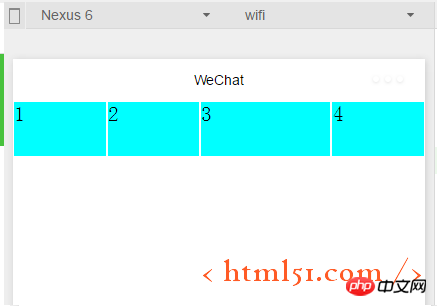
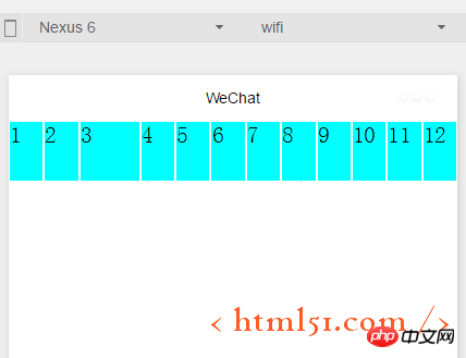
layout.wxss中修改代码如下:在item1中增加: flex-grow: 1,增加i3,表示在一行中如果有剩余空间的话,i3之外的子view占1份空间,而i3子view占2份空间,编译运行效果如图10所示:可以看出i3view所占据的空间比其余3个子view大,但是没有到2倍
1 2 3 4 5 6 7 8 9 10 11 |
|
1.2.2容器内元素属性:flex-shrink
layout.wxml再增加4个子view
layout.wxss中修改代码如下:i3的flex-shrink为0,其余子view为1,这表示当空间不足时所有子view都等比缩小,但是i3的view保持大小不变,编译运行,效果如图11所示
1 2 3 4 5 6 7 8 9 10 11 12 |
|
更多Detailed introduction to WeChat mini program development相关文章请关注PHP中文网!

Hot AI Tools

Undresser.AI Undress
AI-powered app for creating realistic nude photos

AI Clothes Remover
Online AI tool for removing clothes from photos.

Undress AI Tool
Undress images for free

Clothoff.io
AI clothes remover

AI Hentai Generator
Generate AI Hentai for free.

Hot Article

Hot Tools

Notepad++7.3.1
Easy-to-use and free code editor

SublimeText3 Chinese version
Chinese version, very easy to use

Zend Studio 13.0.1
Powerful PHP integrated development environment

Dreamweaver CS6
Visual web development tools

SublimeText3 Mac version
God-level code editing software (SublimeText3)

Hot Topics
 1378
1378
 52
52
 PHP permission management and user role setting in mini program development
Jul 04, 2023 pm 04:48 PM
PHP permission management and user role setting in mini program development. With the popularity of mini programs and the expansion of their application scope, users have put forward higher requirements for the functions and security of mini programs. Among them, permission management and user role setting are An important part of ensuring the security of mini programs. Using PHP for permission management and user role setting in mini programs can effectively protect user data and privacy. The following will introduce how to implement this function. 1. Implementation of Permission Management Permission management refers to granting different operating permissions based on the user's identity and role. in small
 PHP page jump and routing management in mini program development
Jul 04, 2023 pm 01:15 PM
PHP's page jump and routing management in mini program development With the rapid development of mini programs, more and more developers are beginning to combine PHP with mini program development. In the development of small programs, page jump and routing management are very important parts, which can help developers achieve switching and navigation operations between pages. As a commonly used server-side programming language, PHP can interact well with mini programs and transfer data. Let’s take a detailed look at PHP’s page jump and routing management in mini programs. 1. Page jump base
 How to implement small program development and publishing in uniapp
Oct 20, 2023 am 11:33 AM
How to develop and publish mini programs in uni-app With the development of mobile Internet, mini programs have become an important direction in mobile application development. As a cross-platform development framework, uni-app can support the development of multiple small program platforms at the same time, such as WeChat, Alipay, Baidu, etc. The following will introduce in detail how to use uni-app to develop and publish small programs, and provide some specific code examples. 1. Preparation before developing small programs. Before starting to use uni-app to develop small programs, you need to do some preparations.
 PHP security protection and attack prevention in mini program development
Jul 07, 2023 am 08:55 AM
PHP security protection and attack prevention in mini program development With the rapid development of the mobile Internet, mini programs have become an important part of people's lives. As a powerful and flexible back-end development language, PHP is also widely used in the development of small programs. However, security issues have always been an aspect that needs attention in program development. This article will focus on PHP security protection and attack prevention in small program development, and provide some code examples. XSS (Cross-site Scripting Attack) Prevention XSS attack refers to hackers injecting malicious scripts into web pages
 PHP data caching and caching strategies in small program development
Jul 05, 2023 pm 02:57 PM
PHP data caching and caching strategies in mini program development With the rapid development of mini programs, more developers are beginning to pay attention to how to improve the performance and response speed of mini programs. One of the important optimization methods is to use data caching to reduce frequent access to the database and external interfaces. In PHP, we can use various caching strategies to implement data caching. This article will introduce the principles of data caching in PHP and provide sample codes for several common caching strategies. 1. Data caching principle Data caching refers to storing data in memory to
 Implementation method of drop-down menu developed in PHP in WeChat applet
Jun 04, 2023 am 10:31 AM
Today we will learn how to implement the drop-down menu developed in PHP in the WeChat applet. WeChat mini program is a lightweight application that users can use directly in WeChat without downloading and installing, which is very convenient. PHP is a very popular back-end programming language and a language that works well with WeChat mini programs. Let's take a look at how to use PHP to develop drop-down menus in WeChat mini programs. First, we need to prepare the development environment, including PHP, WeChat applet development tools and servers. then we
 PHP page animation effects and interaction design in mini program development
Jul 04, 2023 pm 11:01 PM
Introduction to PHP page animation effects and interaction design in mini program development: A mini program is an application that runs on a mobile device and can provide an experience similar to native applications. In the development of mini programs, PHP, as a commonly used back-end language, can add animation effects and interactive design to mini program pages. This article will introduce some commonly used PHP page animation effects and interaction designs, and attach code examples. 1. CSS3 animation CSS3 provides a wealth of properties and methods for achieving various animation effects. And in small
 UniApp implements analysis of the development and launch process of ByteDance mini-programs
Jul 06, 2023 pm 05:01 PM
Analysis of the development and launch process of ByteDance applets implemented by UniApp. As an emerging mobile application development method, ByteDance applets are gradually becoming popular in the industry. Before developing the Bytedance mini program, we need to understand how to use UniApp to implement the development and launch process. 1. Introduction to UniApp UniApp is a framework developed based on Vue.js that uses HTML5, App, and small programs as the unified development framework for multiple terminals. By writing a set of code, it can run on multiple platforms at the same time, including fonts.


