CSS3 Gradient is divided into linear gradient (linear) and radial gradient (radial). Since different rendering engines have different syntax for implementing gradients, here we only analyze its usage based on the W3C standard syntax of linear gradients. You can refer to relevant information for the rest. W3C syntax has been supported by browsers such as IE10+, Firefox19.0+, Chrome26.0+ and Opera12.1+.
In this section, let’s talk about linear gradients:

Parameters:
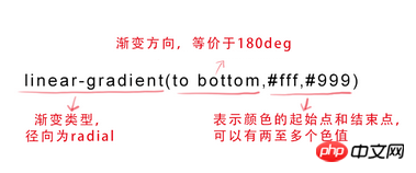
The first parameter: Specify the gradient direction , can be represented by the keyword "angle" or "English":

(Click the image to enlarge)
When the first parameter is omitted , the default is "180deg", which is equivalent to "to bottom".
The second and third parameters represent the starting point and end point of the color, and can have multiple color values.
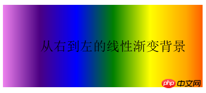
background-image:linear-gradient(to left, red, orange,yellow,green,blue,indigo,violet);
Rendering:

2. text-overflow and word-wrap
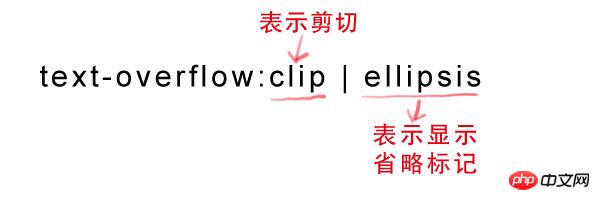
text-overflow is used to set whether to use an omission The mark(...) marks the overflow of text within the object.
Grammar:

But text-overflow is only used to explain how to display text when it overflows. To achieve the effect of producing an ellipsis when overflowing, you must Define the forced text to be displayed in one line (white-space:nowrap) and the overflow content to be hidden (overflow:hidden). Only in this way can the effect of displaying ellipsis in the overflow text be achieved. The code is as follows:
text-overflow:ellipsis ; overflow:hidden; white-space:nowrap;
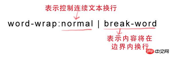
At the same time, word-wrap can also be used to set the text behavior, whether to break the current line when it exceeds the boundary of the specified container.
Syntax:

normal is the browser default value, break-word is set to wrap inside long words or URL addresses, this attribute is not commonly used, use The browser default value is sufficient.
3. Embed font @font-face
@font-face can load server-side font files, allowing the browser to display fonts that are not installed on the user's computer.
Syntax:
@font-face {
font-family: font name;
src: relative or absolute path to the font file on the server;
}
After setting this, you can set the font style in (font-*) just like using a normal font.
For example:
p {
font-size:12px;
font-family: "My Font";
/*Required, set @font-face The same value of font-family */
}
4. Text shadow text-shadow
text-shadow can be used to set the shadow effect of text.
Syntax:
text-shadow: X-Offset Y-Offset blur color; , otherwise offset to the left;
Y-Offset: refers to the vertical offset distance of the shadow. If its value is positive, the shadow is offset downward, otherwise it is offset upward;
Blur: refers to the blurring degree of the shadow. Its value cannot be a negative value. The larger the value, the blurr the shadow. On the contrary, the clearer the shadow. If the shadow blur is not needed, the Blur value can be set to 0;
Color: refers to the color of the shadow, which can use rgba color.
For example, we can use the following code to set the shadow effect.
text-shadow: 0 1px 1px #fff
The above article has a comprehensive understanding of css gradient color omission mark embedded font text shadow is all the content shared by the editor, I hope it can give you A reference, and I hope everyone will support the PHP Chinese website.
For more details on css gradient colors, omitted tags, embedded fonts, and text shadows, please pay attention to the PHP Chinese website for related articles!
Related articles:


