The following editor will bring you a simple example of css3 filtering effect. The editor thinks it is quite good, so I will share it with you now and give it as a reference for everyone. Let’s follow the editor and take a look.

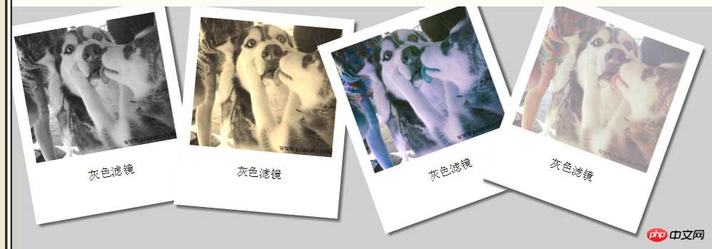
The picture above is the filter effect of the new features of CSS3. After learning this, we, the big web people who love beauty and handsomeness, will Isn’t it possible to perfectly beautify photos with code?~~
Okay, let’s first implement the white frame behind the photo,
<style>
#p1{

          /*给p定义宽高和颜色*/


          width: 200px;
          height: 250px;
          background: white;

         /* 内填充距离照片为15px ,文字居中*/
          padding: 15px;

          text-align: center;

      /*  把白色背景旋转-10deg  */

          -webkit-transform: rotate(-10deg);

      /*给背景一个阴影的效果*/
          box-shadow: 4px 4px 4px #666;
          float: left;
          }


</style>
<BR>
<body><BR>
<p id="p1">
<img  src="/static/imghw/default1.png"  data-src="img/001V28Mwty6Fww02IiNad&690.jpg"  class="lazy"   alt="Simple example of css3 filtering effect" >
<p>灰色滤镜</p>
</p>
<BR>
</body>put the white background frame After writing it, it’s time to filter it
First come to the first picture, artistic black and white
#p1 img{

/*把p1里面的图片百分百,等同于相对于在p1里面百分比放大填充*/
width: 100%;
/*把图片变成黑白色括号里跟颜色变化的值,只能取0~1之间*/
-webkit-filter: grayscale(1); }The second picture, uh... Old photos.
#p1 img{
            width: 100%;
            -webkit-filter: sepia(1);
}The third photo, reverse color? I’m not sure what color it is either
#p1 img{
            width: 100%;
            -webkit-filter: hue-rotate(200deg);
}The fourth photo seems to be covered with a layer of white mist
#p1 img{
            width: 100%;
            -webkit-filter: opacity(0.5);
}There is another photo It’s not on the renderings, but the blur effect code is as follows
#p4 img{
            width: 100%;
            -webkit-filter: opacity(0.5);
}Okay, I’ve finished sharing my filter, and the next step is to go to the beautiful picture
The above css3 The simple example of filtering effect is all the content shared by the editor. I hope it can give you a reference, and I hope you will support the PHP Chinese website.
For more simple examples of css3 filtering effects and related articles, please pay attention to the PHP Chinese website!


