 Web Front-end
 CSS Tutorial
 Detailed explanation of Bootstrap implementation of beautiful and concise CSS3 price list example source code
Detailed explanation of Bootstrap implementation of beautiful and concise CSS3 price list example source code
Preface
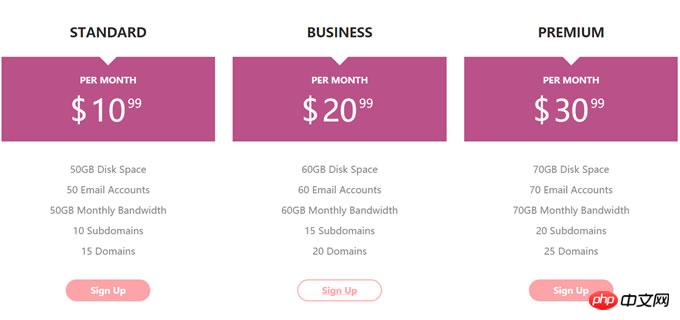
This is a beautiful and concise CSS3 price list style. The price list is laid out based on the Bootstrap grid system. Simple CSS3 code is used to beautify the price list. The style is very fashionable and beautiful, and can display good effects on different screens.
Let’s look at the renderings first

View the demo download source code
First of all The bootstrap.min.css file is introduced into the page. Here I use the official CDN resource. You can also download it for local use.
<link rel="stylesheet" href="http//cdn.bootcss.com/bootstrap/3.3.5/css/bootstrap.min.css">
The HTML structure of the css3 price list is as follows:
<p class="container">
    <p class="row">
        <p class="col-md-4 col-sm-6">
            <p class="pricingTable">
                <h3 id="Standard">Standard</h3>
                <p class="price-value">
                    <span class="month">per month</span>
                    <span class="amount">
                        <span class="currency">$</span>
                        10
                        <span class="value">99</span>
                    </span>
                </p>
                <ul class="pricing-content">
                    <li>50GB Disk Space</li>
                    <li>50 Email Accounts</li>
                    <li>50GB Monthly Bandwidth</li>
                    <li>10 Subdomains</li>
                    <li>15 Domains</li>
                </ul>
                <a href="#" class="pricingTable-signup">sign up</a>
            </p>
        </p>

        <p class="col-md-4 col-sm-6">
            <p class="pricingTable">
                <h3 id="Business">Business</h3>
                <p class="price-value">
                    <span class="month">per month</span>
                    <span class="amount">
                        <span class="currency">$</span>
                        20
                        <span class="value">99</span>
                    </span>
                </p>
                <ul class="pricing-content">
                    <li>60GB Disk Space</li>
                    <li>60 Email Accounts</li>
                    <li>60GB Monthly Bandwidth</li>
                    <li>15 Subdomains</li>
                    <li>20 Domains</li>
                </ul>
                <a href="#" class="pricingTable-signup">sign up</a>
            </p>
        </p>
    </p>
</p>CSS3
Add the following CSS styles to the price list for rendering and beautify.
.pricingTable{
    text-align: center;
    background: #fff;
    padding: 30px 0;
}
.pricingTable .title{
    font-size: 22px;
    font-weight: 600;
    color: #2e282a;
    text-transform: uppercase;
    margin: 0 0 30px 0;
}
.pricingTable .price-value{
    padding: 30px 0;
    background: #ba5289;
    margin-bottom: 30px;
    position: relative;
}
.pricingTable .price-value:before{
    content: "";
    border-top: 15px solid #fff;
    border-left: 15px solid transparent;
    border-right: 15px solid transparent;
    position: absolute;
    top: 0;
    left: 46%;
}
.pricingTable .month{
    display: block;
    height: 50px;
    font-size: 15px;
    font-weight: 900;
    color: #fff;
    text-transform: uppercase;
}
.pricingTable .amount{
    display: inline-block;
    font-size: 50px;
    color: #fff;
    position: relative;
}
.pricingTable .currency{
    position: absolute;
    top: -1px;
    left: -35px;
}
.pricingTable .value{
    font-size: 20px;
    position: absolute;
    top: -11px;
    right: -27px;
}
.pricingTable .pricing-content{
    padding: 0;
    margin: 0 0 30px 0;
    list-style: none;
}
.pricingTable .pricing-content li{
    font-size: 16px;
    color: #868686;
    line-height: 35px;
}
.pricingTable .pricingTable-signup{
    display: inline-block;
    padding: 8px 40px;
    background: #fca4a7;
    font-size: 15px;
    font-weight: 600;
    color: #fff;
    text-transform: capitalize;
    border: 2px solid #fca4a7;
    border-radius: 30px;
    transition: all 0.5s ease 0s;
}
.pricingTable .pricingTable-signup:hover{
    background: #fff;
    color: #fca4a7;
}
@media only screen and (max-width: 990px){
    .pricingTable{ margin-bottom: 30px; }
}Now you can open the browser to see the effect. The effect on the mobile phone is also good.
For more detailed explanations of Bootstrap’s implementation of beautiful and concise CSS3 price list example source code related articles, please pay attention to the PHP Chinese website!
Related articles:
Detailed explanation of Bootstrap’s pure CSS3 arrow button style
jQuery realizes infinite regional linkage based on BootStrap style

Hot AI Tools

Undresser.AI Undress
AI-powered app for creating realistic nude photos

AI Clothes Remover
Online AI tool for removing clothes from photos.

Undress AI Tool
Undress images for free

Clothoff.io
AI clothes remover

AI Hentai Generator
Generate AI Hentai for free.

Hot Article

Hot Tools

Notepad++7.3.1
Easy-to-use and free code editor

SublimeText3 Chinese version
Chinese version, very easy to use

Zend Studio 13.0.1
Powerful PHP integrated development environment

Dreamweaver CS6
Visual web development tools

SublimeText3 Mac version
God-level code editing software (SublimeText3)

Hot Topics
 1386
1386
 52
52
 Working With GraphQL Caching
Mar 19, 2025 am 09:36 AM
If you’ve recently started working with GraphQL, or reviewed its pros and cons, you’ve no doubt heard things like “GraphQL doesn’t support caching” or
 Building an Ethereum app using Redwood.js and Fauna
Mar 28, 2025 am 09:18 AM
With the recent climb of Bitcoin’s price over 20k $USD, and to it recently breaking 30k, I thought it’s worth taking a deep dive back into creating Ethereum
 Vue 3
Apr 02, 2025 pm 06:32 PM
It's out! Congrats to the Vue team for getting it done, I know it was a massive effort and a long time coming. All new docs, as well.
 Can you get valid CSS property values from the browser?
Apr 02, 2025 pm 06:17 PM
I had someone write in with this very legit question. Lea just blogged about how you can get valid CSS properties themselves from the browser. That's like this.
 A bit on ci/cd
Apr 02, 2025 pm 06:21 PM
I'd say "website" fits better than "mobile app" but I like this framing from Max Lynch:
 Comparing Browsers for Responsive Design
Apr 02, 2025 pm 06:25 PM
There are a number of these desktop apps where the goal is showing your site at different dimensions all at the same time. So you can, for example, be writing
 Using Markdown and Localization in the WordPress Block Editor
Apr 02, 2025 am 04:27 AM
If we need to show documentation to the user directly in the WordPress editor, what is the best way to do it?
 Stacked Cards with Sticky Positioning and a Dash of Sass
Apr 03, 2025 am 10:30 AM
The other day, I spotted this particularly lovely bit from Corey Ginnivan’s website where a collection of cards stack on top of one another as you scroll.


