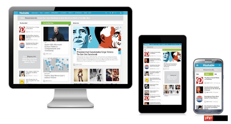
Adaptive design and responsive design are currently very popular and often confused. Adaptive design should not be confused with adaptive layout. They are completely different concepts.
Let me first explain the similarities and differences between the two:
Since the rapid development of mobile terminals, various models have developed rapidly. The solution for many websites is to provide different web pages for different devices, such as providing a dedicated mobile version, or iPhone/iPad version. Although this ensures the effect, it is more troublesome and requires maintaining several versions at the same time. Moreover, if a website has multiple portals, it will greatly increase the complexity of the architectural design.
Therefore, some people have long imagined whether it is possible to "design once and apply universally" so that the same web page can automatically adapt to screens of different sizes and automatically adjust the layout (layout) according to the screen width?
In 2010, Ethan Marcotte proposed the term "Responsive Web Design", which refers to a web design that can automatically recognize the screen width and make corresponding adjustments.

As shown in the figure, it is called adaptive layout. Adaptive layout has its value in that it can provide a more practical solution, making the project less expensive to implement and easier to test. An adaptive layout can be seen as a cheaper alternative to responsive layout, making it more attractive for projects with limited resources.
But in responsive layout, you have to consider hundreds of different states:
Responsive web design is a subset of adaptive web design. Responsive web design refers to the layout of a page (fluid grid, flexible images and media queries). The overall goal is to solve the problem of equipment diversification.
Responsive layout is equal to fluid grid layout, while adaptive layout is equal to using fixed split points for layout.
When fixed width is combined with fluid width, adaptive layout is a type of responsive design, not just an alternative to it.
So how to implement responsive layout? The following will unveil the responsive layout for you step by step:
1. Learn to use Css3 Media Queries and choose to apply different Css rules according to different screen resolutions
Introduction to Media Queries syntax:
max-width: If the width of the browsing area is less than 400 pixels, the following CSS description will be applied immediately:
@media screen and (max-width:400px){
    .class  {
         background:#ccc;
     }
}You can also separate the description to be applied into an external file:
<link rel="stylesheet" media="screen and (max-width: 400px)" href="mini.css" />
Min Width: If the width of the browsing area is greater than 800 pixels, the following CSS description will be applied immediately:
@media screen and (min-width:800px){
  .class
  {
    background:#666;
  }
}Device Width: If the maximum visible range of the browsing device is 480px, the CSS description below will be applied immediately: (Note: The current common maximum width of mobile phones is 480px, such as iPhone or Android Phone)
@media screen and (max-device-width:480px){
  .class
  {
    background:#000;
  }
}Provide dedicated css configuration file for iPhone4:
<link rel= "stylesheet" media= "only screen and (-webkit-min-device-pixel-ratio: 2)" type= "text/css" href= "iphone4.css" />
Different css profiles are provided for the iPad's Portrait Mode (upright) and Landscape Mode (lying) two browsing modes:
<link rel="stylesheet" media="all and (orientation:portrait)" href="portrait.css">
<link rel="stylesheet" media="all and (orientation:landscape)" href="landscape.css">
2. Add the viewport tag to the header of the web page
<meta name="viewport" content="width=device-width, initial-scale=1.0">
The browser has launched the "viewport meta" tag. Many mobile browsers now support this tag. The W3C protocol definition viewport meta is still in draft. Many people will add the viewport meta data to the html head, which is a typical mobile viewport. As follows:
<meta name="viewport" content="width=device-width, initial-scale=1.0">
This property controls the size of the view window width. It can be set to an actual specific pixel width = 600 or a width value for a particular device.
The viewport setting properties are as follows:
width: can be set to a value, or specified as device-width
height: can be set to a value, or specified as device-height
initial-scale: the initial scale of entering the page for the first time
minimum-scale: Allows to reduce the minimum scale
maximum-scale: The maximum ratio allowed to be enlarged
user-scalable: Allow user scaling, 1 or 0 (yes or no)
The compilation process will translate into the following semantics:
@viewport {

    width: device-width;

    initial-scale: 1.0

}device-width, mainly to make the entire page width the same as the visible width of the mobile phone, so that it can be easily compatible with the screen sizes of different models. If the width is not set here, it will be based on the width given by html/css. as default value.
因为解析度不同,device-width有时候不一定是view width,所以在类似iphone 4高解析度机器上,device-width=320 ,可是实际解析度为480,这时候就需要利用javascript针对UA下去做动态调整。
user-scalable,这个属性可以让使用者能否放大、缩小页面,如果页面不允许手机使用者缩放,就直接设定0或者no,反之要启动缩放功能,就设置1或者是yes。
接下来将说明几种常用的方式,以及具体例子提供给大家參考。
如果在手机端我们希望网页呈现固定,不希望使用者随意缩放,直接设定如下
<meta name="viewport" content="width=device-width, initial-scale=1.0">
如果希望在不同device使用不同缩放大小,就必须使用javascript,检测UA(User agent),动态设定viewport,如下:
viewport = document.querySelector("meta[name=viewport]");
viewport.setAttribute('content', 'width=device-width; initial-scale=1.0; maximum-scale=1.0; user-scalable=0;');3.不使用绝对宽度
由于网页会根据屏幕宽度调整布局,所以不能使用绝对宽度(margin-left:5px)的布局,也不能使用具有绝对宽度(例如:width:200px)的元素,而最好使用百分比宽度width:20%;或者with:auto;
4.字体最好不要用绝对大小(px),而使用相对大小(em)
body { font: normal 100% Helvetica, Arial, sans-serif; }上面的代码指定,字体大小是页面默认大小的100%,即16像素。
h1 { font-size: 1.5em; }h1的大小是默认大小的1.5倍,即24像素(24/16=1.5)
.small { font-size: 0.875em; }small元素的大小是默认大小的0.875倍,即14像素(14/16=0.875)
这里顺便说说 px pt em rem区别:
px是pixel,像素,是屏幕上显示数据的最基本的点,在HTML中,默认的单位就是px;
pt是point,是印刷行业常用单位,等于1/72英寸。
em才是真正的“相对单位”(百分比嘛,当然是相对),而px和pt都是绝对单位(都有固定值)。所以,一般移动终端布局用em比较合适。
rem是css3的出现,同时引进新的单位,而rem是相对于根元素,这样就意味着,我们只需要在根元素确定一个参考值,在根元素中设置多大的字体,这完全可以根据您自己的需要。
5.流动布局(fluid grid)
流动布局的含义是各个位置都是浮动的,不是固定不变的
.main { float: right; width: 70%; }
.leftBar { float: left; width: 25%; }float的好处是,如果宽度太小,放不下两个元素,后面的元素会自动滚动到前面元素的下方,不会在水平方向overflow(溢出),避免了水平滚动条的出现。
6.图片的自动缩放,等比缩放
 img{
    max-width: 100%;
}要使图片按等比缩放,一般不需要规定图片高度。且最好不用background-image,因为这样不会按照等比缩放。
 What are the network file server tools?
 Implementation method of vue online chat function
 How to restore videos that have been officially removed from Douyin
 Why the computer keeps restarting automatically
 How to recover files emptied from Recycle Bin
 How to solve http status 404
 Regular expression does not contain
 What are the sorting methods?


