1. Use transition
Transition effects are generally achieved by the browser directly changing the CSS properties of the element. For example, if you use the :hover selector, once the user hovers over the element, the browser will apply the properties associated with the selector.
When the user hovers the mouse over the span element, the browser will respond and directly apply the new attributes. The changes are shown below:

#CCS transition properties allow control of how quickly new property values are applied. For example, you can choose to gradually change the appearance of the span element in the example, so that the effect of moving the mouse over the word banana is more harmonious.

The transition-delay and transition-duration properties are specified as CSS time, which is a number in ms (milliseconds) or s (seconds).
The format of the transition abbreviation attribute is as follows:
transition: <transition-property> <transition-duration> <transition-timing-function> <transition-delay>
Modify the CSS code of the previous example as follows:
p { padding: 5px; border: medium double black; background-color: lightgray; font-family: sans-serif;}
#banana { font-size: large; border: medium solid green;}
#banana:hover {
    font-size: x-large; border: medium solid white; background-color: #1fa6e6; color: white; padding: 4px;
    transition-delay: 100ms;
    transition-property: background-color,color,padding,font-size,border;
    transition-duration: 500ms;
}In this example, a transition is added to the style, applied via the #banana:hover selector. The transition starts 100ms after the user hovers the mouse over the span element and lasts 500ms. The transition is applied to the background-color, color, padding, font-size, and border properties. The following rendering shows the gradual progression of this transition:

#Note how multiple properties are specified in this example. The values of the transition properties are separated by commas so that the transition effects will appear at the same time. Multiple values can be specified for delay time and duration, which means that different properties start transitioning at different points in time and have different durations.
1.1 Creating a Reverse Transition
Transitions only take effect when the style associated with them is applied. The :hover selector is used in the example styles, which means the style will only be applied when the user hovers over the span element. Once the user mouses away from the span element, only the #banana style is left. By default, the element's appearance will immediately return to its original state.
For this reason, most transitions occur in pairs: a transition to a temporary state and a reverse transition in the opposite direction. Modify the CCS code of the previous example to show how to smoothly return to the original style by applying another transition style.
p { padding: 5px; border: medium double black; background-color: lightgray; font-family: sans-serif;}
#banana {
    font-size: large; border: medium solid green;
    transition-delay: 100ms;
    transition-duration: 500ms;}
#banana:hover {
    font-size: x-large; border: medium solid white; background-color: #1fa6e6; color: white; padding: 4px;
    transition-delay: 100ms;
    transition-property: background-color,color,padding,font-size,border;
    transition-duration: 500ms;
}
1.2 Select the calculation method of the intermediate value
When using transition, the browser needs to Calculate the intermediate value between the initial value and the final value for each property. Use the transition-timing-function attribute to specify how to calculate the intermediate value, expressed as a cubic Bezier curve controlled by four points. There are five preset curves to choose from, represented by the following values:
* ease (default)
* linear
#* ease-in
* ease-out
* ease-in-out
You can see these five curves in the figure below, which show the rate at which the intermediate value changes to the final value over time. .

#The easiest way to figure out these values is to experiment in your own HTML document. There is another value, cubic-bezier, which can be used to specify a custom curve.
Modify the CSS style of the previous example as follows to show the application of the transition-timing-function attribute:
p { padding: 5px; border: medium double black; background-color: lightgray; font-family: sans-serif;}
#banana {
    font-size: large; border: medium solid green;
    transition-delay: 10ms;
    transition-duration: 250ms;;
}
#banana:hover {
    font-size: x-large; border: medium solid white; background-color: #1fa6e6; color: white; padding: 4px;
    transition-delay: 100ms;
    transition-property: background-color,color,padding,font-size,border;
    transition-duration: 500ms;
    transition-timing-function: linear;
}2. Use animation
CSS animations are essentially enhanced transitions. More choices, more control, and more flexibility in how you transition from one style to another.

The animation abbreviation attribute has the following format:
animation: <animation-name> <animation-duration> <animation-timing-function> <animation-delay> <animation-iteration-count>
注意,这些属性都不是用来指定要作为动画的CSS属性的。这是因为动画是在两部分定义的。第一部分包含在样式声明中,使用了上面表中列出的属性。它们定义了动画的样式,但并没有定义哪些属性是动画。第二部分使用@key-frames规则窗口,用来定义定义动画的属性。从下面代码中可以看到定义动画的这两部分。
<!DOCTYPE html>
<html lang="en">
<head>
<meta charset="UTF-8">
<title>Example</title>
<style type="text/css">
#ball{
width: 180px; height: 180px; background-color:green; margin:20px auto;border-radius: 90px;
-webkit-animation-delay: 100ms;
-webkit-animation-duration: 2000ms;
-webkit-animation-iteration-count: infinite;
-webkit-animation-timing-function: linear;
-webkit-animation-name:'GrowQuare';
}
@-webkit-keyframes GrowQuare {
     to {
         background-color: yellow;
         border-radius: 0;
     }
 }
</style>
</head>
<body>
<p id="ball"></p>
</body>
</html>要明白在这个示例中做了什么,应该仔细研究一下动画的两部分。第一部分是在样式中定义动画属性,是跟#ball选择器一起的。先看看基本属性:选择器样式应用100ms后开始播放动画属性,持续时间2000ms,无限重复播放,中间值使用linear函数计算。除了重复播放动画,这些属性在过渡中都有对应属性。
这些基本的属性并没有指出为哪些CSS属性应用动画。为此,要使用 animation-name 属性给动画属性起个名字,这里叫 GrowsQuare 。这样,就相当于告诉浏览器找一组名为 GrowQuare 的关键帧,然后将这些基本属性的值应用到 @keyframes指定的动画属性上。下面是此例代码中关键帧的声明(这里省略了-webkit前缀):
@-webkit-keyframes GrowQuare {
to {
background-color: yellow;
border-radius: 0;
}
}声明的开始是@keyframes,接着指定了这组关键帧的名字 GrowQuare。声明内部指定了一组要应用的动画效果。to 声明定义了一组设置动画样式的属性,同时也定义了动画结束时这些属性的最终值。动画的初始值来自进行动画处理的元素在应用样式之前的属性值。
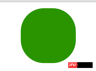
此例的效果是一个大小为180像素的圆形,渐变成正方形。其显示效果如下图所示:

以上这篇浅谈CSS过渡、动画和变换就是小编分享给大家的全部内容了,希望能给大家一个参考,也希望大家多多支持PHP中文网。
更多A brief discussion on CSS transition, animation and transformation methods相关文章请关注PHP中文网!


