CSS3 implementation of timeline effects
Recently, when I turned on my computer, I could see that new users of Geek Academy have free VIP for one month, so I went in and took a look. I won’t talk about its courses here. I saw this effect on the actual combat path map page:

#It’s a bit like a timeline, and every piece of mouse hovering has a drop-down effect to expand and introduce the screenshot information, and the effect is pretty good. But it seems that this effect is not very flexible for dynamic addition, because the height is not as flexible as the width, so you have to add it one by one. So many of them are made for display effect.
Of course, I also created some simpler similar effects based on this idea, mainly the overall layout effect. I will not imitate each specific piece of content, and I also added an opening animation myself. Make it more fun...
Let’s take a look at the effect first:
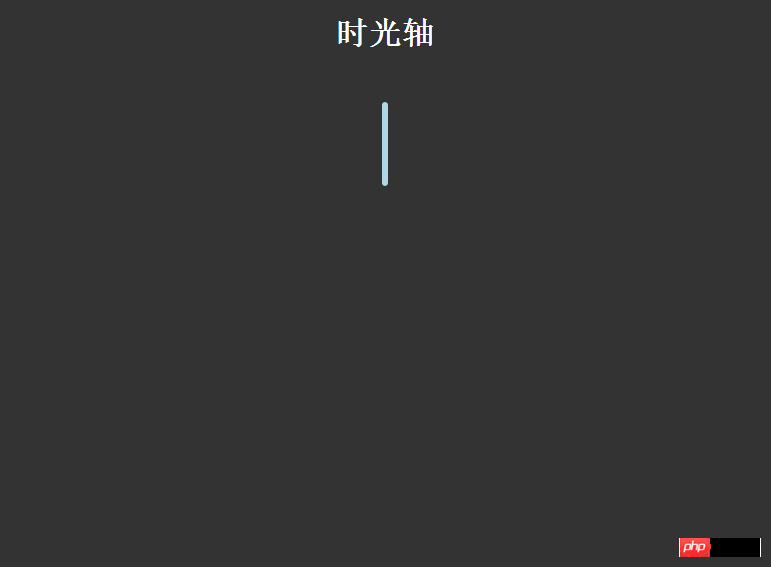
The effect is probably like this. Without further ado, let’s go directly to the topic:
HTML structure:
<p class="timezone">
            <p class="time">
                <h2 id="">2015-07-02</h2>
                <p>
                    <p>暴走大事件第一季</p>
                    <ul>

                    </ul>
                </p>
            </p>
            <p class="timeLeft" style="top: 100px;">
                <h2 id="">2015-07-02</h2>
                <p>
                    <p>暴走大事件第二季</p>
                    <ul>

                    </ul>
                </p>
</p>The HTML structure is simplified here. The .time class is represented on the right, .timeLeft is represented on the left, and then just add some margins. , I deleted the content in each piece.
CSS style code is as follows:
body{
                background: #333;
            }
            h1{
                text-align: center;
                color:#fff;
            }
            .timezone{
                width:6px;
                height: 350px;
                background: lightblue;
                margin: 0 auto;
                margin-top:50px;
                border-radius: 3px;
                position: relative;
                -webkit-animation: heightSlide 2s linear;
            }
            @-webkit-keyframes heightSlide{
                0%{
                    height: 0;
                }
                100%{
                    height: 350px;
                }
            }
            .timezone:after{
                content: '未完待续...';
                width: 100px;
                color:#fff;
                position: absolute;
                margin-left: -35px;
                bottombottom: -30px;
                -webkit-animation: showIn 4s ease;
            }
            .timezone .time,.timezone .timeLeft{
                position: absolute;
                margin-left: -10px;
                margin-top:-10px;
                width:20px;
                height:20px;
                border-radius: 50%;
                border:4px solid rgba(255,255,255,0.5);
                background: lightblue;
                -webkit-transition: all 0.5s;
                -webkit-animation: showIn ease;
            }
            .timezone .time:nth-child(1){
                -webkit-animation-duration:1s;
            }
            .timezone .timeLeft:nth-child(2){
                -webkit-animation-duration:1.5s;
            }
            .timezone .time:nth-child(3){
                -webkit-animation-duration:2s;
            }
            .timezone .timeLeft:nth-child(4){
                -webkit-animation-duration:2.5s;
            }
            @-webkit-keyframes showIn{
                0%,70%{
                    opacity: 0;
                }
                100%{
                    opacity: 1;
                }
            }
            .timezone .time h2,.timezone .timeLeft h2{
                position: absolute;
                margin-left: -120px;
                margin-top: 3px;
                color:#eee;
                font-size: 14px;
                cursor:pointer;
                -webkit-animation: showIn 3s ease;
            }
            .timezone .timeLeft h2{
                margin-left: 60px;
                width: 100px;
            }
            .timezone .time:hover,.timezone .timeLeft:hover{
                border:4px solid lightblue;
                background: lemonchiffon;
                box-shadow: 0 0 2px 2px rgba(255,255,255,0.4);
            }
            .timezone .time p,.timezone .timeLeft p{
                position: absolute;
                top:50%;
                margin-top: -25px;
                left:50px;
                width: 300px;
                height: 50px;
                background: lightblue;
                border:3px solid #eee;
                border-radius: 10px;
                z-index: 2;
                overflow: hidden;
                cursor:pointer;
                -webkit-animation: showIn 3s ease;
                -webkit-transition: all 0.5s;
            }
            .timezone .timeLeft p{
                left:-337px;
            }
            .timezone .time p:hover,.timezone .timeLeft p:hover{
                height: 170px;
            }
            .timezone .time p p,.timezone .timeLeft p p{
                color: #fff;
                font-weight: bold;
                text-align: center;
            }
            .timezone .time:before,.timezone .timeLeft:before{
                content: '';
                position: absolute;
                top:0px;
                left: 32px;
                width: 0px;
                height: 0px;
                border:10px solid transparent;
                border-right:10px solid #eee;
                z-index:-1;
                -webkit-animation: showIn 3s ease;
            }
            .timezone .timeLeft:before{
                left:-33px;
                border:10px solid transparent;
                border-left:10px solid #eee;
            }
            .timezone .time p ul,.timezone .timeLeft p ul{
                list-style: none;
                width:300px;
                padding:5px 0 0;
                border-top:2px solid #eee;
                color:#fff;
                text-align: center;
            }
            .timezone .time p li,.timezone .timeLeft p li{
                display: inline-block;
                height: 25px;
                line-height: 25px;
}This CSS style code is for reference only. It is not very practical and has not been organized. The main thing is to understand the animation. The effect also depends on the overall layout. good luck!
The above is the entire content of this article. I hope it will be helpful to everyone's learning. I also hope that everyone will support the PHP Chinese website.
For more articles related to CSS3 implementation of timeline effects, please pay attention to the PHP Chinese website!

Hot AI Tools

Undresser.AI Undress
AI-powered app for creating realistic nude photos

AI Clothes Remover
Online AI tool for removing clothes from photos.

Undress AI Tool
Undress images for free

Clothoff.io
AI clothes remover

Video Face Swap
Swap faces in any video effortlessly with our completely free AI face swap tool!

Hot Article

Hot Tools

Notepad++7.3.1
Easy-to-use and free code editor

SublimeText3 Chinese version
Chinese version, very easy to use

Zend Studio 13.0.1
Powerful PHP integrated development environment

Dreamweaver CS6
Visual web development tools

SublimeText3 Mac version
God-level code editing software (SublimeText3)

Hot Topics
 1387
1387
 52
52
 How to achieve wave effect with pure CSS3? (code example)
Jun 28, 2022 pm 01:39 PM
How to achieve wave effect with pure CSS3? This article will introduce to you how to use SVG and CSS animation to create wave effects. I hope it will be helpful to you!
 Use CSS skillfully to realize various strange-shaped buttons (with code)
Jul 19, 2022 am 11:28 AM
This article will show you how to use CSS to easily realize various weird-shaped buttons that appear frequently. I hope it will be helpful to you!
 How to hide elements in css without taking up space
Jun 01, 2022 pm 07:15 PM
Two methods: 1. Using the display attribute, just add the "display:none;" style to the element. 2. Use the position and top attributes to set the absolute positioning of the element to hide the element. Just add the "position:absolute;top:-9999px;" style to the element.
 How to create a timeline in PPT
Mar 20, 2024 pm 04:11 PM
Many friends always feel that when making PPT, the production is too monotonous and does not highlight the characteristics of everyone or everything in it. So, in order to make our PPT less monotonous and present our content in a more organized manner, we can use the timeline in PPT to make the PPT more vivid. So how can we use the timeline in PPT? How about making it more lively and interesting? Next, let’s take a look at it with the editor. Once you learn it, you can show it off in front of your friends. 1. First open PPT, create a new blank document, then click [Insert], click [SmartArt Graphics] 2. Click [Process], click on any one, and then press OK. 3. We can do it as we like
 How to implement lace borders in css3
Sep 16, 2022 pm 07:11 PM
In CSS, you can use the border-image attribute to achieve a lace border. The border-image attribute can use images to create borders, that is, add a background image to the border. You only need to specify the background image as a lace style; the syntax "border-image: url (image path) offsets the image border width inward. Whether outset is repeated;".
 How to enlarge the image by clicking the mouse in css3
Apr 25, 2022 pm 04:52 PM
Implementation method: 1. Use the ":active" selector to select the state of the mouse click on the picture; 2. Use the transform attribute and scale() function to achieve the picture magnification effect, the syntax "img:active {transform: scale(x-axis magnification, y Axis magnification);}".
 It turns out that text carousel and image carousel can also be realized using pure CSS!
Jun 10, 2022 pm 01:00 PM
How to create text carousel and image carousel? The first thing everyone thinks of is whether to use js. In fact, text carousel and image carousel can also be realized using pure CSS. Let’s take a look at the implementation method. I hope it will be helpful to everyone!
 How to develop timeline functionality using PHP
Aug 18, 2023 pm 11:39 PM
Introduction to how to use PHP to develop the timeline function: Timeline is a common function to display timelines, which can arrange events in chronological order so that users can clearly understand the development and sequence of events. PHP is a scripting language widely used in web development. It has powerful data processing and database operation capabilities, and is suitable for developing timeline functions. This article will introduce how to use PHP to develop timeline functions and provide code examples. Steps: Create database and data table First, we need to create a database and corresponding data


