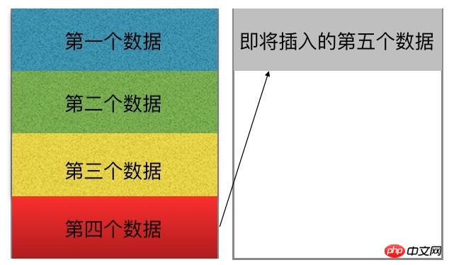
Only use css to achieve the effect of "four rows per column, and the data will automatically fill in the next column after loading one column". This question is represented by a diagram as follows:

If the question is changed to "Use only css to implement four columns in each row, the data will automatically fill in the next row after loading one row. ”, then this problem is much simpler, I believe everyone can use a variety of methods to achieve it. But how to solve this problem now.
By the way, this problem seems not so easy to solve. After all, we all use js or templates to assist in solving problems like this.
What is the difficulty of this question?
Only use css to achieve this effect for dynamically added data, which means that except for dynamically adding data, it is impossible to change the existing document structure. What does that mean? For example, for this implementation, we can use the ul>li structure, but except for adding li (equivalent to adding a data layer), it is impossible to add a ul or other html tags to the original document.
This question becomes how to set their different attributes for the li under the same ul so that they "float" to another column after the fifth one? (Note: This is the structure used by the author, you can use other structures)
After analyzing the problem here, my first reaction is to use the nth-child attribute. For li:nth-child(5 ), li:nth-child(6), li:nth-child(7)... Set the positioning attributes respectively, so that when the fifth, sixth, and seventh data are added, they can be displayed to the corresponding location. But this is not appropriate for dynamically added data. After all, we don’t know how many pieces of data there are, and we also need to calculate the left and top values required by the current li when positioning. (If you are interested, you can use scss to expand this idea)
Solution:
Here I would like to introduce another implementation method , use the column of CSS3 to separate related attributes (this method is only supported in ie11, other browsers need to add the corresponding browser prefix);
Post my relevant code first:
1) html structure code:
<!DOCTYPE html>
<html>
<head>
<title>test</title>
</head>
<body>
<ul></ul>
</body>
</html>
2) js code (note: the js here is only used to generate data)
<script type="text/javascript">
window.onload = function() {
var oul = document.getElementsByTagName('ul')[0];
for(var i=0; i<9; i++){
var _li = document.createElement('li');
_li.innerText = i+1;
oul.appendChild(_li);
}
};
</script>3) css code (key part)
<style type="text/css">
ul{
    margin:0px;
    padding:0px;
    height:200px;
    width: 100px;
    text-align: center;
    -moz-column-gap: 12px;
    -moz-column-count: 1;
    -moz-column-rule: 1px solid #d8d8d8;
    -webkit-column-gap: 12px;
    -webkit-column-count: 1;
    -webkit-column-rule: 1px solid #d8d8d8;
    column-gap: 12px;
    column-count: 1;
    column-rule: 1px solid #d8d8d8;
 }
ul li{
    height: 50px;
    line-height: 50px;
 }
</style>The most important thing about the above code is the implementation of the css code part , which meets the requirements of the question. The main attributes are height, width, column related in ul and the height attribute of li.
column-count represents the number of columns, column-gap represents the gap between columns, and column-rule represents the dividing line between columns;
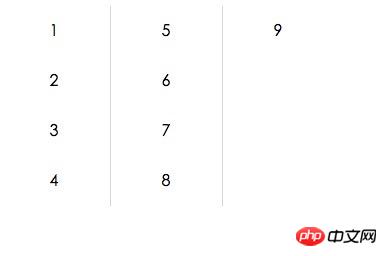
Set the ul height here to 200px , each li is 50px high, so that when the columns are full of 4, they will be divided into the second column.
The display result is as shown in the figure:

The above is the detailed content of Detailed explanation of how CSS implements four rows per column and automatically fills the data into the next column after loading one column.. For more information, please follow other related articles on the PHP Chinese website!


