Detailed description of length units in CSS
Previous words
This article is divided into absolute length units and relative length units to introduce the main knowledge of length units in CSS
Absolute length unit
Absolute length unit represents a physical measurement
Pixel px (pixels)
On the web , the pixel px is a typical unit of measurement, and many other length units map directly to pixels. Finally, they are processed in pixels
inches
1cm = 10mm = 96px/2.54 = 37.8px
millimeters
1mm = 0.1cm = 3.78px
1/4mmq(quarter-millimeters) 1q = 1/4mm = 0.945px
1pt = 1/72in = =0.0139in = 1/72*2.54cm = 1/72*96px = 1.33px
PICAS(picas)
1pc = 12pt = 1/6in = 1/6*96px = 16px
Font-related relative length units
em, ex, ch, rem are font-related The relative length unit
em
em represents the calculated value of the font-size attribute of the element. If used for the font-size attribute itself, relative Relative to the font-size of the parent element; if used for other attributes, relative to the font-size of the own element<style>
.box{font-size: 20px;}
.in{
/* 相对于父元素,所以2*2px=40px */
font-size: 2em;
/* 相对于本身元素,所以5*40px=200px */
height: 5em;
/* 10*40px=400px */
width: 10em;
background-color: lightblue;
}
</style><p class="box">
<p class="in">测试文字</p>
</p>
##rem

Compatibility: IE8-not supported <style>
/* 浏览器默认字体大小为16px,则2*16=32px,所以根元素字体大小为32px */
html{font-size: 2rem;}
/* 2*32=64px */
.box{font-size: 2rem;}
.in{
/* 1*32=32px */
font-size: 1rem;
/* 1*32=32px */
border-left: 1rem solid black;
/* 4*32=128px */
height: 4rem;
/* 6*32=192px */
width: 6rem;
background-color: lightblue;
}
</style>
<p class="box">
    <p class="in" id="test">测试文字</p>
</p>ex

[Note]ex is often used for fine-tuning in practice<style>
.box{font-size: 20px;}
.in{
font-size: 1ex;
border-left: 1ex solid black;
height: 10ex;
width: 20ex;
background-color: lightblue;
}
</style>
<p class="box">
<p class="in" id="test">测试文字</p>
</p>
<script>
var aBtns = document.getElementsByTagName('button');
for(var i = 0; i < aBtns.length; i++ ){
aBtns[i].onclick = function(){
test.style.fontFamily = this.innerHTML;
}
}
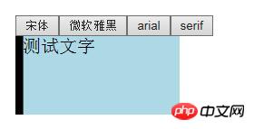
</script>ch is similar to ex and is defined as the width of the number 0. When the width of the number 0 cannot be determined, half of the em value is used as the ch value
Compatibility: IE8-not supported[Note]ch is mainly used for Braille typesetting in practice
<style>
.box{font-size: 20px;}
.in{
    font-size: 1ch;
    border-left: 1ch solid black;
    height: 10ch;
    width: 20ch;
    background-color: lightblue;
}
</style>
<p class="box">
<p class="in" id="test">测试文字</p>
</p><script>
var aBtns = document.getElementsByTagName('button');
for(var i = 0; i < aBtns.length; i++ ){
aBtns[i].onclick = function(){
test.style.fontFamily = this.innerHTML;
}
}
</script>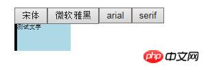
 The viewport-related length value is relative to the size of the initial containing block. When the width and height of the initial containing block change, they will scale accordingly. However, when the root element's overflow value is auto, any scrollbars are assumed not to exist.
Regarding the viewport-related units, there are four units: vh, vw, vmin, and vmax. Compatibility: IE8-not supported, IOS7.1-not supported, android4.3-not supported ( For vmax, all IE browsers do not support it)[Note] BlackBerry incorrectly calculates it relative to the visual viewport; and Safari strangely calculates it relative to the html element, if content is added to the html , these two units will also change
vh1/100 of the layout viewport height
vw 1/100 of the layout viewport width
<style>
body{margin: 0;}
.box{
    /* 实现与屏幕等高的效果 */
    height: 100vh;
    background-color: lightblue;
}
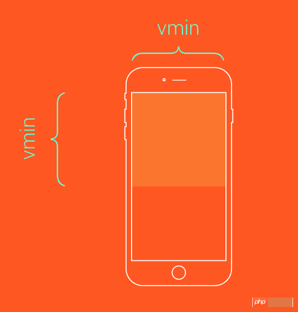
</style>##vmin
1/100 of the minimum value between layout viewport height and width
<p class="box"></p>

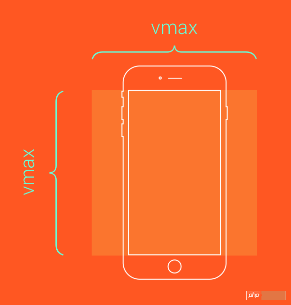
vmax
1/100 of the maximum value between layout viewport height and width
/*类似于contain效果*/
.box{
    height: 100vmin;
    width: 100vmin;
}
The above is all the clichés about the length unit in CSS brought to you by the editor. I hope everyone will support the PHP Chinese website
The above is the detailed content of Detailed description of length units in CSS. For more information, please follow other related articles on the PHP Chinese website!

Hot AI Tools

Undresser.AI Undress
AI-powered app for creating realistic nude photos

AI Clothes Remover
Online AI tool for removing clothes from photos.

Undress AI Tool
Undress images for free

Clothoff.io
AI clothes remover

Video Face Swap
Swap faces in any video effortlessly with our completely free AI face swap tool!

Hot Article

Hot Tools

Notepad++7.3.1
Easy-to-use and free code editor

SublimeText3 Chinese version
Chinese version, very easy to use

Zend Studio 13.0.1
Powerful PHP integrated development environment

Dreamweaver CS6
Visual web development tools

SublimeText3 Mac version
God-level code editing software (SublimeText3)

Hot Topics
 Vue 3
Apr 02, 2025 pm 06:32 PM
It's out! Congrats to the Vue team for getting it done, I know it was a massive effort and a long time coming. All new docs, as well.
 Building an Ethereum app using Redwood.js and Fauna
Mar 28, 2025 am 09:18 AM
With the recent climb of Bitcoin’s price over 20k $USD, and to it recently breaking 30k, I thought it’s worth taking a deep dive back into creating Ethereum
 Can you get valid CSS property values from the browser?
Apr 02, 2025 pm 06:17 PM
I had someone write in with this very legit question. Lea just blogged about how you can get valid CSS properties themselves from the browser. That's like this.
 A bit on ci/cd
Apr 02, 2025 pm 06:21 PM
I'd say "website" fits better than "mobile app" but I like this framing from Max Lynch:
 Stacked Cards with Sticky Positioning and a Dash of Sass
Apr 03, 2025 am 10:30 AM
The other day, I spotted this particularly lovely bit from Corey Ginnivan’s website where a collection of cards stack on top of one another as you scroll.
 Comparing Browsers for Responsive Design
Apr 02, 2025 pm 06:25 PM
There are a number of these desktop apps where the goal is showing your site at different dimensions all at the same time. So you can, for example, be writing
 Using Markdown and Localization in the WordPress Block Editor
Apr 02, 2025 am 04:27 AM
If we need to show documentation to the user directly in the WordPress editor, what is the best way to do it?
 Why are the purple slashed areas in the Flex layout mistakenly considered 'overflow space'?
Apr 05, 2025 pm 05:51 PM
Questions about purple slash areas in Flex layouts When using Flex layouts, you may encounter some confusing phenomena, such as in the developer tools (d...


