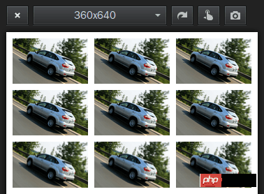
The left, middle and right three-column page layout is very common. Here we take a look at the application examples of CSS fixed-width three-column layout, including the arrangement method of equal width and equal spacing:
Fixed width Three-column layout
This is very basic. We can understand it directly by looking at the code:
<p id="wrapper">
 <p id="header">header</p>
 <p id="body" class="cls">
  <p id="aside">
   <p class="inner">
    aside
    <br><br><br><br><br><br><br><br><br><br><br><br><br><br><br><br><br><br>
   </p>
  </p>
  <p id="content" class="cls">
   <p id="main">
    <p class="inner">
     main
     <br><br><br><br><br><br><br><br><br><br><br><br><br><br><br><br><br><br>
    </p>
   </p>
   <p id="content-aside">
    <p class="inner">
     content-aside
     <br><br><br><br><br><br><br><br><br><br><br><br><br><br><br><br><br><br>
    </p>
   </p>
  </p>
 </p>
 <p id="footer">footer</p>
</p>#header{ width: 980px; height: 90px; margin: 0 auto; background: #f60;}
#body{ width: 980px; margin: 0 auto;}
#aside{ float: left; width: 240px; background: #ccc;}
#content{ margin-left: 240px;}
#main{ float: left; width: 540px; background: pink;}
#content-aside{ float: left; width: 200px; background: orange; }
#footer{ width: 980px; height: 90px; margin: 0 auto; background: #08f;}Example: Implementing three-column pictures Equal-width and equal-spaced layout
Each picture block floats left, width 30%, left margin 2.5%:
100%=(2.5%+30%) +(2.5%+30%)+(2.5%+30%)+2.5%
<!DOCTYPE html>
<html>
<head>
<meta charset="utf-8">
<meta name="viewport" content="width=device-width,initial-scale=1,maximum-scale=1,user-scalable=0">
<title>三列图片等宽布局</title>
<style>
* {
    margin: 0;
    padding: 0;
}
img {
    display: block;
    width: 30%;
    margin: 2.5% 0 0 2.5%;
    float: left;
}
</style>
</head>
<body>
<p>
<img  src="/static/imghw/default1.png"  data-src="byd.jpg"  class="lazy"   / alt="Detailed instructions for using CSS fixed-width three-column layout" ><img  src="/static/imghw/default1.png"  data-src="byd.jpg"  class="lazy"   / alt="Detailed instructions for using CSS fixed-width three-column layout" ><img  src="/static/imghw/default1.png"  data-src="byd.jpg"  class="lazy"   / alt="Detailed instructions for using CSS fixed-width three-column layout" >
<img  src="/static/imghw/default1.png"  data-src="byd.jpg"  class="lazy"   / alt="Detailed instructions for using CSS fixed-width three-column layout" ><img  src="/static/imghw/default1.png"  data-src="byd.jpg"  class="lazy"   / alt="Detailed instructions for using CSS fixed-width three-column layout" ><img  src="/static/imghw/default1.png"  data-src="byd.jpg"  class="lazy"   / alt="Detailed instructions for using CSS fixed-width three-column layout" >
<img  src="/static/imghw/default1.png"  data-src="byd.jpg"  class="lazy"   / alt="Detailed instructions for using CSS fixed-width three-column layout" ><img  src="/static/imghw/default1.png"  data-src="byd.jpg"  class="lazy"   / alt="Detailed instructions for using CSS fixed-width three-column layout" ><img  src="/static/imghw/default1.png"  data-src="byd.jpg"  class="lazy"   / alt="Detailed instructions for using CSS fixed-width three-column layout" >
</p>
</body>
</html>width: 30%; represents 30% of the width of the parent element.
height : 30%; If the specific height of the parent element is not set, then this height has no effect.
To achieve a responsive square, you can use the unit vw (Viewport Width):
.square {
    width: 30%;
    height: 30vw;
    background: url("byd.jpg") no-repeat scroll center 0 transparent;
    background-size: 100% 100%;
    margin: 2.5% 0 0 2.5%;
    float: left;
} However, it should be noted that lower versions of IE and lower versions of Android/iOS browsers do not support the viewport unit.
Or use JS to set the height according to the width to ensure compatibility:
<script src="jquery.js"></script>
<script>
$(document).ready(function(){
    $("img").height($("img").width());
});
$(window).resize(function(){
    $("img").height($("img").width());
});
</script>Percentage layout can also be regarded as a responsive layout.
Simple and practical percentage layout is still very suitable for mobile WAP page layout:
min-width:320px;
max-width:980px;
width:100%;
overflow-x: hidden;
margin: 0 auto;
The minimum width is 320px, the maximum width is 980px, and the width automatically adapts between 320px and 980px, which looks okay.
Only set the width attribute percentage value in the tag, such as width="40%", There is no need to set the height attribute, so that the image can be scaled according to the original proportion.
The blocks in the container can also be laid out in percentages, such as 60% on the left and 40% on the right.
The above is the detailed content of Detailed instructions for using CSS fixed-width three-column layout. For more information, please follow other related articles on the PHP Chinese website!
 What software is zoom?
 MySQL index
 Why is there no signal on the monitor after turning on the computer?
 The role of base tag
 Introduction to hard disk interface types
 How to use googlevoice
 The difference between JD.com's self-operated flagship store and its official flagship store
 What does Matcha Exchange do?


