
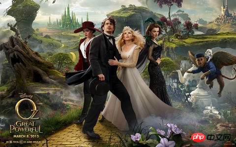
steado "Find Your Way to OZ", a close -up game, "From HTML5" in the latest issue of "Programmers" magazine It is mentioned in the article "Mobile Application Status and Development Trends", which borrows the setting of the recently released "Oz" movie (the setting comes from the classic story "The Wizard of Oz", students who have watched this movie will Deeply touched), constructing an equivalent grand game world. At the same time, Disney cooperated with Google to use it as a show case for Chrome browser performance and HTML5 technology. For such an HTML5 game that uses WebGL 3D, camera, 3D sound effects and other advanced technologies, supports desktop and mobile terminals, and has excellent quality, understanding the implementation principles and techniques behind it must be of great reference significance for us.
## I have long wanted to translate this article to help everyone better understand the application of HTML5 in game development and its application abroad, but this article is too It is long, so it can only be published in installments for the benefit of readers.
This tutorial is considered to be advanced in difficulty among my recent HTML5 introduction articles, and is suitable for developers with certain experience to read and learn.
# Introduction
"Looking for the Road of Oz" is a new experience brought by Disney to Google Chrome. It takes you on an interactive journey through the Kansas Circus and through a giant storm to the Kingdom of Oz.

Our goal is to combine the technical capabilities of the browser to create a fun, immersive experience where users can form a powerful connection with the movie connect.
The work on this game is really huge, so we can only list some chapters and write out the technical stories that we think are interesting. The difficulty of the tutorial gradually increases as you progress.
We have a lot of people working hard to create a better experience, but there are too many to list. Please visit the website to experience the full story down the entire page.
Preview
"Road to Oz" on PC is a rich and immersive world. We combined 3D and traditional filmmaking inspirations to create a scene with several layers of reality. The most prominent technology is the introduction of WebGL using Three.js, using CSS3 features to customize shaders and DOM animation elements. In addition to this, the getUserMedia API (WebRTC) enhances the interactive experience, allowing users to add their own image directly from the camera, and WebAudio brings 3D sound effects.
But the magic of this technology experience is how it all comes together. This was one of the main challenges: how to blend visual effects and interactive elements to create a consistent scene? This visual complexity is very difficult to manage: it's hard to tell what scene we need to develop at any one time.
To address this issue of visual effects and optimization, we made heavy use of a control panel that captured all the relevant settings for the point in time we were examining. Everything in the scene can be corrected in real time in the browser, such as brightness, vertical depth, gamma and more. Anyone can play around with the experience by adjusting the values of important parameters, participating and discovering what works best.
Before sharing our secret, I want to warn you that it may lead to meltdowns. Make sure you are not browsing anything important and add ?debug=on when visiting the website URL. Wait for the website to load. Once you're in, press Ctrl+I and you'll see a drop-down menu appear on the right. If you uncheck the "Exit camera path" option, you can move freely in space using the A, W, S, D keys and the mouse.
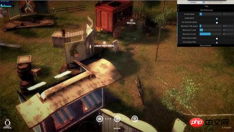
We won’t go into detail about all the settings here, but we encourage you to experiment: the keys display different settings in different scenarios. There is an extra set of keys in the final storm scene: Ctrl+A, which switches the animation being played. In this scene, if you press Esc (to exit the mouse lock function), press Ctrl+I again to enter the special settings of the storm scene. Take a look around and snap some pretty postcards like the ones below.

To do this to ensure it is flexible enough for our needs, we used a great framework called dat.gui (you can have a look here Past tutorial on how to use it). It allows us to quickly change the settings exposed to visitors.
# 绘 绘 绘 绘 绘
# Many classic Disney movies and animation creation scenes mean merging different layers. There are layers of exteriors, layers of unit animation, and layers of physical settings and top layers obtained by painting on glass: a technique called matte painting.
In many ways the structure of the experiences we create is similar, even if there are some “layers” that go far beyond static visuals. In fact, they affect the way things look based on more complex calculations. However, at least at the big picture level, we deal with views, compositing one onto another. At the top, you see a UI layer, and underneath that is the 3D scene: it consists of different scene components.
The top interface layer is created using DOM and CSS 3. Event communication uses Backbone router + onHashChange HTML5 event to control which area responds to animation. (Project source code: /develop/coffee/router/Router.coffee).
# tutorial: Sprite table and retina support
# We rely on a interesting optimization technology and merge multiple interface layers of images into one Separate PNG to reduce server requests. In this project, the interface consists of more than 70 images (excluding 3D textures), all preloaded to reduce website latency. You can see the latest sprite sheet here:
Normal display

Retina display
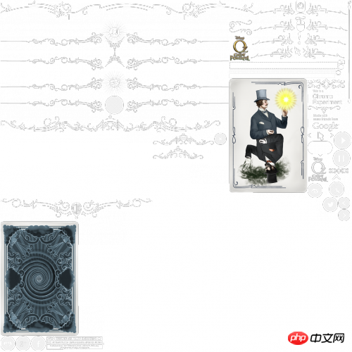
## We use TexturePacker to create any sprite format you need. In this case, we adopt EaselJS, which is very neat and can be used to create animated sprites.
Using the generated sprite table
Once the sprite table is created, you should see a JSON file like this:{
"images": ["interface_2x.png"],
"frames": [
[2, 1837, 88, 130],
[2, 2, 1472, 112],
[1008, 774, 70, 68],
[562, 1960, 86, 86],
[473, 1960, 86, 86]
],
"animations": {
"allow_web":[0],
"bottomheader":[1],
"button_close":[2],
"button_facebook":[3],
"button_google":[4]
},
}<br/>
[x, y, width, height]
<br/>
Note that we have used an HD image to create the sprite sheet, and then we simply create the normal version by resizing the image to half the size.# Now, we only need a JavaScript code to use it. <br/>
var SSAsset = function (asset, p) {
  var css, x, y, w, h;

  // pide the coordinates by 2 as retina devices have 2x density
  x = Math.round(asset.x / 2);
  y = Math.round(asset.y / 2);
  w = Math.round(asset.width / 2);
  h = Math.round(asset.height / 2);

  // Create an Object to store CSS attributes
  css = {
    width                : w,
    height               : h,
    'background-image'   : "url(" + asset.image_1x_url + ")",
    'background-size'    : "" + asset.fullSize[0] + "px " + asset.fullSize[1] + "px",
    'background-position': "-" + x + "px -" + y + "px"
  };

  // If retina devices

  if (window.devicePixelRatio === 2) {

    /*
    set -webkit-image-set
    for 1x and 2x
    All the calculations of X, Y, WIDTH and HEIGHT is taken care by the browser
    */

    css['background-image'] = "-webkit-image-set(url(" + asset.image_1x_url + ") 1x,";
    css['background-image'] += "url(" + asset.image_2x_url + ") 2x)";

  }

  // Set the CSS to the p
  p.css(css);
};
<br/>
logo = new SSAsset(
{
  fullSize     : [1024, 1024],               // image 1x dimensions Array [x,y]
  x            : 1790,                       // asset x coordinate on SpriteSheet
  y            : 603,                        // asset y coordinate on SpriteSheet
  width        : 122,                        // asset width
  height       : 150,                        // asset height
  image_1x_url : 'img/spritesheet_1x.png',   // background image 1x URL
  image_2x_url : 'img/spritesheet_2x.png'    // background image 2x URL
},$('#logo'));
If you want to know more about it To change the pixel density, you can read this article by Boris SMUS.
3D Content Pipeline
3D Content Pipeline 3D Content Pipeline When you think about a 3D scene, one of the toughest questions is how to ensure that you create content with the highest expressive potential from all areas of modeling, animation and special effects. In many ways, the core of this problem is the content pipeline: using a predetermined program to create content from a 3D scene. We wanted to create an exciting world, so we needed a reliable process to help 3D artists create it. They will need to give their 3D modeling and animation software as much freedom of expression as possible, and we will need to bring them to the screen through code.
We have been working on this kind of problem for a while, because every time we created a 3D website in the past, we found some limitations of the tools we used before. Later we created this tool called 3D Librarian and were about to apply it to real work.
This tool has some history: it was originally created for Flash, and it will allow you to take a large Maya scene as a single compressed file and optimize it for unpacking runtime. The reason this is optimal is because it effectively wraps the scene into essentially the same data structure that is manipulated at rendering and animation time. This way very little parsing needs to be done when the file is loaded. Unpacking in Flash is very fast because the file is in AMF format and Flash can decompress it natively. Using the same format in WebGL requires a little more work on the CPU. We actually had to recreate a layer of unpacked data JavaScript code, which basically unpacked these files and recreated the data structures required by WebGL. Decompressing the entire 3D scene is somewhat taxing on the CPU: decompressing scene 1 of the game takes about 2 seconds on mid-to-high-end machines. So for this we use Web Workers technology to implement it at the "scene setting" time (actually before the scene appears), so it will not affect the user experience.
This handy tool can import 3D scenes: models, textures and skeletal animations. You can create a single library file that can later be loaded by the 3D engine.
But we once encountered a problem, and now we use WebGL to solve it. Therefore, we created a specific JavaScript layer that uses the 3D library to compress the 3D scene files and translate them into the correct format that WebGL understands.
# Tutorial: There must be wind
# A repeated theme in "Looking for Oz Road" is the wind. The main thread of the plot is strung together from weak to strong winds.
The first scene of the carnival is relatively peaceful. Going through various scenes, the user gradually experiences strong winds, and finally comes to the final scene, a storm.
Therefore, it is important to provide an immersive wind effect.
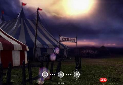
To achieve this effect, we filled the 3 carnival scenes with soft objects, such as tents and balloons.
The above is the detailed content of How to develop excellent HTML5 games - Detailed explanation of Disney's 'Finding Road to Oz' game technology (1). For more information, please follow other related articles on the PHP Chinese website!
 What are the production methods of html5 animation production?
 The difference between HTML and HTML5
 How to call external js in html
 Second-level domain name query method
 How to use scannow command
 How to use require
 What are the application scenarios of PHP singleton mode?
 What are the requirements for opening a digital currency account? Is it free?
 How to set up ftp server


