 Web Front-end
 H5 Tutorial
 HTML5 CSS3 special topic Detailed explanation of sample code for creating photo album effect using pure CSS
HTML5 CSS3 special topic Detailed explanation of sample code for creating photo album effect using pure CSS
HTML5 CSS3 Special Topic Detailed explanation of the sample code for creating a photo album effect with pure CSS:
I accidentally found such an example on my computer today. I think the effect is pretty good. I don’t remember when I downloaded it. Yes, I haven’t used w3cfuns for a long time. I miss the days of learning the front desk, so I would like to share it with you.
Rendering:
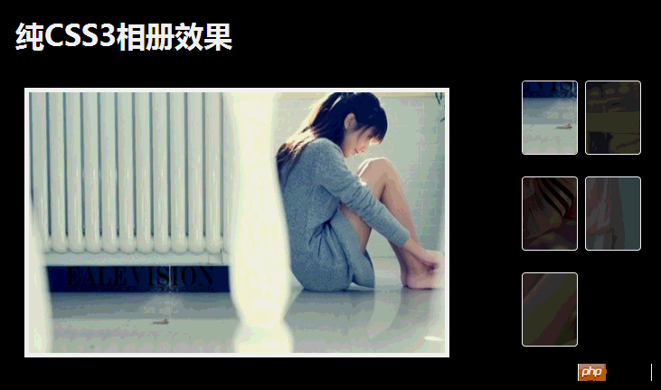
#The effect is still very good. The most important thing is that no line of js is used. This is Highlights.
Look at the html file first:
<body>

<p id="gallery">
    <h1>纯CSS3相册效果</h1>
    <ul>

        <li>
            <span class="touch"><img src="images/pic1.jpg"/></span>

            <p style="display: block;">
                <img src="images/pic1.jpg"/>
            </p>
        </li>

        <li>
            <span><img src="images/pic2.jpg"/></span>

            <p>
                <img src="images/pic2.jpg"/>
            </p>
        </li>
        <li>
            <span><img src="images/pic3.jpg"/></span>

            <p>
                <img src="images/pic3.jpg"/>
            </p>
        </li>

        <li>
            <span><img src="images/pic4.jpg"/></span>

            <p>
                <img src="images/pic4.jpg"/>
            </p>
        </li>

        <li>
            <span><img src="images/pic5.jpg"/></span>

            <p>
                <img src="images/pic5.jpg"/>
            </p>
        </li>


    </ul>

    <p class="clearfix"></p>
</p>


</body>
Describe briefly:
<style type="text/css">

        body
        {
            font-family: "微软雅黑";
        }

        #gallery
        {
            width: 700px;
            position: relative;
            margin: 20px auto 0;
            background-color: #000;
            min-height: 400px;
            padding: 20px;
        }

            /*标题*/
        #gallery h1
        {
            color: #fff;
            font-size: 2em;
            font-weight: bold;
        }

        #gallery ul
        {
            width: 140px;
            float: right;
            margin: 10px 0 20px;
        }

        #gallery ul li
        {
            float: left;
            margin: 20px 8px 0 0;
        }

        #gallery ul li span
        {
            display: block;
            position: relative;
            width: 60px;
            height: 80px;
            border: 1px solid #fff;
            -moz-border-radius: 4px;
            -webkit-border-radius: 4px;
            -ms-border-radius: 4px;
            -o-border-radius: 4px;
            border-radius: 4px;
            overflow: hidden;
        }

        #gallery  ul li span img
        {
            position: relative;
            top: -200px;
            left: -100px;
            filter: alpha(opacity=30);
            opacity: 0.3;
        }

        #gallery ul li span.touch img, #gallery ul li:hover span img
        {
            opacity: 1;
            filter: alpha(opacity=100);
        }

        #gallery ul li:hover p
        {
            display: block;
        }

        #gallery ul li p  img
        {
            width: 460px;
            height: 288px;
        }

        #gallery ul li p
        {
            display: none;
            position: absolute;
            top: 100px;
            left: 30px;
            border: 5px solid #fff;
        }

        .clearfix
        {
            clear: both;
        }


</style>There are no complicated styles in css, so I won’t describe them here. In addition, I introduced a reset style css, reset.css, in the html. You can also use your own reset style:
html, body, p, span, applet, object, iframe, h1, h2, h3, h4, h5, h6, p, blockquote, pre, a, abbr, acronym, address, big, cite, code, del, dfn, em, font, img, ins,
 kbd, q, s, samp, small, strike, strong, sub, sup, tt, var, b, u, i, center, dl, dt, dd, ol, ul, li, fieldset, form, label, legend{
	margin: 0;
	padding: 0;
	font-size: 100%;
	border: 0;
	outline: 0;
	background: transparent;
	}

ol, ul {
	list-style: none;
	}

blockquote, q {
	quotes: none;
	}

:focus {
	outline: 0;
	}

table {
	border-collapse: collapse;
	border-spacing: 0;
	}
#
The above is the detailed content of HTML5 CSS3 special topic Detailed explanation of sample code for creating photo album effect using pure CSS. For more information, please follow other related articles on the PHP Chinese website!

Hot AI Tools

Undresser.AI Undress
AI-powered app for creating realistic nude photos

AI Clothes Remover
Online AI tool for removing clothes from photos.

Undress AI Tool
Undress images for free

Clothoff.io
AI clothes remover

Video Face Swap
Swap faces in any video effortlessly with our completely free AI face swap tool!

Hot Article

Hot Tools

Notepad++7.3.1
Easy-to-use and free code editor

SublimeText3 Chinese version
Chinese version, very easy to use

Zend Studio 13.0.1
Powerful PHP integrated development environment

Dreamweaver CS6
Visual web development tools

SublimeText3 Mac version
God-level code editing software (SublimeText3)

Hot Topics
 1386
1386
 52
52
 Table Border in HTML
Sep 04, 2024 pm 04:49 PM
Guide to Table Border in HTML. Here we discuss multiple ways for defining table-border with examples of the Table Border in HTML.
 HTML margin-left
Sep 04, 2024 pm 04:48 PM
Guide to HTML margin-left. Here we discuss a brief overview on HTML margin-left and its Examples along with its Code Implementation.
 Nested Table in HTML
Sep 04, 2024 pm 04:49 PM
This is a guide to Nested Table in HTML. Here we discuss how to create a table within the table along with the respective examples.
 HTML Table Layout
Sep 04, 2024 pm 04:54 PM
Guide to HTML Table Layout. Here we discuss the Values of HTML Table Layout along with the examples and outputs n detail.
 HTML Input Placeholder
Sep 04, 2024 pm 04:54 PM
Guide to HTML Input Placeholder. Here we discuss the Examples of HTML Input Placeholder along with the codes and outputs.
 Moving Text in HTML
Sep 04, 2024 pm 04:45 PM
Guide to Moving Text in HTML. Here we discuss an introduction, how marquee tag work with syntax and examples to implement.
 HTML Ordered List
Sep 04, 2024 pm 04:43 PM
Guide to the HTML Ordered List. Here we also discuss introduction of HTML Ordered list and types along with their example respectively
 HTML onclick Button
Sep 04, 2024 pm 04:49 PM
Guide to HTML onclick Button. Here we discuss their introduction, working, examples and onclick Event in various events respectively.


