 Web Front-end
 H5 Tutorial
 How to create various lists on H5 mobile terminal (seven final chapters)
How to create various lists on H5 mobile terminal (seven final chapters)
How to make various lists on H5 mobile terminal (seven final chapters)
If you saw this article first, it is recommended that you go there first Take a look at the corresponding content in the above link, so that the context is coherent and it is easier to understand the content of this article.
Through several chapters, from the simplest list of one line of text to various pictures List of articles. In fact, most of the forms of lists can be found in the corresponding methods in my six chapters of blog posts. The methods are just these methods, it is just a matter of how to use them flexibly.
Therefore , in the final chapter, we will no longer give any code, but analyze the implementation methods through several seemingly unmentioned cases and give ideas. The specific implementation is a matter for everyone to think about.
Let’s analyze some cases
When I write blog posts, I don’t like to add too much decorative code to the code. The examples given are also relatively simple examples. No I don't know how. It's just to allow readers to go straight to the core when reading the code and understand the core meaning I want to express. More colors and shadows can be used at will.
Single-line graphic and text list
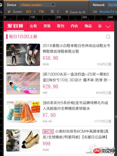
Taobao’s H5 design has a lot worth learning. The screenshot above is from Taobao’s Juhuasuan
As shown in the picture above, it seems that this list is more complicated. In fact, this list is not complicated at all. In Chapter 3, we introduced how to implement a small icon in front of the list How to do it.
In this case, it is actually a large icon. Change the icon to a picture and it will be OK. The width of the picture is fixed, but the width of the following text is not fixed. .This idea is exactly the same as the icon list.
The following text has a variety of elements, and these elements can be typeset and laid out using various methods. I took a look at Taobao's code. Taobao's The front-end engineer used a superb document flow layout method to implement this layout. Personally, I still like to use the positioning layout method to implement it. In terms of implementation, there is not much difference, the only difference is in their respective ideas.
Four-column picture layout
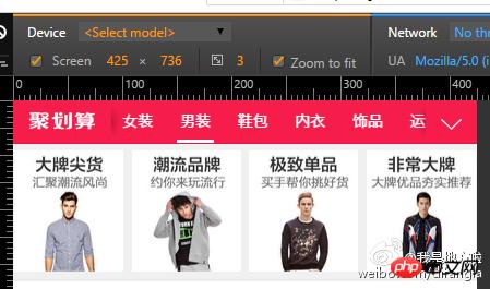
As shown in the picture above, this is a four-column layout of mixed graphics and text. In fact, we are in double columns There are already similar tutorials on the mixed arrangement of pictures and text. It is nothing more than replacing 50% with 25%.
It can be seen from this that three-column layout, five-column layout, and how many columns you like , are all done based on proportion. In principle, they are similar.
Chaotic graphic and text layout
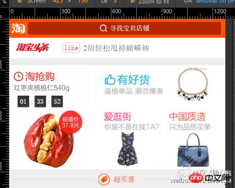
This is also the homepage of Taobao. Yes The layout of four elements of different sizes. Isn’t it very confusing? In fact, it’s not.
First of all, we need to calculate the proportions according to our design needs, and then use the method given in the case in Chapter 6 ( The secret of linking width and height), just typesetting.
If you use document flow layout, it is more difficult. You can also use positioning layout after calculating the proportion. I wonder if I can add another piece of love. In fact, it is always the same.
No matter how complicated the layout seems, if you calm down and analyze it carefully, you can find a solution to the problem.
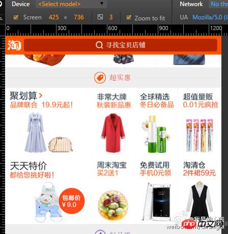
If you have found a solution to the above one, then this one is really too simple. It is just a combination of several methods.
Summary
The secret of linking width and height is the inner padding value. This feature is not obvious on the PC side, but it really solves a big problem on the mobile side.
On the PC side, document flow layout is natural. Even rookie front-end developers who have been in the industry for a few years do not know or are not familiar with positioning layout. But on the mobile side, positioning layout is more common and important
Be good at dismantling complex problems, looking at the essence through the problem, and solving the problem by breaking it into parts.
A can be A, and A can also be B, A is also equal to A+1
percentage.
occupies an exclusive line. If you do not write the percentage, you can set the internal and external padding
Borders can not only be realized with borders, there are many ways to achieve them.
Linyuan Xianyu might as well retreat and build a net
The above is the detailed content of How to create various lists on H5 mobile terminal (seven final chapters). For more information, please follow other related articles on the PHP Chinese website!

Hot AI Tools

Undresser.AI Undress
AI-powered app for creating realistic nude photos

AI Clothes Remover
Online AI tool for removing clothes from photos.

Undress AI Tool
Undress images for free

Clothoff.io
AI clothes remover

AI Hentai Generator
Generate AI Hentai for free.

Hot Article

Hot Tools

Notepad++7.3.1
Easy-to-use and free code editor

SublimeText3 Chinese version
Chinese version, very easy to use

Zend Studio 13.0.1
Powerful PHP integrated development environment

Dreamweaver CS6
Visual web development tools

SublimeText3 Mac version
God-level code editing software (SublimeText3)

Hot Topics
 Table Border in HTML
Sep 04, 2024 pm 04:49 PM
Guide to Table Border in HTML. Here we discuss multiple ways for defining table-border with examples of the Table Border in HTML.
 Nested Table in HTML
Sep 04, 2024 pm 04:49 PM
This is a guide to Nested Table in HTML. Here we discuss how to create a table within the table along with the respective examples.
 HTML margin-left
Sep 04, 2024 pm 04:48 PM
Guide to HTML margin-left. Here we discuss a brief overview on HTML margin-left and its Examples along with its Code Implementation.
 HTML Table Layout
Sep 04, 2024 pm 04:54 PM
Guide to HTML Table Layout. Here we discuss the Values of HTML Table Layout along with the examples and outputs n detail.
 Moving Text in HTML
Sep 04, 2024 pm 04:45 PM
Guide to Moving Text in HTML. Here we discuss an introduction, how marquee tag work with syntax and examples to implement.
 HTML Ordered List
Sep 04, 2024 pm 04:43 PM
Guide to the HTML Ordered List. Here we also discuss introduction of HTML Ordered list and types along with their example respectively
 HTML onclick Button
Sep 04, 2024 pm 04:49 PM
Guide to HTML onclick Button. Here we discuss their introduction, working, examples and onclick Event in various events respectively.
 HTML Input Placeholder
Sep 04, 2024 pm 04:54 PM
Guide to HTML Input Placeholder. Here we discuss the Examples of HTML Input Placeholder along with the codes and outputs.


