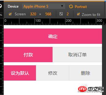
Some banner buttons are often needed on mobile h5 pages Of course, it is very simple to make a banner button. However, product managers and designers will always give you some trouble. For example, it is obviously a button with the same format, but here is a banner button. Below, the banner requires two buttons. When entering the inner page, three buttons are squeezed into one banner.
If there is no reasonable solution, then it will undoubtedly be very disgusting. Because , we must write multiple styles. And we always want to write less code, so do we have any good solutions to achieve it?
In fact, there is. Below, in this blog post, let Let’s realize this challenge.
Maybe after reading the above text, you don’t understand what I want to express. Next, let’s take a look at a rendering, and you will Understand what I'm talking about.

As shown in the picture above, the first one is a column button, the second row is two buttons, and the third row is three button.
I hope that all these needs can be met through a kind of CSS, and the html structure is extremely simple. How to achieve it? Look at the following code:
<!DOCTYPE html><!DOCTYPE html><html lang="zh"><head>
    <meta charset="UTF-8">
    <title>移动端H5做一个Detailed explanation of the sample code for making an unlimited number of banner buttons on the H5 mobile terminal</title>
    <meta name="viewport" content="width=device-width, initial-scale=1.0, maximum-scale=1.0, user-scalable=0" />
    <link rel="stylesheet" href="../style/style.css">
    </head>
    <body>
    <br>
    <!-- 第一行按钮 -->
    <p class="button_box">
        <p class="button pink">确定</p>
    </p>
    <br>
    <!-- 第二行按钮 -->
    <p class="button_box">
        <p class="button pink">付款</p>
        <p class="button">取消订单</p>
    </p>
    <br>
    <!-- 第三行按钮 -->
    <p class="button_box">
        <p class="button pink">设为默认</p>
        <a class="button">修改</a>
        <label class="button">删除<input type="submit"></label>
</p></body></html>As shown in the above code.
The
bris to separate the distance between each button, mainlyp.button_boxThe content inside. The structure of
html should be said to be quite simple. First of all, the outer layer is the box of p.button_box, and inside, if you need any buttons, just write A non-self-closing sum element of a .button is sufficient.
Non-self-closing sum elements refer to other elements except self-closing elements such as
br\hr\input.
In the third line, we demonstrate how to write ordinary boxes, links, and buttons.
Since buttons are self-closing elements, we use a labelThe element is wrapped to make it available.
First reference reset.scss and mixin.scss, see mobile H5 series blog post basics reset.scss and mixin.scss
Secondly, the CSS part is written using SASS syntax. If you don’t know how to do it, please refer to the summary of SASS learning experience of CSS pre-compilation technology. I won’t elaborate too much.
.button_box {
    display: table;     // 将 button_box 外层盒子模拟成表格
    width: 100%;        // 表格非完整块级元素,需要设定宽度
    table-layout:fixed; // 设定表格内单元格的宽度为自动等宽,重要!
    border-collapse: collapse;  // 合并表格和单元格边框
    .button {
        display: table-cell;    // 将子元素模拟成单元格
        font-size: 1.5rem;text-align: center;
        background: #eee;color: #555;   // 设定默认按钮样式
        box-shadow: 0 0 0 1px #ddd;     // 利用阴影模拟边框(阴影不占用盒子模型)
        text-decoration: none;          // 如果元素是链接,则去掉下划线
        @include hlh(4.8rem);           // 引用高度行高隐藏溢出代码块
        &.pink {        //设定一个特殊按钮样式,可根据需要设定多个
            background: #F13E7A;
            color: #fff;
            box-shadow:0 0 0 1px #F13E7A;
        }
        input {display: none;}      // 如果是按钮,则隐藏
    }
}sass I have put part of the explanation in the comments. The main idea is to use the special properties of the table to achieve this seemingly laborious requirement.
The table is so magical element. Because we used table layout back then, the code was as smelly and long as an old lady's footcloth. Therefore, we started the p+css craze. However, due to overcorrection, we ignored many awesome features of tables. .
Actually, forms are very powerful. Through this case, we used forms to successfully solve this seemingly difficult requirement. And the completion was very ideal and great.
html Elements are far from block-level elements and inline elements. There are many attributes that we need to try and understand. It looks simple, are you sure it is simple?
The above is the detailed content of Detailed explanation of the sample code for making an unlimited number of banner buttons on the H5 mobile terminal. For more information, please follow other related articles on the PHP Chinese website!
 what is h5
 What are the methods of building a mobile website?
 How to implement h5 to slide up and load the next page on the web side
 Which is more difficult, c language or python?
 Delete redundant tables in the table
 How to watch live broadcast playback records on Douyin
 How to export word from powerdesigner
 How to solve webstorm crash


