HTML5-detailed code examples for customizing input elements
The
input element can generate a simple text box for users to enter data. The disadvantage is that the user can enter any value, and the type type can be configured to obtain additional attributes. The type attribute has 23 different values, while the input element has a total of 30 attributes, many of which can only be used with specific type attribute values.
1. Use the input element to enter text
The input element whose type attribute is set to text is displayed as a single-line text box in the browser.
1. Set the element size
maxlength attribute sets the maximum number of characters that the user can input;
size attribute sets the number of characters that the text box can display.
<label for="username"></label>
<input type="text" name="username" id="username" maxlength="10" size="20">
2. Set the initial value and placeholder prompt
The value attribute sets the default value;
The placeholder attribute sets a prompt text to inform the user what type of data to enter.
<label for="address"></label>
<input type="text" name="address" id="address" value="北京市">
<label for="tel"></label>
<input type="text" name="telephone" placeholder="请输入电话号码">
3. Using data list
You can set the list attribute of the input element to the id attribute value of a datalist element, so that when the user enters data in the text box, he only needs to start from the latter element. Just choose from the batch of options provided.
<input type="text" name="city" list="cityList">
<datalist id="cityList">
    <option value="BeiJing" label="北京市"></option>
    <option value="QingDao">青岛市</option>
    <option value="YanTai"></option>
</datalist>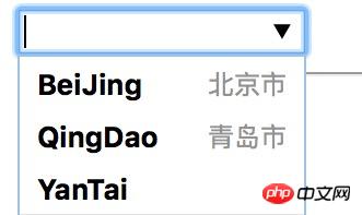
The picture is displayed under HTML5-detailed code examples for customizing input elements 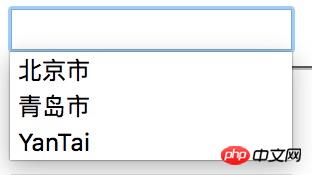
The picture is displayed under HTML5-detailed code examples for customizing input elements
Note: The performance will be different under different browsers
(1) Each option element in the datalist element represents a value for the user to select, and its value attribute value is when the option represented by the element is selected. The data value used by the input element;
(2) Description information, which can be set through the label attribute or as the content of the option element.
4. Generate a read-only or disabled text box
Both the readonly and disabled attributes can be used to generate a text box that cannot be edited by the user, and the resulting appearance will be different.
<input type="text" name="readonly" value="readonly" readonly>
<input type="text" name="disabled" value="disabled" disabled>
Note: The data of the input element with the disabled attribute set cannot be submitted to the server; the data of the input element with the readonly attribute can be submitted to Server;
Recommendation: The readonly attribute needs to be used with caution (no visual signal informs the user that editing is prohibited, the user cannot input, and the user is confused), and the use of hidden type input elements should be considered;
2. Use input elements to check input data
1. Use input elements to obtain numerical values
The input box generated by an input element whose type attribute is set to number is only allowed to accept numerical values.
min sets the minimum acceptable value;
max sets the maximum acceptable value;
step specifies the step size for adjusting the value up and down.
<fieldset>
    <legend>number</legend>
    <label for="score">分数:</label>
<input type="number" name="score" id="score" min="60" max="100" step="5"></fieldset>2. Use the input element to obtain a value within a specified range
The range input element can specify a value range in advance for the user to choose.
<fieldset>
    <legend>range</legend>
    <label for="price">价格:</label>
    <span>1</span>
    <input type="range" name="price" id="price" min="0" max="100" step="5">
<span>100</span></fieldset>3. Use the input element to obtain Boolean input
The checkbox input will generate a check box for the user to select yes or no.
<fieldset>
    <legend>checkbox</legend>
    <input type="checkbox" name="agree" id="agree">
<label for="agree">同意条款</label></fieldset>Note: When submitting a form, only the data value of the checked check box will be sent to the server (if the data item of the checkbox input element does not exist in the submitted item , indicating that the user has not checked).
4. Use the input element to generate a set of fixed options
The radio input element is used to generate a set of radio buttons for users to choose from a set of fixed options. It is suitable for situations where there is not much valid data available. To generate a mutually exclusive set of options, simply set the name attribute of all related input elements to the same value.
<fieldset>
    <legend>选出你最喜欢的水果:</legend>
    <label for="oranges">
        <input type="radio" value="oranges" id="oranges" name="fave">
        Oranges    </label>
    <label for="apples">
        <input type="radio" value="apples" id="apples" name="fave" checked>
Apples </label></fieldset>5. Use the input element to obtain a string with a specified format
The input elements whose type attribute is set to email, tel, and url can accept valid email addresses, respectively. Phone number and URL.
<fieldset>
    <legend>规定格式的字符串</legend>
    <p>
        <label for="email">
            邮箱:<input type="email" name="email" id="email">
        </label>
    </p>
    <p>
        <label for="password">
            密码:<input type="password" name="password" id="password">
        </label>
    </p>
    <p>
        <label for="tel">
            电话:<input type="tel" name="tel" id="tel">
        </label>
    </p>
    <p>
        <label for="url">
            URL:<input type="text" name="url" id="url">
        </label>
</p></fieldset>Note: The above type of input elements will only detect the data entered by the user when submitting the form, and the checking effects vary.
6. Use input elements to get time and date| Explanation | Example (under HTML5-detailed code examples for customizing input elements ) | |
|---|---|---|
| Get the universal time date and time, including time zone information | According to the filling situation | |
| Get the local date and time, excluding time zone information | According to the filling situation | |
| Get the local date | 2016-08-12 | |
| Get the year and month information | 2016-08 | |
| Get time | 13:00 | |
| Get Current week | 2016-W32 |
| 属性 | 说明 |
|---|---|
| accept | 指定接受的MIME类型 |
| multipe | 设置这个属性的input元素可一次上传多个文件 |
<form action="http://localhost:8888/form/uploadFile" method="post" enctype="multipart/form-data">
    <label for="filedata">请选择文件:</label>
    <input type="file" name="filedata" id="filedata">
<button type="submit">提交</button></form>注意:表单编码类型为multipart/form-data的时候才能上传文件。
The above is the detailed content of HTML5-detailed code examples for customizing input elements. For more information, please follow other related articles on the PHP Chinese website!

Hot AI Tools

Undresser.AI Undress
AI-powered app for creating realistic nude photos

AI Clothes Remover
Online AI tool for removing clothes from photos.

Undress AI Tool
Undress images for free

Clothoff.io
AI clothes remover

Video Face Swap
Swap faces in any video effortlessly with our completely free AI face swap tool!

Hot Article

Hot Tools

Notepad++7.3.1
Easy-to-use and free code editor

SublimeText3 Chinese version
Chinese version, very easy to use

Zend Studio 13.0.1
Powerful PHP integrated development environment

Dreamweaver CS6
Visual web development tools

SublimeText3 Mac version
God-level code editing software (SublimeText3)

Hot Topics
 1657
1657
 14
14
 1415
1415
 52
52
 1309
1309
 25
25
 1257
1257
 29
29
 1230
1230
 24
24
 Table Border in HTML
Sep 04, 2024 pm 04:49 PM
Guide to Table Border in HTML. Here we discuss multiple ways for defining table-border with examples of the Table Border in HTML.
 HTML margin-left
Sep 04, 2024 pm 04:48 PM
Guide to HTML margin-left. Here we discuss a brief overview on HTML margin-left and its Examples along with its Code Implementation.
 Nested Table in HTML
Sep 04, 2024 pm 04:49 PM
This is a guide to Nested Table in HTML. Here we discuss how to create a table within the table along with the respective examples.
 HTML Table Layout
Sep 04, 2024 pm 04:54 PM
Guide to HTML Table Layout. Here we discuss the Values of HTML Table Layout along with the examples and outputs n detail.
 HTML Input Placeholder
Sep 04, 2024 pm 04:54 PM
Guide to HTML Input Placeholder. Here we discuss the Examples of HTML Input Placeholder along with the codes and outputs.
 HTML Ordered List
Sep 04, 2024 pm 04:43 PM
Guide to the HTML Ordered List. Here we also discuss introduction of HTML Ordered list and types along with their example respectively
 HTML onclick Button
Sep 04, 2024 pm 04:49 PM
Guide to HTML onclick Button. Here we discuss their introduction, working, examples and onclick Event in various events respectively.
 Moving Text in HTML
Sep 04, 2024 pm 04:45 PM
Guide to Moving Text in HTML. Here we discuss an introduction, how marquee tag work with syntax and examples to implement.


