Pure CSS3 achieves good form validation effects
This is a series of content that supplements the basic knowledge of HTML5, the others are:
1. HTML5--New structural elements
2. HTML5-- figure, time, details, mark
- ##3. HTML5-- details Learn and use
- 4. HTML5--Changes in existing elements
- 5. HTML5--Web forms
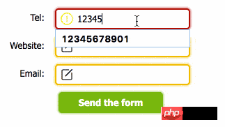
Today Continue to learn about Web forms, but today we will focus on practical implementation, using HTML5 forms and CSS3-UI to achieve a good form effect. The effect can be seen in the following animation:
- 1. HTML5
New form types: tel, email, url (previous article There is Introduction)
- 2. Basic verification of HTML5 form:
requiredAttribute
- 3. HTML5 form self-definition
Validation rules: pattern attribute
Main introduction content
- 1. CSS3 User
- Interface
Text
Since it is a form, we must have a basic form HTML structure. The following is the structure I created. All three forms are required fields, and for
<div class="code" style="position:relative; padding:0px; margin:0px;"><pre class='brush:php;toolbar:false;'><form>
<ol>
<li>
<label for="tel">Tel:</label>
<input type="tel" required name="" pattern="\d{Pure CSS3 achieves good form validation effects}" id="tel">
</li>
<li>
<label for="url">Website:</label>
<input type="url" required name="" id="url">
</li>
<li>
<label for="email">Email:</label>
<input type="email" required name="" id="email">
</li>
<li>
<input type="submit" name="" value="Send the form">
</li>
</ol></form></pre><div class="contentsignin">Copy after login</div></div>The effect after creation is as follows. It feels very different from the effect we want. They have the same roots, the same HTML, but this one is so ugly.
Don’t worry, let’s dress it slowly.
Use simple rules below to beautify the form: 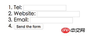
* {
    margin: 0;
    font: 13px tahoma, verdana, sans-serif;
    padding: 0;}ol {
    width: 400px;
    margin: 50px;}li {
    clear: both;
    list-style-type: none;
    margin: 0 0 10px;}li:nth-last-child(1) {
    text-align: center;}label {
    display: block;
    float: left;
    margin: 0 10px 0 0;
    padding: 5px;
    text-align: right;
    width: 100px;}input {
    border-radius: 5px;
    padding: 5px 5px 5px 30px;
    width: 155px;}input:focus {
    outline: none;}
Now the effect is very good, However, there is still some distance from our goal. Now we should consider what the input box should look like in each link of
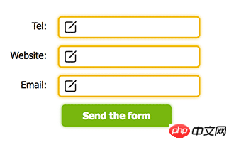
. There are three situations in the above example: 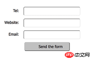
1. When the input box is not activated
- 2. When the input box is activated (incorrect input)
- 3. Input box activation (correct input)
- In view of the above three situations, here are three descriptions:
- 2. When activated, if the input is incorrect, the form displays a dark red reminder
- 3. When activated, if the input is correct, the form will be green and pass
- , followed by the changes of the three icons.
When we define the form
stateAfter the definition is completed, we actually already have an effect in mind, and the code is the  tool# to achieve the effect. ##, let’s take a look at how to define it:
First, the input box is not activated. At this time, the status of the input box is invalid and required:
input:invalid:required {
    background-image: url('nor.png');
    box-shadow: 0 0 5px #f0bb18;
border: 2px solid #f0bb18;}The second is when the input box is activated, but the input has not been successful. At this time, the status of the input box is focus and invalid
:
input:focus:invalid {
    background-image: url('warn.png');
    box-shadow: 0 0 5px #b01212;
border: 2px solid #b01212;} Finally, when the input box is activated, the form input is successful. At this time, the input box status is valid:
input:valid {
    background-image: url('suc.png');
border: 2px solid #7ab526;}Finally, modify the submit button: input[type="submit"] {
background: #7ab526;
border: none;
box-shadow: 0 0 5px #7ab526;
color: #fff;
cursor: pointer;
font-weight: bold;
padding: 7px;
width: 150px;}How about it, it’s not bad.
 The pseudo-classes we use are as follows:
:valid —— 表单元素在内容符合元素类型并验证通过后,获得该类
:invalid —— 如果表单元素内容有误,它将获得该类
:required —— 任何拥有required属性的表单元素应用了此类
其他拓展
1、不触发浏览器验证
如果你不希望浏览器为表单验证,使用noval<a href="http://www.php.cn/wiki/1261.html" target="_blank">idate</a>属性或formnovalidate属性可以关闭浏览器验证。
其中novalidate是表单form所具有的属性,提交表单时会忽略任何错误提示和空白域。
<form novalidate>
...</form>formnovalidate是input元素的属性,可以为单个表单元素设置该属性。
<form>
... <input type="submit" formnovalidate></form>上述表单同样不会触发验证。
2、自定义错误提示内容
在上面的例子中可以看到,浏览器会对我们的表单进行验证,在这个过程中会弹出错误消息。而随着输入的不同,这些验证消息也是不一样的。

我们虽然不能更改提示框的样式,但我们可以使用JavaScript的<a href="http://www.php.cn/code/8209.html" target="_blank">set</a>CustomValidity()函数修改错误文字:
<form>
<input oninput="check()" type="tel" id="tel"></form><script>
function check() {
tel = document.querySelector('#tel');
tel.setCustomValidity('请输入正确的Pure CSS3 achieves good form validation effects位电话号码');
}</script>那么,现在当我们输入的时候,提示内容就变成我们自定义的了:
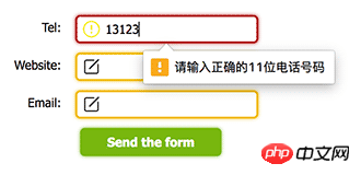
现在还有一个问题,浏览器的提示是不一样的,为空时的提示和错误的提示文案不一样,这样我们应该怎么分开处理呢?
这时候就需要validity来查看当前的验证状态:
tel = document.querySelector('#tel');console.log( tel.validity )
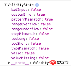
如上图所示,当前验证状态为:customError,就是说用户自定义的验证失败,我们可以根据这些状态来动态的更新提示信息。如果最终验证成功,其中的valid将变为true。
function check( el ) {
    var validity = el.validity;
    if ( validity.valueMissing ) {
        el.setCustomValidity('该字段为必填内容');
    } else if ( validity.patternMismatch ) {
        el.setCustomValidity('输入内容不符合格式');
    } else {
        el.setCustomValidity('输入有误');
}}上述只是演示,实际场景时刻替换自己的提示内容。
最后,可以通过validationMessage来获取当前的错误提示信息:
console.log( el.validationMessage )// "请填写此字段。"
总结
在本次学习中做了一个简单且最常见的Demo,另外介绍了一些关于表单验证修饰的细节,虽然这些东西五年前就已经有了,但补充基础知识什么时候都不算晚。
今天学习了valid、invalid、required的使用,知识点虽小,但效果却不错,每次学习都有新发现,慢慢积累。
The above is the detailed content of Pure CSS3 achieves good form validation effects. For more information, please follow other related articles on the PHP Chinese website!

Hot AI Tools

Undresser.AI Undress
AI-powered app for creating realistic nude photos

AI Clothes Remover
Online AI tool for removing clothes from photos.

Undress AI Tool
Undress images for free

Clothoff.io
AI clothes remover

AI Hentai Generator
Generate AI Hentai for free.

Hot Article

Hot Tools

Notepad++7.3.1
Easy-to-use and free code editor

SublimeText3 Chinese version
Chinese version, very easy to use

Zend Studio 13.0.1
Powerful PHP integrated development environment

Dreamweaver CS6
Visual web development tools

SublimeText3 Mac version
God-level code editing software (SublimeText3)

Hot Topics
 How to achieve wave effect with pure CSS3? (code example)
Jun 28, 2022 pm 01:39 PM
How to achieve wave effect with pure CSS3? This article will introduce to you how to use SVG and CSS animation to create wave effects. I hope it will be helpful to you!
 Use CSS skillfully to realize various strange-shaped buttons (with code)
Jul 19, 2022 am 11:28 AM
This article will show you how to use CSS to easily realize various weird-shaped buttons that appear frequently. I hope it will be helpful to you!
 How to hide elements in css without taking up space
Jun 01, 2022 pm 07:15 PM
Two methods: 1. Using the display attribute, just add the "display:none;" style to the element. 2. Use the position and top attributes to set the absolute positioning of the element to hide the element. Just add the "position:absolute;top:-9999px;" style to the element.
 How to implement lace borders in css3
Sep 16, 2022 pm 07:11 PM
In CSS, you can use the border-image attribute to achieve a lace border. The border-image attribute can use images to create borders, that is, add a background image to the border. You only need to specify the background image as a lace style; the syntax "border-image: url (image path) offsets the image border width inward. Whether outset is repeated;".
 It turns out that text carousel and image carousel can also be realized using pure CSS!
Jun 10, 2022 pm 01:00 PM
How to create text carousel and image carousel? The first thing everyone thinks of is whether to use js. In fact, text carousel and image carousel can also be realized using pure CSS. Let’s take a look at the implementation method. I hope it will be helpful to everyone!
 How to enlarge the image by clicking the mouse in css3
Apr 25, 2022 pm 04:52 PM
Implementation method: 1. Use the ":active" selector to select the state of the mouse click on the picture; 2. Use the transform attribute and scale() function to achieve the picture magnification effect, the syntax "img:active {transform: scale(x-axis magnification, y Axis magnification);}".
 css3 what is adaptive layout
Jun 02, 2022 pm 12:05 PM
Adaptive layout, also known as "responsive layout", refers to a web page layout that can automatically recognize the screen width and make corresponding adjustments; such a web page can be compatible with multiple different terminals instead of making a specific version for each terminal. . Adaptive layout was born to solve the problem of mobile web browsing, and can provide a good user experience for users using different terminals.
 Does css3 animation effect have deformation?
Apr 28, 2022 pm 02:20 PM
The animation effect in css3 has deformation; you can use "animation: animation attribute @keyframes ..{..{transform: transformation attribute}}" to achieve deformation animation effect. The animation attribute is used to set the animation style, and the transform attribute is used to set the deformation style. .


