 Web Front-end
 CSS Tutorial
 Use CSS3 to achieve ever-changing text shadow text-shadow effect design
Use CSS3 to achieve ever-changing text shadow text-shadow effect design
This article mainly introduces the use of CSS3 to achieve ever-changing text shadowstext-shadowRelated information on effect design, interested friends can refer to it
The examples in this article are for everyone Shared the ever-changing text-shadowtext-shadow effect examples of CSS3 for your reference. The specific content is as follows
Syntax:
none |
or
none|
Simple explanation of the value:
represents the color;
represents the length value composed of floating point numbers and unit identifiers, which can be negative Value, specifies the horizontal extension distance of the shadow;
represents the length value composed of a floating point number and a unit identifier, which cannot be a negative value, and specifies the distance of the blur effect. If you only need a blur effect, set the first two lengths to 0.
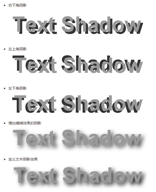
Example:
<style type="text/css">
p{
    text-align:center;
    margin:0;
    font-family:helvetica,arial,sans-serif;
    color:#999;
    font-size:80px;
    font-weight:bold;
    text-shadow:0.1em 0.1em #333;//右下角阴影
    text-shadow:-0.1em -0.1em #333;//左上角阴影
    text-shadow:-0.1em 0.1em #333;//左下角阴影
    text-shadow:0.1em 0.1em 0.3em #333;//增加模糊效果的阴影
    text-shadow:0.1em 0.1em 0.3em black;//定义文本阴影效果
}
</style>
Example: Increase the contrast between foreground and background colors through shadows
p{
    text-align:center;
    margin:150px auto;
    font-family:helvetica,arial,sans-serif;
    font-size:80px;
    font-weight:bold;
    color:#fff;//设置文字颜色
    text-shadow:0.1em 0.1em 0.3em black;//通过阴影增加前景色和背景色的对比

}
The shadow offset is specified by two
After the shadow offset, you can specify a blur radius. The blur radius is a length value that specifies the range of the blur effect.
You can also specify a color value before or after the length value of the shadow effect. The color value will be used as the basis for the shadow effect. If no color is specified, the color attribute value will be used instead.
Example:Simulate complex text effectsp{
text-align:center;
margin:0;
padding:24px;
font-family:helvetica,arial,sans-serif;
font-size:80px;
font-weight:bold;
color:#000;//设置文字颜色
background:#000;//设置背景颜色
text-shadow:0 0 4px white,
0 -5px 4px #ff3,
2px -10px 6px #fd3,
-2px -15px 11px #f80,
2px -25px 18px #f20;//使用阴影叠加出燃烧的文字特效
}
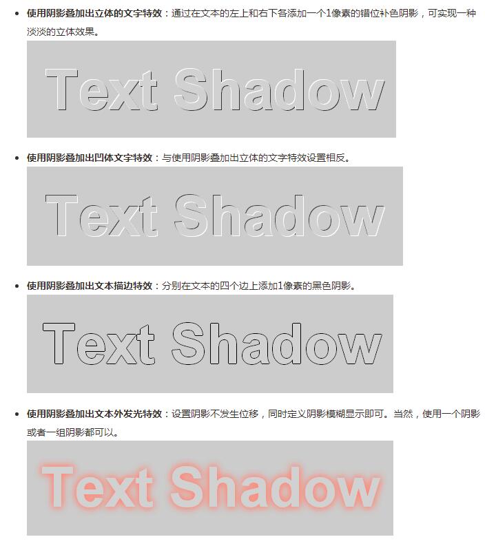
 Note: Each shadow effect The shadow offset value must be specified, while the blur radius and shadow color are optional parameters separated by a comma between each shadow.
p{
    text-align:center;
    margin:0;
    padding:24px;
    font-family:helvetica,arial,sans-serif;
    font-size:80px;
    font-weight:bold;
    color:#D1D1D1;
    background:#CCC;
    text-shadow:-1px -1px white,
                -1px -1px #333;//使用阴影叠加出立体的文字特效

                1px 1px white,
                -1px -1px #444;//使用阴影叠加出凹体文字特效

                -1px 0 black,
                0 1px black,
                1px 0 black,
                0 -1px black;//使用阴影叠加出文本描边特效

                    0 0 0.2em #F87,
                    0 0 0.2em #F87;//使用阴影叠加出文本外发光特
}
The above is the detailed content of Use CSS3 to achieve ever-changing text shadow text-shadow effect design. For more information, please follow other related articles on the PHP Chinese website!

Hot AI Tools

Undresser.AI Undress
AI-powered app for creating realistic nude photos

AI Clothes Remover
Online AI tool for removing clothes from photos.

Undress AI Tool
Undress images for free

Clothoff.io
AI clothes remover

AI Hentai Generator
Generate AI Hentai for free.

Hot Article

Hot Tools

Notepad++7.3.1
Easy-to-use and free code editor

SublimeText3 Chinese version
Chinese version, very easy to use

Zend Studio 13.0.1
Powerful PHP integrated development environment

Dreamweaver CS6
Visual web development tools

SublimeText3 Mac version
God-level code editing software (SublimeText3)

Hot Topics
 1378
1378
 52
52
 Making Your First Custom Svelte Transition
Mar 15, 2025 am 11:08 AM
The Svelte transition API provides a way to animate components when they enter or leave the document, including custom Svelte transitions.
 Working With GraphQL Caching
Mar 19, 2025 am 09:36 AM
If you’ve recently started working with GraphQL, or reviewed its pros and cons, you’ve no doubt heard things like “GraphQL doesn’t support caching” or
 Show, Don't Tell
Mar 16, 2025 am 11:49 AM
How much time do you spend designing the content presentation for your websites? When you write a new blog post or create a new page, are you thinking about
 Building an Ethereum app using Redwood.js and Fauna
Mar 28, 2025 am 09:18 AM
With the recent climb of Bitcoin’s price over 20k $USD, and to it recently breaking 30k, I thought it’s worth taking a deep dive back into creating Ethereum
 Creating Your Own Bragdoc With Eleventy
Mar 18, 2025 am 11:23 AM
No matter what stage you’re at as a developer, the tasks we complete—whether big or small—make a huge impact in our personal and professional growth.
 A bit on ci/cd
Apr 02, 2025 pm 06:21 PM
I'd say "website" fits better than "mobile app" but I like this framing from Max Lynch:
 Vue 3
Apr 02, 2025 pm 06:32 PM
It's out! Congrats to the Vue team for getting it done, I know it was a massive effort and a long time coming. All new docs, as well.
 Let's use (X, X, X, X) for talking about specificity
Mar 24, 2025 am 10:37 AM
I was just chatting with Eric Meyer the other day and I remembered an Eric Meyer story from my formative years. I wrote a blog post about CSS specificity, and


