 Web Front-end
 HTML Tutorial
 Detailed explanation of common misunderstandings in the use of HTML and CSS
Detailed explanation of common misunderstandings in the use of HTML and CSS
Myth 1. Polyp syndrome
<p class="nav">
    <ul>
       <li><a href="/home/">Home</a></li>
       <li><a href="/about/">About</a></li>
       <li><a href="/concact/">Concact</a></li>
    </ul>
</p>The above situation of using redundant p tags is called "Polyp syndrome " should be simplified to the following
<ul class="nav">
      <li><a href="/home/">Home</a></li>
      <li><a href="/about/">About</a></li>
      <li><a href="/concact/">Concact</a></li>
</ul> Misunderstanding 2. Multi-class class syndrome Note that class can be applied to any number of elements on the page, which is very suitable for identification Content type or other similar items
A piece of news (news title, news details)
<h1 class="news-head">Elastic Layout Example—View Source for the HTML and CSS</h1>
<p class="news-head">Lorem ipsum dolor sit amet.
        Duis aute irure dolor in reprehenderit in voluptate velit esse cillum dolore eu fugiat nulla pariatur.
Excepteur sint occaecat cupidatat non proident, sunt in culpa qui officia deserunt mollit anim id est laborum.</p>The above class names are called "## if they use news-head and news-text. #Multi-category syndrome"Performance, there is no need for so many classes to distinguish element styles
It is better to use
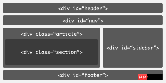
p (pision) to represent part instead of having no semantics (most people misunderstand that p has no semantics! ! !), in fact, p can divide the document into several meaningful areas.
class name news to identify the entire news item. Then you can use the cascade style to identify news titles and texts. You should modify it as follows
<p class="news">
    <h1>Elastic Layout Example—View Source for the HTML and CSS</h1>
    <p>Lorem ipsum dolor sit amet.
        Duis aute irure dolor in reprehenderit in voluptate velit esse cillum dolore eu fugiat nulla pariatur.
        Excepteur sint occaecat cupidatat non proident, sunt in culpa qui officia deserunt mollit anim id est laborum.</p>
</p>span to group or identify the inline elements
<h2> Andy wins an Oscar for his cameo in Iron Man</h2>
<p>Public and on <span class="date">Februray 22nd, 2009</span>
    By <span class="author">Harry Knowles</span>
</p>Misunderstanding 3. Misunderstanding about the use of id is used to identify specific elements on the page (such as sitenavigation, header, footer) and must be unique; it can also be used to identify persistent Structural elements (such as main navigation, content area)
/*大量的使用id,很难找到唯一名称混乱*/
#andy, #rich, #jeremy, #james-box, #sophie {
    font-size: 1em;
    font-weight: bold;
    border: 1px solid #ccc;
}
/*只需一个普通类替代它*/
.staff {
    font-size: 1em;
    font-weight: bold;
    border: 1px solid #ccc;
}
The above is the entire content of this article. I hope that the content of this article can bring certain benefits to everyone's study or work. Help, and I hope you can support Script Home!
The above is the detailed content of Detailed explanation of common misunderstandings in the use of HTML and CSS. For more information, please follow other related articles on the PHP Chinese website!

Hot AI Tools

Undresser.AI Undress
AI-powered app for creating realistic nude photos

AI Clothes Remover
Online AI tool for removing clothes from photos.

Undress AI Tool
Undress images for free

Clothoff.io
AI clothes remover

AI Hentai Generator
Generate AI Hentai for free.

Hot Article

Hot Tools

Notepad++7.3.1
Easy-to-use and free code editor

SublimeText3 Chinese version
Chinese version, very easy to use

Zend Studio 13.0.1
Powerful PHP integrated development environment

Dreamweaver CS6
Visual web development tools

SublimeText3 Mac version
God-level code editing software (SublimeText3)

Hot Topics
 1359
1359
 52
52
 How to do PS gradient color picker
Apr 06, 2025 pm 10:09 PM
Gradient color pickers give designers the flexibility to extract and create gradients from images. It simplifies gradient creation, ensures accuracy, inspires, improves efficiency and provides cross-platform support, and covers a wide range of applications including websites, graphic design, UI/UX design and digital art.
 How to remove the default style in Bootstrap list?
Apr 07, 2025 am 10:18 AM
The default style of the Bootstrap list can be removed with CSS override. Use more specific CSS rules and selectors, follow the "proximity principle" and "weight principle", overriding the Bootstrap default style. To avoid style conflicts, more targeted selectors can be used. If the override is unsuccessful, adjust the weight of the custom CSS. At the same time, pay attention to performance optimization, avoid overuse of !important, and write concise and efficient CSS code.
 How to build a bootstrap framework
Apr 07, 2025 pm 12:57 PM
To create a Bootstrap framework, follow these steps: Install Bootstrap via CDN or install a local copy. Create an HTML document and link Bootstrap CSS to the <head> section. Add Bootstrap JavaScript file to the <body> section. Use the Bootstrap component and customize the stylesheet to suit your needs.
 How to view Bootstrap's grid system
Apr 07, 2025 am 09:48 AM
Bootstrap's mesh system is a rule for quickly building responsive layouts, consisting of three main classes: container (container), row (row), and col (column). By default, 12-column grids are provided, and the width of each column can be adjusted through auxiliary classes such as col-md-, thereby achieving layout optimization for different screen sizes. By using offset classes and nested meshes, layout flexibility can be extended. When using a grid system, make sure that each element has the correct nesting structure and consider performance optimization to improve page loading speed. Only by in-depth understanding and practice can we master the Bootstrap grid system proficiently.
 How to use GitHub for HTML?
Apr 07, 2025 am 12:13 AM
The reason for using GitHub to manage HTML projects is that it provides a platform for version control, collaborative development and presentation of works. The specific steps include: 1. Create and initialize the Git repository, 2. Add and submit HTML files, 3. Push to GitHub, 4. Use GitHubPages to deploy web pages, 5. Use GitHubActions to automate building and deployment. In addition, GitHub also supports code review, Issue and PullRequest features to help optimize and collaborate on HTML projects.
 How to keep the code simple in the center of the Bootstrap picture
Apr 07, 2025 am 07:27 AM
Bootstrap picture centering tips: Use the grid system to center horizontally: justify-content-center class to center horizontally, col-auto allows the picture to adapt as needed, and img-fluid adapts to container size. Use Flexbox to center vertically: d-flex sets the container to the Flex container, align-items: center vertically. Try to use Bootstrap's own classes, follow concise code guidelines, avoid custom styles, excessive nesting, and improve the readability and efficiency of the code.
 Does the image centering support image zooming?
Apr 07, 2025 am 07:42 AM
How to achieve image centering and scaling in Bootstrap: Use d-flex justify-content-center to center images horizontally. Use align-items-center and fixed parent element height vertically center the image. Use the width and height attributes to control the image size, or use max-width and max-height to limit the maximum size. Use the img-fluid class or responsive design mechanism, such as media queries, to achieve responsive scaling. Optimize image size, control scaling using the object-fit attribute, and follow best practices to ensure performance and maintainability.
 How to view the CSS style of Bootstrap
Apr 07, 2025 am 10:24 AM
How to view Bootstrap CSS: Using Browser Developer Tools (F12). Find the "Elements" or "Inspector" tab and find the Bootstrap component. View the CSS styles that the component applies in the Styles panel. Developer tools can be used to filter styles or debug code to gain insight into how it works. Proficient in developer tools and avoid detours.


