 Web Front-end
 CSS Tutorial
 In-depth analysis of the position attribute and z-index attribute in CSS
In-depth analysis of the position attribute and z-index attribute in CSS
In web design, the use of positionattributes is very important. Sometimes if we cannot understand this attribute clearly, it will bring us many unexpected difficulties. The
position attribute has four different positioning methods, namely static, fixed, relative, and absolute. Finally, we will introduce the z-index attribute that is closely related to the position attribute.
Part one: position: static
static positioning is the default value of HTML element, that is, there is no positioning, and the element appears in the normal flow , therefore, this positioning will not be affected by top, bottom, left, right.
For example, the html code is as follows:
<p class="wrap">

    <p class="content"></p>

</p>css code is as follows:
.wrap{width: 300px;height: 300px; background: red;}

.content{position: static; top:100px; width: 100px;height: 100px; background: blue;}The rendering is as follows: 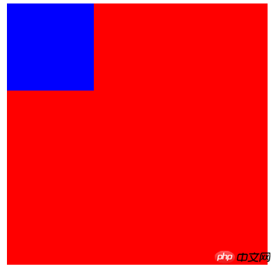
We found that although static and top are set, the elements still appear in the normal flow.
Part 2: fixed positioning
Fixed positioning means that the position of the element is a fixed position relative to the browser window. Even if the window is scrolled, it will not scroll, and fixed positioning makes the element The position is independent of the document flow, so it does not take up space, and it overlaps other elements.
html code is as follows:
<p class="content">我是使用fix来定位的!!!所以我相对于浏览器窗口,一直不动。</p>
css code is as follows:
body{height:1500px; background: green; font-size: 30px; color:white;}

.content{ position: fixed; right:0;bottom: 0; width: 300px;height: 300px; background: blue;}
The rendering is as follows: 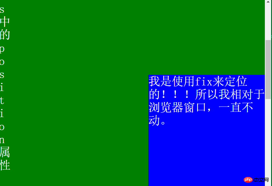
That is, the p in the lower right corner will never move, just like the advertisements that often pop up! ! !
It is worth noting: fixed positioning needs to be described under IE7 and IE8! DOCTYPE can only be supported.
Part 3: relative positioning
The positioning of a relatively positioned element is relative to its own normal position.
Key: How to understand its own coordinates?
Let us look at such an example, the hmtl is as follows:
<h2>这是位于正常位置的标题</h2>

<h2 class="pos_bottom">这个标题相对于其正常位置向下移动</h2>

<h2 class="pos_right">这个标题相对于其正常位置向右移动</h2>
css code is as follows:
.pos_bottom{position:relative; bottom:-20px;}

.pos_right{position:relative;left:50px;}The rendering is as follows: 
That is bottom:-20px;; move downward. left:50px;Move to the right.
It can be understood as: after moving, it is the negative position before moving.
For example, in the above example, the bottom after the move is: -20px; that is, the bottom after the move is: 20px before the move; that is, the bottom after the move is 20px before the move;
Another example: left:50px; after moving, it is -50px from the left before moving; that is to say, after moving, it is 50px from the right before moving.
That is: after moving, before moving: if the value is a negative number, it is directly changed to an integer; if the value is an integer, the relative direction is changed directly.
After figuring out how relative moves, let’s see if there will be other effects after moving.
html code is as follows:
<h2>这是一个没有定位的标题</h2>

<h2 class="pos_top">这个标题是根据其正常位置向上移动</h2>

<p><b>注意:</b> 即使相对定位元素的内容是移动,预留空间的元素仍保存在正常流动。</p>
css code is as follows:
h2.pos_top{position:relative;top:-35px;The rendering is as follows: 
According to the previous statement, top:-35px; if the value is a negative number, then it is directly changed to a positive number, that is, the upward shift is 35px after the move compared to before the move; we found that on the above, after the move, the element above overlaps; on Even if the content of the relative element is moved, the element with reserved space is still kept in normal flow, which means that after the relative movement, it will not affect other elements below.
Part 4: Absolute Positioning
Absolutely positioned elements are relative to the nearest positioned parent element. If the element has no positioned parent element, then its position Relative to .
Here are a few examples:
Example 1:
<title>绝对定位</title>

<style>                body{background:green;}

    .parent{ width: 500px;height: 500px;background: #ccc;}

    .son{ width: 300px;height: 300px;background: #aaa;}

    span{position: absolute; right: 30px; background: #888;}

</style>
<p class="parent">

    <p class="son">

        <span>什么?</span>

    </p>

</p>The effect is as follows: 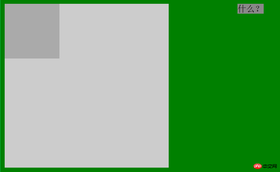
That is, I only set it in span position:absolute; but not in its parent element, so its position is relative to html.
Example 2:
.son{position: relative; width: 100px;height: 100px;background: #aaa; }
Compared with the previous example, I only modified the css of the element where class is son and set it to position : relative; The rendering is as follows: 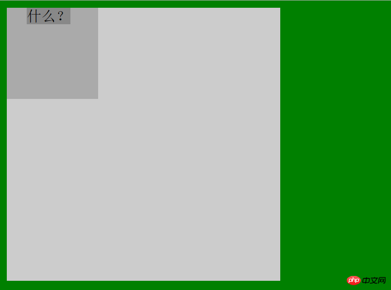
So, we find that the current position of span is relative to the parent element with class son that has the position attribute.
Example 3:
.parent{position: absolute; width: 300px;height: 300px;background: #ccc;}这个例子我只是修改了第一个例子中的css--设置了position:absolute;效果如下: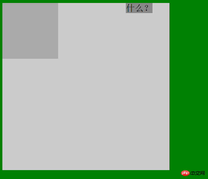
于是我们发现,现在span的定位是相对于具有position:absolute的属性的class为parent的父元素。
例4:
.parent{position:fixed; width: 300px;height: 300px;background: #ccc;}相对于例1,我添加了fixed的position属性,发现结果和例3是一模一样的。
例5:
.parent{position:static; width: 300px;height: 300px;background: #ccc;}相对于例1,我添加了static的position属性(即html的默认属性),结果和例1是一样的。
综上所述,当某个absolute定位元素的父元素具有position:relative/absolute/fixed时,定位元素都会依据父元素而定位,而父元素没有设置position属性或者设置了默认属性,那么定位属性会依据html元素来定位。
第五部分:重叠的元素--z-index属性
首先声明:z-index只能在position属性值为relative或absolute或fixed的元素上有效。
基本原理是:z-index的值可以控制定位元素在垂直于显示屏幕方向(z轴)上的堆叠顺序(stack order),值大的元素发生重叠时会在值小的元素上面。
下面我们通过几个例子继续来理解这个属性。
例1: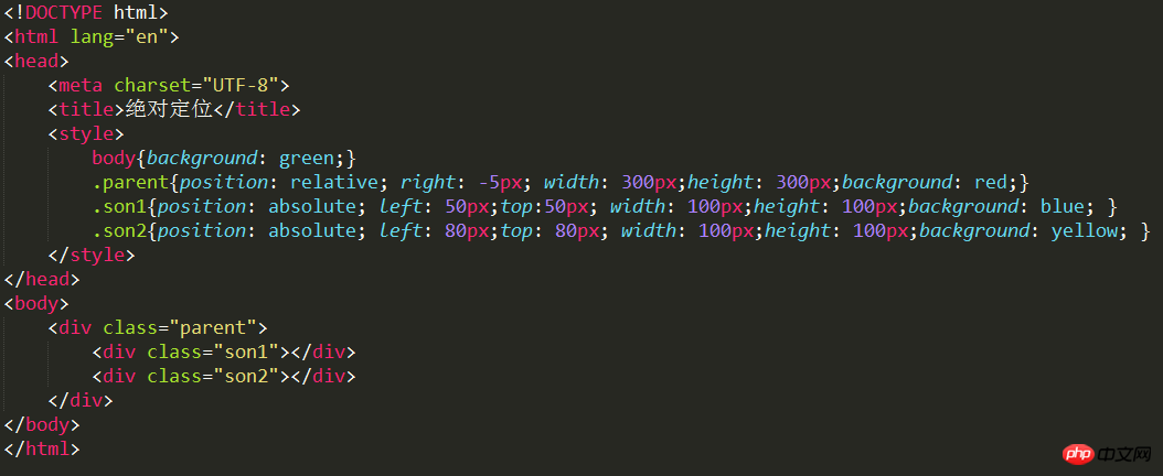
即son1和son2是parent的两个子元素,效果图如下: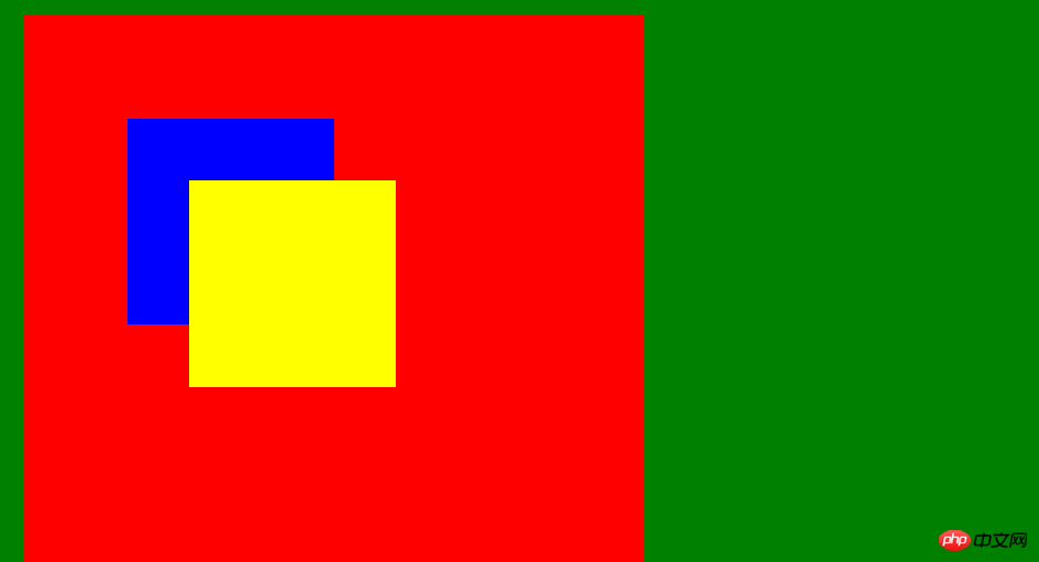
这是没有使用z-index,我们发现son2在son1之上,这是因为son2在html中排在了son1之后,所以后来者将前者覆盖,如果我们颠倒以下两者的顺序,就会发现蓝色(son1)在上了。
例2:
在son1中加入z-index:1;可以发现效果如下: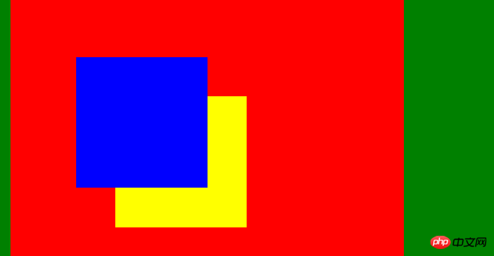
也就是说son2的index值是小于1的。
如果我们给son2也加上z-index:1;呢?结果得到黄色(son2)就在上面了。(因为一旦z-index值相等,情况就和都不设置index值一样了)
例3:
在son2中加入z-index:5;可以发现效果如下: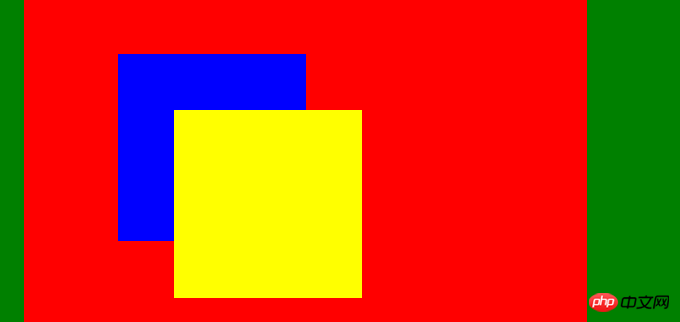
即黄色(son2)又在上面了,这个很简单,不作过多讨论。
例4:
在父元素添加z-index:10;
在son1和son2添加z-index:5; 这样理论上父元素就会在上面(黄色覆盖蓝色和黄色);
结果如下: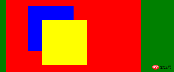
结果没有变!!!!! 这就说明父元素和子元素不能做z-index的比较!!!但真的是这样吗?看下一个例子:
例5:
把两个子元素的z-index值同时设置为-5;父元素不设置z-index属性。结果如下: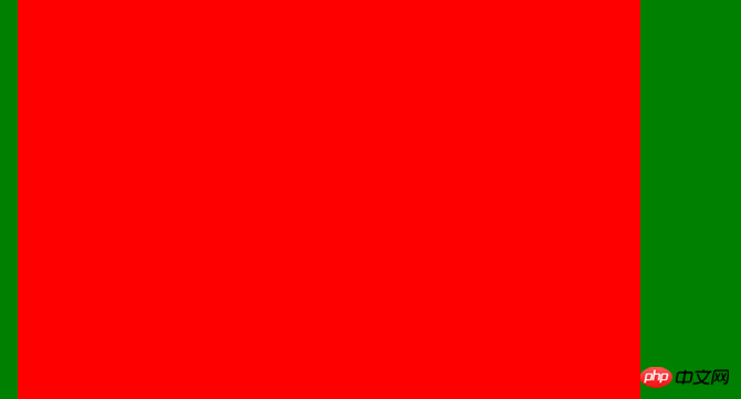
成功!!说明在父元素和子元素之间还是可以作比较的!!!只是需要我们把子元素的z-index值设为负数。
例6:
我们在例5的基础上再给父元素添加一个z-index:10,讲道理~应该也可以得到和例5相同的结果吧!!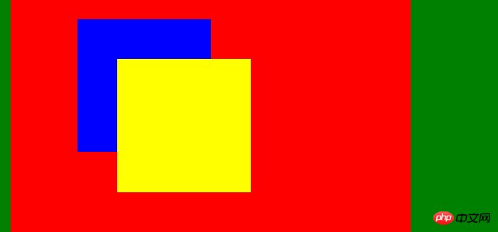
然而.... 看来我们不能设置父元素的z-index值,否则就不能出现我们想要的效果。下面再看一个有趣的例子!
例7:
我们根据例6的经验不设置父元素的值,现在设置son1(蓝色)的z-index为5,son2的z-index为-5,看下面的结果: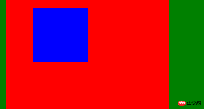
即son1在最上面,父元素在中间,son2在最下面。
对于z-index的探索就这样结束了吗??当然没有,看下面几个更为有趣的例子吧。
例8:
代码如下: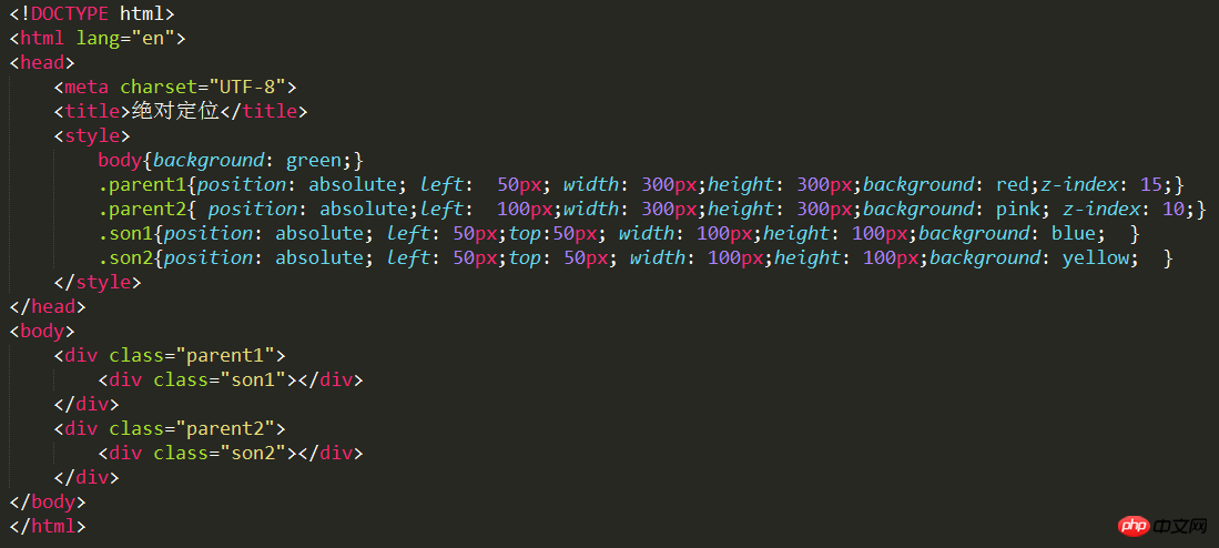
效果如下: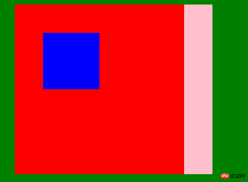
虽然parent1和parent2分别是son1和son2的父元素,按照我们之前的理解,父元素是不可添加z-index值的,否则会导致错误。但是这里parent1和parent2相对于body又是子元素,他俩是同级的,所以就可以进行比较了。且此时parent1的子元素son1(蓝色)在上。
例9:
如果我们在例7的基础上,把parent2的z-index值设为20,就会发现如下效果: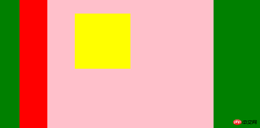
即parent2在上的同时son2也会同时在上。这也就是所谓的“拼爹”了!!
例10.同样在例7的基础上,我们不设置parent1和parent2和son2的index值,而只设置son1的z-index值为10,效果如下:
That is, the blue son1 that was originally below was brought up, but the parent element (parent1) was not brought up. Hey, it is unfilial! !
Example 11. Obviously, based on Example 10, if we set the index value of son2 to be larger than that of son1, such as 20, then son2 will cover son1, and both will be in the two parent elements. Only on! !
The effect is as follows: 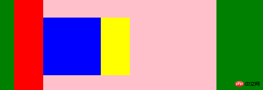
Example 12. Of course, if we set the z-index of the two sons to a negative number such as -5, then the two sons will be covered by the parent element: 
Part Six: Summary
This part of the knowledge is still very interesting, I hope You can continue to explore. Of course, it would be great if I could give you a little help through this blog post!
The above is the detailed content of In-depth analysis of the position attribute and z-index attribute in CSS. For more information, please follow other related articles on the PHP Chinese website!

Hot AI Tools

Undresser.AI Undress
AI-powered app for creating realistic nude photos

AI Clothes Remover
Online AI tool for removing clothes from photos.

Undress AI Tool
Undress images for free

Clothoff.io
AI clothes remover

AI Hentai Generator
Generate AI Hentai for free.

Hot Article

Hot Tools

Notepad++7.3.1
Easy-to-use and free code editor

SublimeText3 Chinese version
Chinese version, very easy to use

Zend Studio 13.0.1
Powerful PHP integrated development environment

Dreamweaver CS6
Visual web development tools

SublimeText3 Mac version
God-level code editing software (SublimeText3)

Hot Topics
 Demystifying Screen Readers: Accessible Forms & Best Practices
Mar 08, 2025 am 09:45 AM
This is the 3rd post in a small series we did on form accessibility. If you missed the second post, check out "Managing User Focus with :focus-visible". In
 Create a JavaScript Contact Form With the Smart Forms Framework
Mar 07, 2025 am 11:33 AM
This tutorial demonstrates creating professional-looking JavaScript forms using the Smart Forms framework (note: no longer available). While the framework itself is unavailable, the principles and techniques remain relevant for other form builders.
 Adding Box Shadows to WordPress Blocks and Elements
Mar 09, 2025 pm 12:53 PM
The CSS box-shadow and outline properties gained theme.json support in WordPress 6.1. Let's look at a few examples of how it works in real themes, and what options we have to apply these styles to WordPress blocks and elements.
 Create an Inline Text Editor With the contentEditable Attribute
Mar 02, 2025 am 09:03 AM
Building an inline text editor isn't trivial. The process starts by making the target element editable, handling potential SyntaxError exceptions along the way. Creating Your Editor To build this editor, you'll need to dynamically modify the content
 Working With GraphQL Caching
Mar 19, 2025 am 09:36 AM
If you’ve recently started working with GraphQL, or reviewed its pros and cons, you’ve no doubt heard things like “GraphQL doesn’t support caching” or
 Making Your First Custom Svelte Transition
Mar 15, 2025 am 11:08 AM
The Svelte transition API provides a way to animate components when they enter or leave the document, including custom Svelte transitions.
 Comparing the 5 Best PHP Form Builders (And 3 Free Scripts)
Mar 04, 2025 am 10:22 AM
This article explores the top PHP form builder scripts available on Envato Market, comparing their features, flexibility, and design. Before diving into specific options, let's understand what a PHP form builder is and why you'd use one. A PHP form
 File Upload With Multer in Node.js and Express
Mar 02, 2025 am 09:15 AM
This tutorial guides you through building a file upload system using Node.js, Express, and Multer. We'll cover single and multiple file uploads, and even demonstrate storing images in a MongoDB database for later retrieval. First, set up your projec


