 WeChat Applet
 Mini Program Development
 WeChat applet development imitation CCB circular menu example code
WeChat applet development imitation CCB circular menu example code
This article mainly introduces the example code of imitating the circular menu of China Construction Bank in the development of WeChat applet. It has certain reference value. If you need it, you can learn about it.
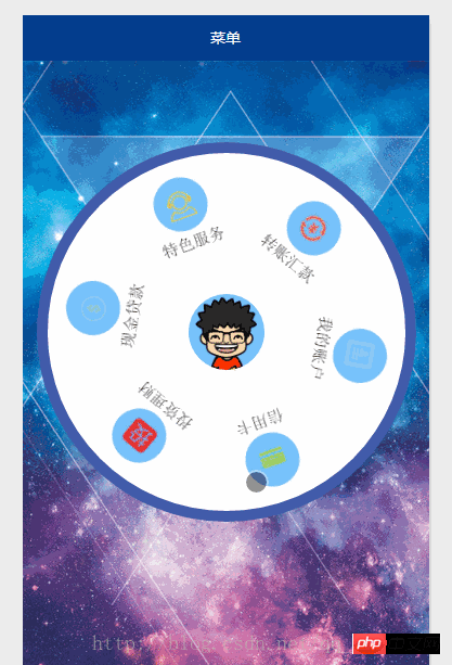
There is a circular menu on the home page of the CCB APP. It looks like a toy.

Function introduction:
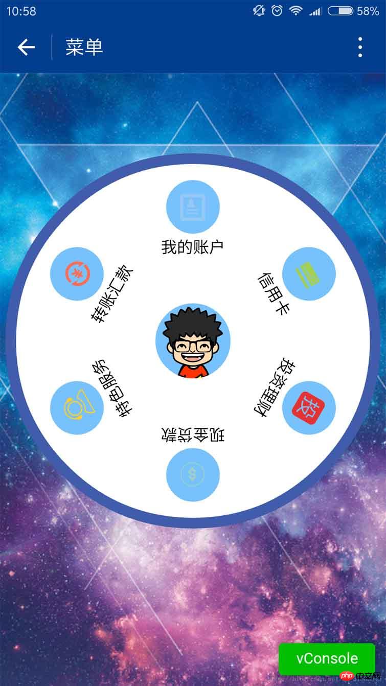
1. A circular background. Six item menus. In the middle is the avatar of the WeChat user;
2. Touch scrolling. When the speed is small, scroll with the finger, lift the finger, and the scrolling stops; when the speed is high, , scroll with your finger, lift your finger, and it will automatically scroll for a period of time;
Last real device screenshot:

Above code:
1.index.js
##
var app = getApp()
Page({
data: {
userInfo: {},
menuList: {},//菜单集合
animationData: {},
startPoint: {},//触摸开始
dotPoint: {},//圆点坐标
startAngle: 0,//开始角度
tempAngle: 0,//移动角度
downTime: 0,//按下时间
upTime: 0,//抬起时间
// isRunning: false,//正在滚动
},
onLoad: function () {
var that = this
//调用应用实例的方法获取全局数据
app.getUserInfo(function (userInfo) {
//更新数据
that.setData({
userInfo: userInfo,
})
})
wx.getSystemInfo({
success: function (res) {
var windowWidth = res.windowWidth * 0.5;
that.setData({
//圆点坐标,x为屏幕一半,y为半径与margin-top之和,px
//后面获取的触摸坐标是px,所以这里直接用px.
dotPoint: { clientX: windowWidth, clientY: 250 }
})
}
})
},
onReady: function (e) {
var that = this;
app.menuConfig = {
menu: [
{ 'index': 0, 'menu': '我的账户', 'src': '../images/account.png' },
{ 'index': 1, 'menu': '信用卡', 'src': '../images/card.png' },
{ 'index': 2, 'menu': '投资理财', 'src': '../images/investment.png' },
{ 'index': 3, 'menu': '现金贷款', 'src': '../images/loan.png' },
{ 'index': 4, 'menu': '特色服务', 'src': '../images/service.png' },
{ 'index': 5, 'menu': '转账汇款', 'src': '../images/transfer.png' }
]
}
// 绘制转盘
var menuConfig = app.menuConfig.menu,
len = menuConfig.length,
menuList = [],
degNum = 360 / len // 文字旋转 turn 值
for (var i = 0; i < len; i++) {
menuList.push({ deg: i * degNum, menu: menuConfig[i].menu, src: menuConfig[i].src });
console.log("menu:" + menuConfig[i].menu)
}
that.setData({
menuList: menuList
});
},
// 菜单拖动的三个方法
buttonStart: function (e) {
this.setData({
startPoint: e.touches[0]
})
var x = this.data.startPoint.clientX - this.data.dotPoint.clientX;
var y = this.data.startPoint.clientY - this.data.dotPoint.clientY;
var startAngle = Math.asin(y / Math.hypot(x, y)) * 180 / Math.PI;
this.setData({
startAngle: startAngle
})
},
buttonMove: function (e) {
//获取滑动时的时间
var downTime = Date.now();
this.setData({
downTime: downTime
})
var that = this;
var endPoint = e.touches[e.touches.length - 1]
//根据触摸位置计算角度
var x = endPoint.clientX - this.data.dotPoint.clientX;
var y = endPoint.clientY - this.data.dotPoint.clientY;
var moveAngle = Math.asin(y / Math.hypot(x, y)) * 180 / Math.PI
var quadrant = 1;
if (x >= 0) {
quadrant = y >= 0 ? 4 : 1;
} else {
quadrant = y >= 0 ? 3 : 2;
}
var tempAngle = 0;
// 如果是一、四象限,则直接end角度-start角度,角度值都是正值
if (quadrant == 1 || quadrant == 4) {
tempAngle += moveAngle - this.data.startAngle;
} else
// 二、三象限,色角度值是负值
{
tempAngle += this.data.startAngle - moveAngle;
}
var menuConfig = app.menuConfig.menu;
var menuList = [];
for (var i = 0; i < this.data.menuList.length; i++) {
menuList.push({ deg: this.data.menuList[i].deg + tempAngle, menu: menuConfig[i].menu, src: menuConfig[i].src });
}
this.setData({
menuList: menuList
})
//重置开始角度
this.setData({
startPoint: e.touches[e.touches.length - 1]
})
var endX = this.data.startPoint.clientX - this.data.dotPoint.clientX;
var endY = this.data.startPoint.clientY - this.data.dotPoint.clientY;
var startAngle = Math.asin(endY / Math.hypot(endX, endY)) * 180 / Math.PI;
this.setData({
startAngle: startAngle,
tempAngle: tempAngle
})
},
buttonEnd: function (e) {
// 计算,每秒移动的角度
var that = this;
var upTime = Date.now();
var angleSpeed = this.data.tempAngle * 1000 / (upTime - this.data.downTime);
if (Math.abs(angleSpeed) < 100) {
//速度小于100时,停止滚动
return
} else {
//速度大于100时,自动滚动
if (angleSpeed > 0) {
if (angleSpeed > 500) angleSpeed = 500
var animationRun = wx.createAnimation({
duration: 2000,
//ease-out结束时减速
timingFunction: 'ease-out'
})
that.animationRun = animationRun
animationRun.rotate(angleSpeed).step()
that.setData({
animationData: animationRun.export(),
})
}
else {
if (angleSpeed < -500) angleSpeed = -500
angleSpeed = Math.abs(angleSpeed);
var animationRun = wx.createAnimation({
duration: 2000,
// ease-out结束时减速
timingFunction: 'ease-out'
})
that.animationRun = animationRun
animationRun.rotate(-angleSpeed).step()
that.setData({
animationData: animationRun.export(),
})
}
}
}
})<view class="circle-out">
<view class="circle-in">
<image class="userinfo-avatar" src="{{userInfo.avatarUrl}}"></image>
<view class="menu-list" catchtouchmove="buttonMove" catchtouchstart="buttonStart" catchtouchend="buttonEnd">
<view class="menu-item" wx:for="{{menuList}}" wx:key="unique" animation="{{animationData}}">
<view class="menu-circle-item" style="-webkit-transform: rotate({{item.deg}}deg);" data-menu="{{item.menu}}">
<image class="image-style" src="{{item.src}}"></image>
</view>
<view class="menu-circle-text-item" style="-webkit-transform: rotate({{item.deg}}deg);">
<text class="text-style">{{item.menu}}</text>
</view>
</view>
</view>
</view>
</view>page {
background-image: url('http://ac-ejx0nsfy.clouddn.com/ac767407f474e1c3970a.jpg');
background-attachment: fixed;
background-repeat: no-repeat;
background-size: cover;
}
.circle-out {
margin: 75px auto;
position: relative;
width: 350px;
height: 350px;
border-radius: 50%;
background-color: #415cab;
}
.userinfo-avatar {
width: 70px;
height: 70px;
border-radius: 50%;
position: absolute;
top: 0;
bottom: 0;
left: 0;
right: 0;
margin: auto;
}
/**子控件的透明度等于父控件透明度*子控件透明度,父控件的opacity设置后,
所以子控件opacity设置为1依然无效,必须分离开
*/
.circle-in {
position: absolute;
width: 330px;
height: 330px;
border-radius: 50%;
top: 0;
bottom: 0;
left: 0;
right: 0;
margin: auto;
background-color: #fff;
}
/**菜单*/
.menu-list {
position: absolute;
left: 0;
top: 0;
width: inherit;
height: inherit;
}
.menu-item {
position: absolute;
left: 0;
top: 0;
width: 100%;
height: 100%;
font-weight: 500;
}
.menu-circle-item {
-webkit-transform-origin: 50% 150px;
transform-origin: 50% 150px;
margin: 0 auto;
margin-top: 15px;
position: relative;
height: 50px;
width: 50px;
background-color: #77c2fc;
text-align: center;
border-radius: 50%;
}
.image-style {
height: 25px;
width: 25px;
color: #f00;
margin: 12.5px auto;
}
.text-style {
margin: 5px auto;
font-size: 15px;
}
/***/
.menu-circle-text-item {
-webkit-transform-origin: 50% 100px;
transform-origin: 50% 100px;
margin: 0 auto;
position: relative;
height: 25px;
width: auto;
text-align: center;
}NoteSupplement:

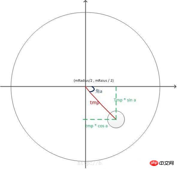
var angleSpeed = this.data.tempAngle * 1000 / (upTime - this.data.downTime);
.
The above is the detailed content of WeChat applet development imitation CCB circular menu example code. For more information, please follow other related articles on the PHP Chinese website!

Hot AI Tools

Undresser.AI Undress
AI-powered app for creating realistic nude photos

AI Clothes Remover
Online AI tool for removing clothes from photos.

Undress AI Tool
Undress images for free

Clothoff.io
AI clothes remover

AI Hentai Generator
Generate AI Hentai for free.

Hot Article

Hot Tools

Notepad++7.3.1
Easy-to-use and free code editor

SublimeText3 Chinese version
Chinese version, very easy to use

Zend Studio 13.0.1
Powerful PHP integrated development environment

Dreamweaver CS6
Visual web development tools

SublimeText3 Mac version
God-level code editing software (SublimeText3)

Hot Topics
 1386
1386
 52
52
 Xianyu WeChat mini program officially launched
Feb 10, 2024 pm 10:39 PM
Xianyu's official WeChat mini program has quietly been launched. In the mini program, you can post private messages to communicate with buyers/sellers, view personal information and orders, search for items, etc. If you are curious about what the Xianyu WeChat mini program is called, take a look now. What is the name of the Xianyu WeChat applet? Answer: Xianyu, idle transactions, second-hand sales, valuations and recycling. 1. In the mini program, you can post idle messages, communicate with buyers/sellers via private messages, view personal information and orders, search for specified items, etc.; 2. On the mini program page, there are homepage, nearby, post idle, messages, and mine. 5 functions; 3. If you want to use it, you must activate WeChat payment before you can purchase it;
 WeChat applet implements image upload function
Nov 21, 2023 am 09:08 AM
WeChat applet implements picture upload function With the development of mobile Internet, WeChat applet has become an indispensable part of people's lives. WeChat mini programs not only provide a wealth of application scenarios, but also support developer-defined functions, including image upload functions. This article will introduce how to implement the image upload function in the WeChat applet and provide specific code examples. 1. Preparatory work Before starting to write code, we need to download and install the WeChat developer tools and register as a WeChat developer. At the same time, you also need to understand WeChat
 Implement the drop-down menu effect in WeChat applet
Nov 21, 2023 pm 03:03 PM
To implement the drop-down menu effect in WeChat Mini Programs, specific code examples are required. With the popularity of mobile Internet, WeChat Mini Programs have become an important part of Internet development, and more and more people have begun to pay attention to and use WeChat Mini Programs. The development of WeChat mini programs is simpler and faster than traditional APP development, but it also requires mastering certain development skills. In the development of WeChat mini programs, drop-down menus are a common UI component, achieving a better user experience. This article will introduce in detail how to implement the drop-down menu effect in the WeChat applet and provide practical
 Implement image filter effects in WeChat mini programs
Nov 21, 2023 pm 06:22 PM
Implementing picture filter effects in WeChat mini programs With the popularity of social media applications, people are increasingly fond of applying filter effects to photos to enhance the artistic effect and attractiveness of the photos. Picture filter effects can also be implemented in WeChat mini programs, providing users with more interesting and creative photo editing functions. This article will introduce how to implement image filter effects in WeChat mini programs and provide specific code examples. First, we need to use the canvas component in the WeChat applet to load and edit images. The canvas component can be used on the page
 Use WeChat applet to achieve carousel switching effect
Nov 21, 2023 pm 05:59 PM
Use the WeChat applet to achieve the carousel switching effect. The WeChat applet is a lightweight application that is simple and efficient to develop and use. In WeChat mini programs, it is a common requirement to achieve carousel switching effects. This article will introduce how to use the WeChat applet to achieve the carousel switching effect, and give specific code examples. First, add a carousel component to the page file of the WeChat applet. For example, you can use the <swiper> tag to achieve the switching effect of the carousel. In this component, you can pass b
 Implement image rotation effect in WeChat applet
Nov 21, 2023 am 08:26 AM
To implement the picture rotation effect in WeChat Mini Program, specific code examples are required. WeChat Mini Program is a lightweight application that provides users with rich functions and a good user experience. In mini programs, developers can use various components and APIs to achieve various effects. Among them, the picture rotation effect is a common animation effect that can add interest and visual effects to the mini program. To achieve image rotation effects in WeChat mini programs, you need to use the animation API provided by the mini program. The following is a specific code example that shows how to
 What is the name of Xianyu WeChat applet?
Feb 27, 2024 pm 01:11 PM
The official WeChat mini program of Xianyu has been quietly launched. It provides users with a convenient platform that allows you to easily publish and trade idle items. In the mini program, you can communicate with buyers or sellers via private messages, view personal information and orders, and search for the items you want. So what exactly is Xianyu called in the WeChat mini program? This tutorial guide will introduce it to you in detail. Users who want to know, please follow this article and continue reading! What is the name of the Xianyu WeChat applet? Answer: Xianyu, idle transactions, second-hand sales, valuations and recycling. 1. In the mini program, you can post idle messages, communicate with buyers/sellers via private messages, view personal information and orders, search for specified items, etc.; 2. On the mini program page, there are homepage, nearby, post idle, messages, and mine. 5 functions; 3.
 Implement the sliding delete function in WeChat mini program
Nov 21, 2023 pm 06:22 PM
Implementing the sliding delete function in WeChat mini programs requires specific code examples. With the popularity of WeChat mini programs, developers often encounter problems in implementing some common functions during the development process. Among them, the sliding delete function is a common and commonly used functional requirement. This article will introduce in detail how to implement the sliding delete function in the WeChat applet and give specific code examples. 1. Requirements analysis In the WeChat mini program, the implementation of the sliding deletion function involves the following points: List display: To display a list that can be slid and deleted, each list item needs to include


