
1. Source of the problem
When I write a carousel to switch, a blank space appears behind the previous picture when it slides out. The second picture does not appear until all the previous pictures slide out. When the problem first started, I searched online and found that some people said that timer animation might cause this situation, so I commented out the timer in the code debugging, so that the picture would stop after taking only one step. I found that there was still a blank space behind it, so I was sure It's not a timer issue. So I checked the box model and found that the width p#main of the container wrapping img was not the sum of the widths of the six pictures I wanted. It turned out that I did not explicitly set the width of the container p#main. But here comes the problem. Without explicitly setting the container width, you may rationally think that the width of the container should not be adapted to the filling of its content? According to the phenomenon mentioned above, the answer is naturally no. It can also be said that this is not the case in all cases, because in fact positioning also has an impact on the width of the container. Let’s discuss the relationship between the size and placement of absolutely positioned elements.
2. Containing block
First, let’s review the basic concept of containing block (positioning context):
1. The initial containing block (containing block of the root element) is composed of User agent determined.
2. The floating element containing block is defined as the nearest block-level ancestor element.
3. The containing block of a relatively positioned or statically positioned element is formed by the content boundary of the nearest block-level box, table cell, or inline block box ancestor element (of any type).
4. The absolutely positioned element containing block is set to the border delimitation (for block-level parent elements) or content boundary delimitation (for inline parent elements) of the nearest positioned ancestor element (of any type) that is not static.
3. Width and offset
Generally, the size and position of an element depend on its containing block. Positioning means that the margin boundaries of an element are offset relative to the corresponding sides of its containing block (the inner border and the adjacent side of the border), which affects everything in the element (margins, borders, padding, content) will move. Therefore, for a positioned element, there is the following equation (the following calculations are based on this formula):
left+margin-left+border-left-width+padding-left+width+padding-right+border-right -width+margin-right+right=width of the containing block (Formula 1-1)
Accordingly, when the width and height of an element are undefined, their values will be affected by positioning. For positioned elements, whether you need to set its width and height should be determined based on the situation. Consider the following situations to determine the width and height:
1. If the offset attributes top, left, bottom, and right are all determined, but the outer margin, inner margin, and When setting a border, whether the width and height are explicitly set, the values are determined by the offset attribute; otherwise, if margins or padding are set (auto also counts), when setting a border, the height and width are the explicitly set values. If the width and height are not explicitly set, they are still determined by the offset attribute.
2. For non-replaced elements, the horizontal axis behavior:
1) If left, width, and right are all auto, and no inner and outer margins or borders are set, then the calculated left side of the element is located in its Static position (reading from left to right), width "appropriate expansion", according to the above equation right is the remaining horizontal distance;
2) When all values in the equation are fixed values, if the element " If the element is "over-restricted", the right will be reset according to the above formula;
3) When only one attribute value in the above equation is auto, when the element is "over-restricted", this attribute value will be reset to Satisfy the equation;
4) The vertical axis rules are similar, but note that only top can take a static position, bottom cannot.
3. For the replacement element (note that there is no concept of "proper expansion" here, because the replacement element has an inherent width and height):
1) First check whether its width (height) is explicit Statement, if explicitly declared, this value will be used, otherwise it will be determined by the actual size (width and height) of the element content;
2) Look at left again, if top is auto, it will be replaced with a static position;
3) If the values of left and bottom are still auto, set the auto of margin to 0. If they are not set to 0, set them to be equal to left and right, and equal to top and bottom;
4) After this, if only If there is an auto value left, it is similar to the non-replaced element, and the auto value is reset according to the equation.
5) When an element is "overly constrained", the user agent ignores right (reading from left to right) and bottom as it does with non-replaced elements.
The above is an analysis of the influencing factors of the actual displayed width and height of an absolutely positioned element. When you find that the interface display effect is inconsistent with what you expected, you can consider analyzing it from the above perspective to see if you need to re-determine the width of the element. The height value, or the value of any of the above properties.
4. Analysis of a common situation
Now let’s analyze the actual example of the width and height problem I encountered in the project. The hypothetical situation discussed here is: the outermost p#rel with width and height is set to relative positioning, and its child p#abs only sets left to a fixed value without setting the width (under the premise that there are no inner and outer margins and borders), p#abs The interior contains different types of elements.
1. Let’s first discuss the case where the innermost layer is wrapped with block-level elements. The code is as follows:
<p>
    </p><p>
        </p><p></p>
        <p></p>
*{margin:0;padding: 0}#rel1{position: relative;width: 120px;height: 50px;background-color: yellow;}#abs1{position: absolute;top: 0;left: -15px}#box1{width: 50px;height: 50px;background-color: red}#box2{width: 50px;height: 50px;background-color: blue}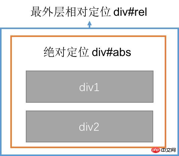

From the code, we can see that we put the absolute positioning element, and padding, and the padding is all 0, and the borderless frame, the above formula 1-1 is simplified to:
## absolute positioning element P p left+width+right of #abs = width of the containing block p#rel Since the left of the absolutely positioned element is a fixed value, and width and right are not set, the latter two are both is the initial value auto. According to the horizontal behavior of the non-replacement axis 1), it can be seen that the width is first appropriately expanded, that is, the child element content of the absolutely positioned element is just placed, and then the value of right is automatically calculated to make the three attributes The sum is exactly equal to the width of the absolutely positioned containing block p#rel, 120px. Therefore, the width value of the absolutely positioned element p#abs at this time is determined by its content. In the two situations shown below (tested by changing the width of the child p#box1 through code), the width of the absolutely positioned element is always equal to the child The value with the largest width in p. It is not affected by the left value, because no matter what the left value is, its right value will be automatically adjusted, thus not affecting the width value. The situation, code and diagram are as follows: 

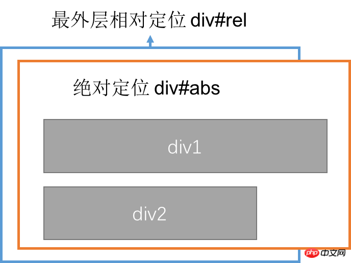

<p>
    </p><p>
        <img  src="/static/imghw/default1.png" data-src="images/pic1.jpeg" class="lazy" alt="Detailed explanation of the impact of CSS absolute positioning on element width" >
        <img  src="/static/imghw/default1.png" data-src="images/pic2.jpeg" class="lazy" alt="Detailed explanation of the impact of CSS absolute positioning on element width" >
    </p>
*{margin:0;padding: 0}#rel2{position: relative;width: 120px;height: 50px;background-color: yellow;}#abs2{position: absolute;top: 0;}img{float:left}#img1{width: 50px;height: 50px}#img2{width: 50px;height: 50px}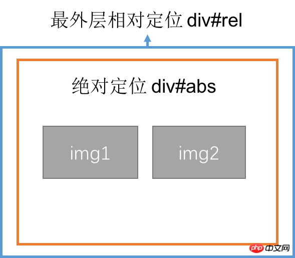 Of course, this situation should be under the premise that the left setting value is within a certain range (because the width is not set, it is auto) , so how to determine this range? When the width of an absolutely positioned element is exactly equal to its minimum and maximum values, use the above formula to find the range of left and set it to (containing block width - maximum absolutely positioned element width) ~ (containing block width - minimum absolutely positioned element width) When left is a certain value, the width of the absolutely positioned element is affected by the left value. You can use the above formula to find the width of the absolutely positioned element when left is a specific value.
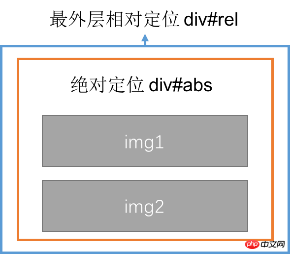
When the value of left is set outside the range mentioned above, the width of the absolutely positioned element has reached the extreme value and will no longer be affected by changes in left. At this time, right will no longer is 0, and will be automatically calculated to satisfy the following formula:
absolute positioning element P#ABS's left+width+right = width


The above is the detailed content of Detailed explanation of the impact of CSS absolute positioning on element width. For more information, please follow other related articles on the PHP Chinese website!


