How to use Bootstrap transition effect Transition modal box (Modal)
This article mainly introduces Bootstrap Transition effectTransition modal box (Modal), which is very good and has reference value. Friends who need it can refer to it
You can switch the hidden content of the modal plug-in:
1. Through the data attribute: on the controller element (such as button or link) Set the attribute data-toggle="modal", and also set data-target="#identifier" or href="#identifier" rel="external nofollow" To specify the specific modal box to switch (with id="identifier")
2. Through Javascript: Using this technology, you can use a simple line of Javascript to Call the modal box with id="identifier":
$('#identifier').modal(options)
<!DOCTYPE html>
<html>
  <head>
    <title>Bootstrap-模态框Modal</title>
    <meta charset="utf-8">
    <link rel="stylesheet" href="css/bootstrap.min.css" rel="external nofollow" >
  </head>
  <body>
  <p class="container">
    <h2 id="创建模态框-Modal">创建模态框(Modal)</h2>
    <!-- 按钮触发模态框 -->
    <button class="btn btn-primary btn-lg" data-toggle="modal" data-target="#myModal">开始演示模态框</button>
    <!-- 模态框(Modal) -->
    <p class="modal fade" id="myModal" tabindex="-1" role="dialog" aria-labelledby="myModalLabel" aria-hidden="true">
      <p class="modal-dialog">
        <p class="modal-content">
          <p class="modal-header">
            <button type="button" class="close"data-dismiss="modal" aria-hidden="true">×</button>
            <h4 id="nbsp-模态框-Modal-标题-nbsp"> 模态框(Modal)标题 </h4>
          </p>
          <p class="modal-body">
            在这里添加一些文本
          </p>
          <p class="modal-footer">
            <button type="button" class="btn btn-default"data-dismiss="modal">关闭</button>
            <button type="button" class="btn btn-primary">提交更改</button>
          </p>
        </p><!-- /.modal-content -->
      </p><!-- /.modal -->
    </p>
  <script src="js/jquery.min.js"></script>
  <script src="js/bootstrap.min.js"></script>
  </body>
</html>
Note:
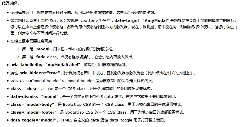
aria-labelledby="myModalLabel" aria-hidden="true"
Official API means that the role settings set for blind people or some readable devices tell the device that this is a pop-up box aria-labelledby=".." which contains the description information, and then aria-hidden="true" Hide it so that most people won't use it. It's more standard to write it this way
Enhance the accessibility of the modal box
Be sure to add role="dialog" to .modal and aria-labelledby="..." Attributes used to point to the title bar of the modal box; add aria-hidden="true" to .modal-dialog Attributes.
In addition, you should also add descriptive information to the modal box .modal through the aria-describedby attribute.
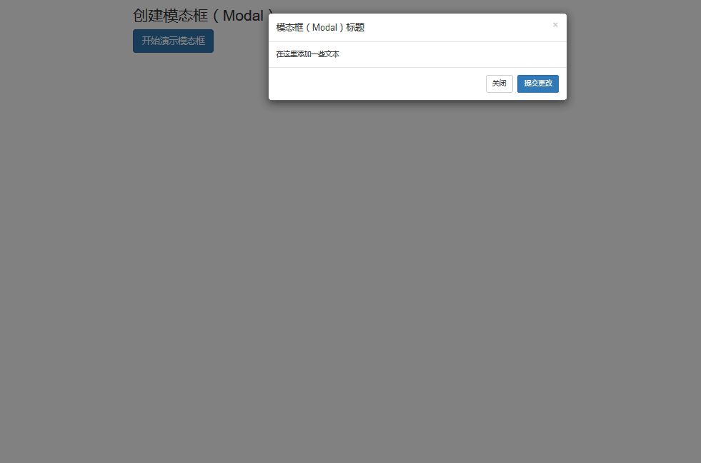
Rendering

Related articles:
Detailed explanation of how to implement basic layout with Bootstrap
BootStrap table usage analysis
JS component Bootstrap Table table row drag effect implementation code
The above is the detailed content of How to use Bootstrap transition effect Transition modal box (Modal). For more information, please follow other related articles on the PHP Chinese website!

Hot AI Tools

Undresser.AI Undress
AI-powered app for creating realistic nude photos

AI Clothes Remover
Online AI tool for removing clothes from photos.

Undress AI Tool
Undress images for free

Clothoff.io
AI clothes remover

AI Hentai Generator
Generate AI Hentai for free.

Hot Article

Hot Tools

Notepad++7.3.1
Easy-to-use and free code editor

SublimeText3 Chinese version
Chinese version, very easy to use

Zend Studio 13.0.1
Powerful PHP integrated development environment

Dreamweaver CS6
Visual web development tools

SublimeText3 Mac version
God-level code editing software (SublimeText3)

Hot Topics
 1378
1378
 52
52
 How to get the bootstrap search bar
Apr 07, 2025 pm 03:33 PM
How to use Bootstrap to get the value of the search bar: Determines the ID or name of the search bar. Use JavaScript to get DOM elements. Gets the value of the element. Perform the required actions.
 How to do vertical centering of bootstrap
Apr 07, 2025 pm 03:21 PM
Use Bootstrap to implement vertical centering: flexbox method: Use the d-flex, justify-content-center, and align-items-center classes to place elements in the flexbox container. align-items-center class method: For browsers that do not support flexbox, use the align-items-center class, provided that the parent element has a defined height.
 How to use bootstrap in vue
Apr 07, 2025 pm 11:33 PM
Using Bootstrap in Vue.js is divided into five steps: Install Bootstrap. Import Bootstrap in main.js. Use the Bootstrap component directly in the template. Optional: Custom style. Optional: Use plug-ins.
 How to write split lines on bootstrap
Apr 07, 2025 pm 03:12 PM
There are two ways to create a Bootstrap split line: using the tag, which creates a horizontal split line. Use the CSS border property to create custom style split lines.
 How to insert pictures on bootstrap
Apr 07, 2025 pm 03:30 PM
There are several ways to insert images in Bootstrap: insert images directly, using the HTML img tag. With the Bootstrap image component, you can provide responsive images and more styles. Set the image size, use the img-fluid class to make the image adaptable. Set the border, using the img-bordered class. Set the rounded corners and use the img-rounded class. Set the shadow, use the shadow class. Resize and position the image, using CSS style. Using the background image, use the background-image CSS property.
 How to resize bootstrap
Apr 07, 2025 pm 03:18 PM
To adjust the size of elements in Bootstrap, you can use the dimension class, which includes: adjusting width: .col-, .w-, .mw-adjust height: .h-, .min-h-, .max-h-
 How to set up the framework for bootstrap
Apr 07, 2025 pm 03:27 PM
To set up the Bootstrap framework, you need to follow these steps: 1. Reference the Bootstrap file via CDN; 2. Download and host the file on your own server; 3. Include the Bootstrap file in HTML; 4. Compile Sass/Less as needed; 5. Import a custom file (optional). Once setup is complete, you can use Bootstrap's grid systems, components, and styles to create responsive websites and applications.
 How to use bootstrap button
Apr 07, 2025 pm 03:09 PM
How to use the Bootstrap button? Introduce Bootstrap CSS to create button elements and add Bootstrap button class to add button text


