Detailed introduction to CSS floating
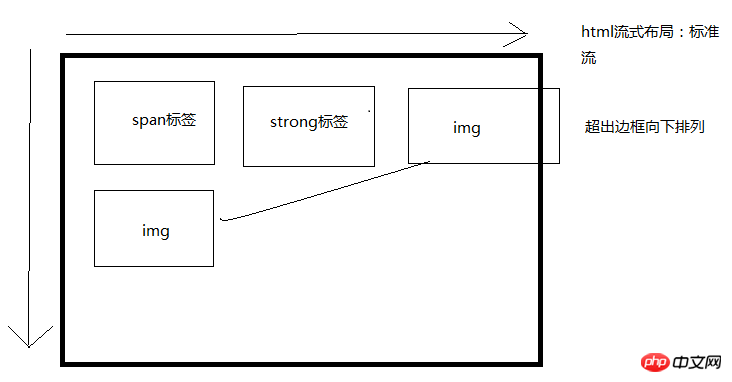
1. The standard flow is the default layout of the browser, which is the default scheduling layout from top to bottom and from left to right.

2. Layout method
2.1The essence of floating: solve the formatting problem of pictures and text side by side.
*After the element is floated, it will break away from the standard flow and affect its layout.
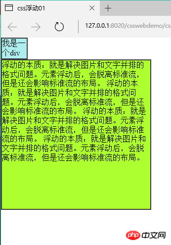
2.1.1 Before the float is set (before):

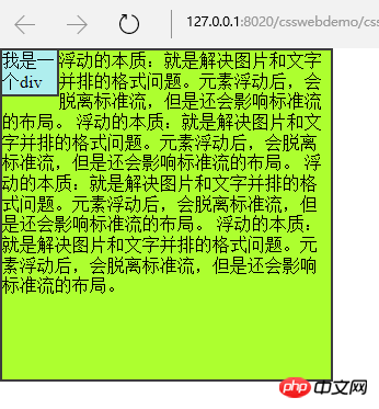
2.1.2. Set the float After(after)
* {
                padding: 0;
                margin: 0;
            }

            .box1 {
                width: 50px;
                height: 40px;
                background-color: #AFEEEE;
                border: 2px solid #3C3C3C;
                float: left;
            }

            .box2 {
                width: 300px;
                height: 300px;
                background-color: #ADFF2F;
                border: 2px solid #3C3C3C;

} *Floating elements will not occupy the space of the standard stream. But it will affect the formatting of text in the standard stream.
 3. Characteristics of floating
3.1. Floating is separated from the standard flow and does not occupy a position, which will affect the standard flow. Floating only floats left and right.
3.2. The arrangement position of floating element A is related to the previous element (block level). If the previous element has a float, the top of the A element will be aligned with the top of the previous element; if the previous element is a standard flow, the top of the A element will be aligned with the bottom of the previous element.
3.3. If one of the child boxes in a parent box is floated, all other children need to be floated in order to be displayed in one row.
3.4. Float displays the corresponding float according to the writing position of the element.
3.5. After the element is floated, if the width and height are not set, the element will have the characteristics of an inline block element. The size of the element depends entirely on the defined size or default content, that is, it has wrapping properties.
3.6. Floating is destructive: after the element is floated, it destroys the original normal flow layout and causes the content to collapse.
Note: If the parent box of a standard stream is not set high and all child boxes float, the height of the parent box will collapse to 0;
4. Solve the height caused by floating destructiveness Collapse problem
4.1.
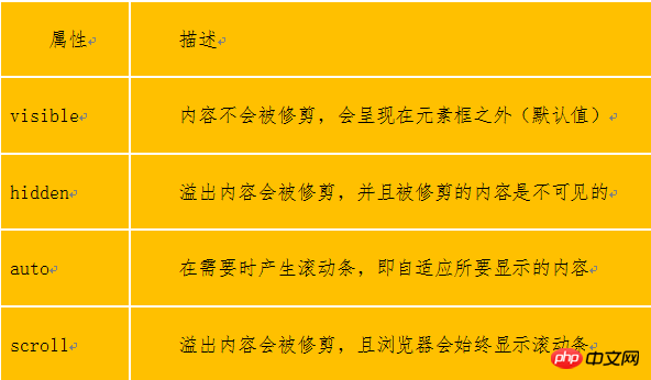
overflowMethod: Set overflow:hidden on the parent box; (make it wrapping)
<!DOCTYPE html>
<html>
    <head>
        <meta charset="UTF-8">
        <title>溢出处理案例</title>
        <style>
            .box1 {
                /*滚动条随着需要而产生*/
                height: 60px;
                width: 60px;
                overflow: auto;
                float: left;
                background-color: #5F9EA0;
            }

            .box2 {
                height: 60px;
                width: 60px;
                overflow: hidden;
                float: left;
                background-color: #ADFF2F;
            }

            .box3 {
                height: 60px;
                width: 60px;
                overflow: visible;
                float: left;
                background-color: #CCCCCC;
            }
            .box4 {
                /*始终有滚动条*/
                height: 160px;
                width: 160px;
                overflow: scroll;
                float: right;
                background-color: #FFC0CB;

            }
        </style>
    </head>
    <body>
        <div class="box1">overflow:auto;**minking 的博客minking 的博客minking 的博客</div>
        <hr />
        <div class="box2">overflow: hidden;**minking 的博客minking 的博客minking 的博客</div>
        <hr />
        <div class="box3">overflow: visible;**minking 的博客minking 的博客minking 的博客</div>
        <hr />
        <div class="box4">overflow: scroll;**minking 的博客minking 的博客minking 的博客</div>
    </body>
</html>
5. Supplement: BFC
Overflow can trigger the BFC of the element, allowing the element to have independent layout space and permissions. All elements within the BFC are typeset and typed according to the parent element. Layout, all parent elements have wrapping properties, which is the principle that solves the problem of height collapse.
For example: Floating can also trigger bfc, and then there are: positioning, overflow,
display: table, table-cell...6. Page center: website The core display area is usually displayed in the center. The widths are: 960px 980px 1000px 1190px 1200px;
7. Floating clearing: Only when there are no floating elements on the left and right sides of the current element will the element be displayed in the standard flow.
**********
clearThe above is the detailed content of Detailed introduction to CSS floating. For more information, please follow other related articles on the PHP Chinese website!

Hot AI Tools

Undresser.AI Undress
AI-powered app for creating realistic nude photos

AI Clothes Remover
Online AI tool for removing clothes from photos.

Undress AI Tool
Undress images for free

Clothoff.io
AI clothes remover

AI Hentai Generator
Generate AI Hentai for free.

Hot Article

Hot Tools

Notepad++7.3.1
Easy-to-use and free code editor

SublimeText3 Chinese version
Chinese version, very easy to use

Zend Studio 13.0.1
Powerful PHP integrated development environment

Dreamweaver CS6
Visual web development tools

SublimeText3 Mac version
God-level code editing software (SublimeText3)

Hot Topics
 Demystifying Screen Readers: Accessible Forms & Best Practices
Mar 08, 2025 am 09:45 AM
This is the 3rd post in a small series we did on form accessibility. If you missed the second post, check out "Managing User Focus with :focus-visible". In
 Create a JavaScript Contact Form With the Smart Forms Framework
Mar 07, 2025 am 11:33 AM
This tutorial demonstrates creating professional-looking JavaScript forms using the Smart Forms framework (note: no longer available). While the framework itself is unavailable, the principles and techniques remain relevant for other form builders.
 Adding Box Shadows to WordPress Blocks and Elements
Mar 09, 2025 pm 12:53 PM
The CSS box-shadow and outline properties gained theme.json support in WordPress 6.1. Let's look at a few examples of how it works in real themes, and what options we have to apply these styles to WordPress blocks and elements.
 Comparing the 5 Best PHP Form Builders (And 3 Free Scripts)
Mar 04, 2025 am 10:22 AM
This article explores the top PHP form builder scripts available on Envato Market, comparing their features, flexibility, and design. Before diving into specific options, let's understand what a PHP form builder is and why you'd use one. A PHP form
 Working With GraphQL Caching
Mar 19, 2025 am 09:36 AM
If you’ve recently started working with GraphQL, or reviewed its pros and cons, you’ve no doubt heard things like “GraphQL doesn’t support caching” or
 Making Your First Custom Svelte Transition
Mar 15, 2025 am 11:08 AM
The Svelte transition API provides a way to animate components when they enter or leave the document, including custom Svelte transitions.
 Show, Don't Tell
Mar 16, 2025 am 11:49 AM
How much time do you spend designing the content presentation for your websites? When you write a new blog post or create a new page, are you thinking about
 Classy and Cool Custom CSS Scrollbars: A Showcase
Mar 10, 2025 am 11:37 AM
In this article we will be diving into the world of scrollbars. I know, it doesn’t sound too glamorous, but trust me, a well-designed page goes hand-in-hand


