
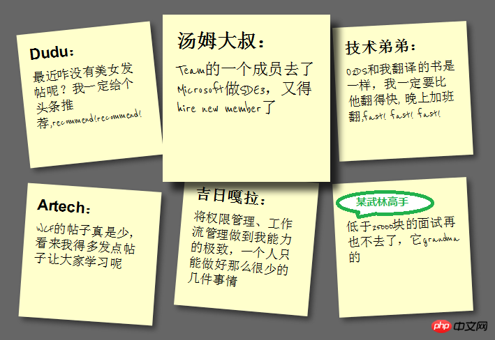
What this article will show you is how to use HTML5/CSS3 to create HTML with sticky note effect in just 5 steps Page, the renderings are as follows:
(Note: The text in the picture is purely fabricated, for humorous purposes, any similarity is purely coincidental, thank you! )
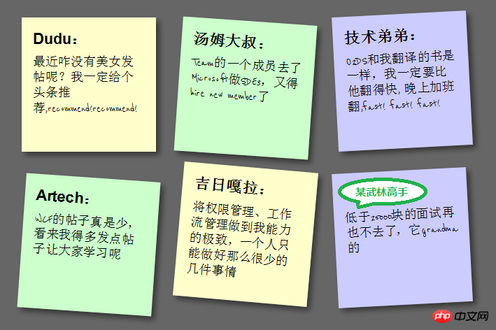
Note: This effect can be seen in Safari, Chrome, Firefox and Opera. The effect cannot be seen on IE due to incomplete support for HTML5.
First add the basic HTML structure and build the basic square. The code is as follows:
Dudu:
最近咋没有美女发帖呢?我一定给个头条推荐,recommend!recommend!


汤姆大叔:
Team的一个成员去了Microsoft做SDE3,又得hire new member了


技术弟弟:
O2DS和我翻译的书是一样,我一定要比他翻得快, 晚上加班翻,fast! fast! fast!


Artech:
WCF的帖子真是少,看来我得多发点帖子让大家学习呢


吉日嘎拉:
将权限管理、工作流管理做到我能力的极致,一个人只能做好那么很少的几件事情


某武林高手:
低于25000块的面试再也不去了,它grandma的
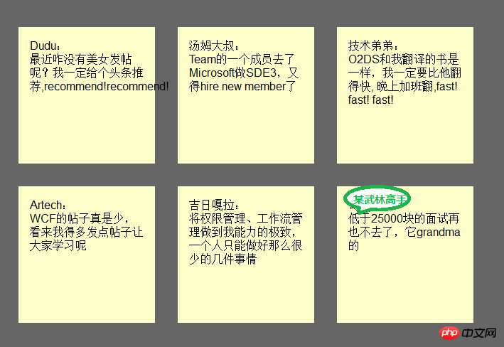
Add an href to each note Connection, mainly to support keyboard access, the CSS code is as follows:
{:;:;}{:;:;:;:;:;}{:;:;}{:;}{:;:;}{:;:;:;:;:;:;:;}{:;:;}The effect is as follows:
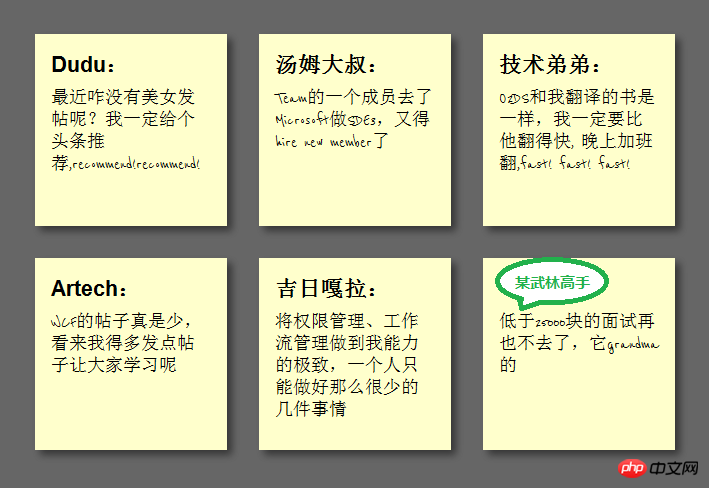
This step is to achieve the square shadow effect and change the font to cursive (English only), because Google provides support for Font API , so we can use it directly. First add the call to the Google API:
<link href="http://fonts.googleapis.com/css?family=Reenie+Beanie:regular" rel="stylesheet" type="text/css">
and then set the reference to this font:
{:;:;:;}{:;:;}Regarding the shadow, since each browser still has Neither of them are fully supported, so they need to be processed separately. The code is as follows:
{:;:;:;:;:;:;:; :; :; :;}The effect is as follows:
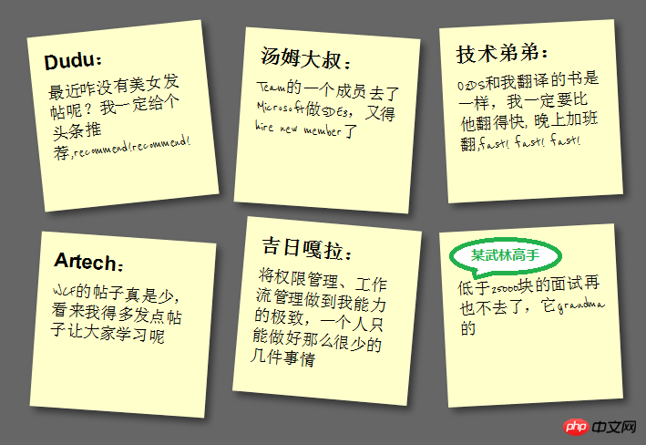
In order to make the square tilt, we need to add the following code in li->a:
{:;:;:;}But in order to make the square tilt randomly instead of all tilting, we need to use a new CSS3 selector to make the square In every 2 tilts, 4 deg, every 3 tilts, negative 3 deg, and every 5 tilts, 5 deg:
{:;:;:;:;:;}{:;:;:;:;:;}{:;:;:;:;:;}The effect is as follows:
To achieve the scaling effect during Hover and Focus, we need to add the following code:
{:;:;:;:;:;:;:;:;}Set z-index The value of 5 is to allow the square to cover other squares when zooming in. At the same time, because focus is also set, the Tab key is also supported for switching access. The effect is as follows:
The special effects in the fourth step look a bit stiff. We can add Transition to achieve a smooth animation effect. In addition, the color is relatively single. We can set different colors. First add Transition in ul->li->a:
<span style="max-width:90%"> -moz-transition:-moz-transform .15s linear; <br/> -o-transition:-o-transform .15s linear; <br/> -webkit-transition:-webkit-transform .15s linear; </span>
and then define different colors in even and 3n:
{:;:;:;:;:;:;}{:;:;:;:;:;:;}In this way, This completes our final effect:

At this point, we have used the basic features of HTML5 and CSS3 to make a pretty good sticky note The effect is that HTML5/CSS3 is indeed very powerful. If you add some advanced features, such as combining it with JavaScript, you can achieve even more awesome effects. You can see this from the HTML5 Lab series of articles given by Dang Knight Brick. .
The above is the detailed content of Use HTML5/CSS3 to quickly create special effects code examples for sticky notes in five steps (pictures and text). For more information, please follow other related articles on the PHP Chinese website!


