 Web Front-end
 CSS Tutorial
 CSS layout flex implements div cross arrangement and bottom alignment method
CSS layout flex implements div cross arrangement and bottom alignment method
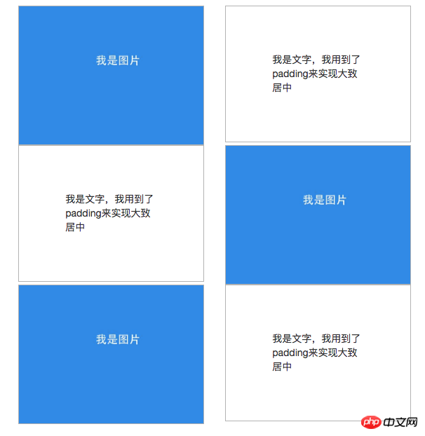
When I was writing a page using wordpress recently, the designer came up with a web page layout pattern that I had never encountered before. Its rendering on a computer (resolution greater than 768px) is as follows:

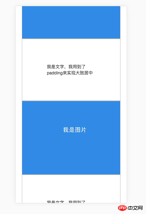
On mobile phones (resolution is less than or equal to 768px), it is required to be arranged like this:

I thought of two methods
The first is to use bootstrap's row and col-md together with col-md-push and col-md-pull to achieve . The code is as follows:
1 nbsp;html> 2 3 4 <meta> 5 <meta> 6 <link> 7 <title>p左右交叉布局--文字和图片交叉</title> 8 9 10 <style>11 .C {12 margin: auto;13 padding: 30px 20px 40px;14 max-width: 600px;15 }16 .I {17 width: 100%;18 }19 .IW, .TW {20 border: 1px solid rgba(0, 0, 0, 0.3);;21 }22 .TW {23 padding: 25%;24 }25 </style>26 <p>27 </p><p>28 </p><p>29 </p><p>30 <img class="I lazy" src="/static/imghw/default1.png" data-src="../../asset/images/flex/r1.jpg" alt="CSS layout flex implements div cross arrangement and bottom alignment method" >31 </p>32 33 <p>34 </p><p>我是文字,我用到了padding来实现大致居中</p>35 36 37 <p>38 </p><p>39 </p><p>40 <img class="I lazy" src="/static/imghw/default1.png" data-src="../../asset/images/flex/r1.jpg" alt="CSS layout flex implements div cross arrangement and bottom alignment method" >41 </p>42 43 <p>44 </p><p>我是文字,我用到了padding来实现大致居中</p>45 46 47 <p>48 </p><p>49 </p><p>50 <img class="I lazy" src="/static/imghw/default1.png" data-src="../../asset/images/flex/r1.jpg" alt="CSS layout flex implements div cross arrangement and bottom alignment method" >51 </p>52 53 <p>54 </p><p>我是文字,我用到了padding来实现大致居中</p>55 56 57 58 59 Effect on computer:

Effect on mobile phone:

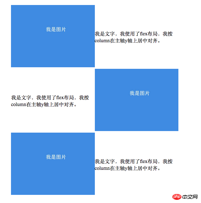
The second method uses flex-direction: row-reverse in flex layout to implement , the code is as follows:
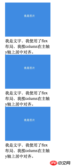
1 nbsp;html> 2 3 4 <meta> 5 <meta> 6 <title>p左右交叉布局--文字和图片交叉</title> 7 8 9 <style>10 .C {11 margin: auto;12 padding: 30px 20px 40px;13 max-width: 600px;14 }15 .R {16 display: block;17 width: 100%;18 }19 @media only screen and (min-width: 768px) {20 .R {21 display: flex;22 width: 100%;23 }24 }25 .R:nth-child(even) {26 flex-direction: row-reverse;27 }28 .I, .W {29 width: 50%;30 }31 .I img {32 width: 100%;33 }34 .W {35 display: flex;36 flex-direction: column;37 font-size: 16px;38 justify-content: center;39 }40 </style>41 <p>42 </p><p>43 </p><p><img src="/static/imghw/default1.png" data-src="../images/flex/r1.jpg" class="lazy" alt="CSS layout flex implements div cross arrangement and bottom alignment method" ></p>44 <p>我是文字,我使用了flex布局,我按column在主轴y轴上居中对齐。</p>45 46 <p>47 </p><p><img src="/static/imghw/default1.png" data-src="../images/flex/r1.jpg" class="lazy" alt="CSS layout flex implements div cross arrangement and bottom alignment method" ></p>48 <p>我是文字,我使用了flex布局,我按column在主轴y轴上居中对齐。</p>49 50 <p>51 </p><p><img src="/static/imghw/default1.png" data-src="../images/flex/r1.jpg" class="lazy" alt="CSS layout flex implements div cross arrangement and bottom alignment method" ></p>52 <p>我是文字,我使用了flex布局,我按column在主轴y轴上居中对齐。</p>53 54 55 56 The effect on the computer is as follows:


.R:nth-child(even) { flex-direction: row-reverse; }, and then arrange it normally on the mobile phone .R { display: block; width: 100%; }.
I also found that using flex can easily achieve bottom alignment of two ps. The specific code is as follows:.C {
display: flex;
align-items: flex-end;
}
.A {
background: rgba(255, 0, 0, 0.1);
}
.A:nth-child(odd) {
background: #1a88ea;
color: white;
font-size: 30px;
padding: 10px 15px;
}<p>
</p><p>创新</p>
<p>实验基地</p>align-items: flex-end;
The effect is as follows:
##Of course, other methods can also be used to achieve this. For example, let C be positioned relatively, let one p in C be positioned absolutely, and then set bottom to 0. The code is as follows, and the effect is the same as above.
<style>.C {
  position: relative;}.A {
  display: inline-block;
  background: rgba(255, 0, 0, 0.1);}.A:nth-child(odd) {
  background: #1a88ea;
  color: white;
  font-size: 30px;
  padding: 10px 15px;}.A:nth-child(even) {
  bottom: 0;
  position: absolute;}</style><p>
  </p><p>创新</p>
<p>实验基地</p>But obviously, it is easier to implement with flex.
The above is the detailed content of CSS layout flex implements div cross arrangement and bottom alignment method. For more information, please follow other related articles on the PHP Chinese website!

Hot AI Tools

Undresser.AI Undress
AI-powered app for creating realistic nude photos

AI Clothes Remover
Online AI tool for removing clothes from photos.

Undress AI Tool
Undress images for free

Clothoff.io
AI clothes remover

AI Hentai Generator
Generate AI Hentai for free.

Hot Article

Hot Tools

Notepad++7.3.1
Easy-to-use and free code editor

SublimeText3 Chinese version
Chinese version, very easy to use

Zend Studio 13.0.1
Powerful PHP integrated development environment

Dreamweaver CS6
Visual web development tools

SublimeText3 Mac version
God-level code editing software (SublimeText3)

Hot Topics
 1386
1386
 52
52
 Working With GraphQL Caching
Mar 19, 2025 am 09:36 AM
If you’ve recently started working with GraphQL, or reviewed its pros and cons, you’ve no doubt heard things like “GraphQL doesn’t support caching” or
 Building an Ethereum app using Redwood.js and Fauna
Mar 28, 2025 am 09:18 AM
With the recent climb of Bitcoin’s price over 20k $USD, and to it recently breaking 30k, I thought it’s worth taking a deep dive back into creating Ethereum
 Vue 3
Apr 02, 2025 pm 06:32 PM
It's out! Congrats to the Vue team for getting it done, I know it was a massive effort and a long time coming. All new docs, as well.
 Can you get valid CSS property values from the browser?
Apr 02, 2025 pm 06:17 PM
I had someone write in with this very legit question. Lea just blogged about how you can get valid CSS properties themselves from the browser. That's like this.
 A bit on ci/cd
Apr 02, 2025 pm 06:21 PM
I'd say "website" fits better than "mobile app" but I like this framing from Max Lynch:
 Comparing Browsers for Responsive Design
Apr 02, 2025 pm 06:25 PM
There are a number of these desktop apps where the goal is showing your site at different dimensions all at the same time. So you can, for example, be writing
 Using Markdown and Localization in the WordPress Block Editor
Apr 02, 2025 am 04:27 AM
If we need to show documentation to the user directly in the WordPress editor, what is the best way to do it?
 Stacked Cards with Sticky Positioning and a Dash of Sass
Apr 03, 2025 am 10:30 AM
The other day, I spotted this particularly lovely bit from Corey Ginnivan’s website where a collection of cards stack on top of one another as you scroll.


