 Web Front-end
 H5 Tutorial
 HTML5 mobile application development-detailed introduction to the role of viewport (pictures and texts)
HTML5 mobile application development-detailed introduction to the role of viewport (pictures and texts)
When using HTML5 to develop mobile applications or mobile web pages, there will always be the following code in the
section. What does this code mean? On the Internet, you will get many answers. I collected some introductions from the Internet and organized them for future reference.<meta name="viewport" content="width=device-width,height=device-height,inital-scale=1.0,maximum-scale=1.0,user-scalable=no;" />
What is Viewport
The mobile browser places the page in a virtual "window" (viewport). Usually this virtual "window" (viewport ) wider than the screen, so that instead of squeezing each web page into a tiny window (which would break the layout of web pages not optimized for mobile browsers), users can pan and zoom to see different parts of the web page. The mobile version of Safari browser recently introduced the viewport meta tag, which allows web developers to control the size and zoom of the viewport. Other mobile browsers also basically support it.
width: Control the size of the viewport, you can specify a value, if 600, or a special value, such as device-width is the width of the device (unit is when the zoom is 100% CSS pixels).
height: Corresponds to width, specifying the height.
initial-scale: Initial scaling ratio, that is, the scaling ratio when the page is loaded for the first time.
maximum-scale: The maximum ratio the user is allowed to zoom to.
minimum-scale: The minimum ratio the user is allowed to zoom to.
user-scalable:Whether the user can manually zoom
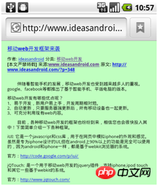
"viewport", translated into Chinese can be called "viewport", Everyone knows that the screen of mobile devices is generally much smaller than that of PCs. The webkit browser will map a larger "virtual" window to the screen of the mobile device. The default virtual window is 980 pixels wide (the current standard for most websites). width) and then scale according to a certain ratio (3:1 or 2:1). That is to say, when we load a normal web page, webkit will first load the web page with the browser standard of 980 pixels, and then reduce it to a width of 490 pixels. Note that this reduction is a global reduction, that is, all elements on the page will be reduced. As shown in the figure below, the effect of an ordinary article page on a mobile device:

The page is loaded at 980 pixels without deformation, but after scaling, a lot of Things are basically invisible to the naked eye.
So can we artificially change the viewport of webkit? Of course you can, add the following viewport code between and :<meta name="viewport" content="width=500"/>
force viewport size command to the page How about it? As shown in the picture below:

device-width will automatically detect the screen width of the mobile device:
<span style="max-width:90%"><</span><span style="color: #800000;">meta </span><span style="color: #ff0000;">name</span><span style="color: #0000ff;">="viewport"</span><span style="color: #ff0000;"> content</span><span style="color: #0000ff;">="width=device-width"</span> <span style="color: #0000ff;">/><br/></span>

The above is the detailed content of HTML5 mobile application development-detailed introduction to the role of viewport (pictures and texts). For more information, please follow other related articles on the PHP Chinese website!

Hot AI Tools

Undresser.AI Undress
AI-powered app for creating realistic nude photos

AI Clothes Remover
Online AI tool for removing clothes from photos.

Undress AI Tool
Undress images for free

Clothoff.io
AI clothes remover

AI Hentai Generator
Generate AI Hentai for free.

Hot Article

Hot Tools

Notepad++7.3.1
Easy-to-use and free code editor

SublimeText3 Chinese version
Chinese version, very easy to use

Zend Studio 13.0.1
Powerful PHP integrated development environment

Dreamweaver CS6
Visual web development tools

SublimeText3 Mac version
God-level code editing software (SublimeText3)

Hot Topics
 1378
1378
 52
52
 Table Border in HTML
Sep 04, 2024 pm 04:49 PM
Guide to Table Border in HTML. Here we discuss multiple ways for defining table-border with examples of the Table Border in HTML.
 HTML margin-left
Sep 04, 2024 pm 04:48 PM
Guide to HTML margin-left. Here we discuss a brief overview on HTML margin-left and its Examples along with its Code Implementation.
 Nested Table in HTML
Sep 04, 2024 pm 04:49 PM
This is a guide to Nested Table in HTML. Here we discuss how to create a table within the table along with the respective examples.
 HTML Table Layout
Sep 04, 2024 pm 04:54 PM
Guide to HTML Table Layout. Here we discuss the Values of HTML Table Layout along with the examples and outputs n detail.
 HTML Input Placeholder
Sep 04, 2024 pm 04:54 PM
Guide to HTML Input Placeholder. Here we discuss the Examples of HTML Input Placeholder along with the codes and outputs.
 HTML Ordered List
Sep 04, 2024 pm 04:43 PM
Guide to the HTML Ordered List. Here we also discuss introduction of HTML Ordered list and types along with their example respectively
 Moving Text in HTML
Sep 04, 2024 pm 04:45 PM
Guide to Moving Text in HTML. Here we discuss an introduction, how marquee tag work with syntax and examples to implement.
 HTML onclick Button
Sep 04, 2024 pm 04:49 PM
Guide to HTML onclick Button. Here we discuss their introduction, working, examples and onclick Event in various events respectively.


