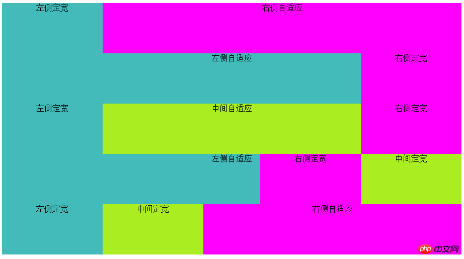
1. Two-column layout, fixed width on the left, adaptive on the right
<div class="grid1">
    <div class="left_1">左侧定宽</div>
    <div class="right_1">右侧自适应</div>
</div>
.left_1{float:left; width:200px;}
.right_1{margin-left:200px;}2. Two-column layout, adaptive on the left, fixed width on the right
<div class="grid2 clearfix">
    <div class="left_2">左侧自适应</div>
    <div class="right_2">右侧定宽</div>
</div>.left_2{float:left; width:100%; margin-right:-200px;}
.right_2{float:right; width:200px;}3. Three-column layout, fixed width on both sides, adaptive in the middle
<div class="grid3 clearfix">
    <div class="left_3">左侧定宽</div>
    <div class="center_3">中间自适应</div>
    <div class="right_3">右侧定宽</div>
</div>.left_3, .right_3{position:relative; float:left; width:200px;}
.left_3{margin-right:-200px;}
.right_3{margin-left:-200px;}
.center_3{float:left; width:100%;}4. Three-column layout, adaptive on the left, fixed width in the middle and right side
<div class="grid4 clearfix">
    <div class="left_4">左侧自适应</div>
    <div class="center_4">中间定宽</div>
    <div class="right_4">右侧定宽</div>
</div>.center_4, .right_4{position:relative; float:right; width:200px;}
.left_4{float:left; width:100%; margin-right:-400px;}5. Three-column layout, left Side and middle fixed width, right side adaptive
<div class="grid5">
    <div class="left_5">左侧定宽</div>
    <div class="center_5">中间定宽</div>
    <div class="right_5">右侧自适应</div>
</div>.left_5, .center_5{position:relative; float:left;width:200px;}
.right_5{margin-left:400px;}

The above writing method is compatible with 5 major browsers, and IE6 to IE8 browsers
The above is the detailed content of Detailed explanation of CSS responsive layout compatible with IE6 method code. For more information, please follow other related articles on the PHP Chinese website!
 IIS unexpected error 0x8ffe2740 solution
 flac format
 What are the e-commerce platforms?
 The difference between ++a and a++ in c language
 Where should I fill in my place of birth: province, city or county?
 What is the difference between 5g and 4g
 How to use btbook magnetic search
 How to configure the path environment variable in java


