
 Web Front-end
H5 Tutorial
HTML5 practice-detailed introduction to three-step implementation of responsive design
Web Front-end
H5 Tutorial
HTML5 practice-detailed introduction to three-step implementation of responsive design
HTML5 practice-detailed introduction to three-step implementation of responsive design

Responsive web design is no longer difficult. If you are not familiar with it yet, and if you are a beginner, responsive design may be a bit complicated for you, but in fact it is simpler than you think. Much. In order to help you learn responsive design faster, I specially wrote this tutorial. In three simple steps, you can master the basic logic and media queries of responsive design (assuming you have knowledge of CSS).
Step 1. Meta tag
Most mobile browsers will adjust the width of the page to the viewport width to adapt to the screen display . Here we will use the viewport tag. For example, the following statement will be added between <head> to tell the browser to use the width of the device as the width of the viewport and cancel the initial scale function.
<meta name="viewport" content="width=device-width, initial-scale=1.0">
IE8 and previous browsers do not support media query. We need to use media-queries.js or respond.js to implement IE browser support for media query.
<!--[if lt IE 9]>
    <script src="http://css3-mediaqueries-js.googlecode.com/svn/trunk/css3-mediaqueries.js"></script>
<![endif]-->Step 2. HTML structure
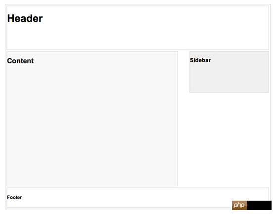
In this example, I have a basic page structure, including header, content container, sidebar and footer. The height of the header is fixed at 180px, the width of the content container is 600px, and the width of the sidebar is 300px.
Step 3. Media Queries
CSS3 media query is a technique used in responsive design. It's like writing a conditional statement to tell the browser how to display the page under a specific viewport width.
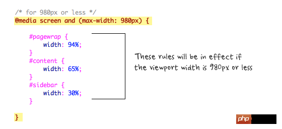
For example, the following command will work when the width of the viewport is equal to or less than 980px. Generally speaking, I will use percentage values instead of pixel values to set the width of the container, so that the effect of fluid layout can be achieved.
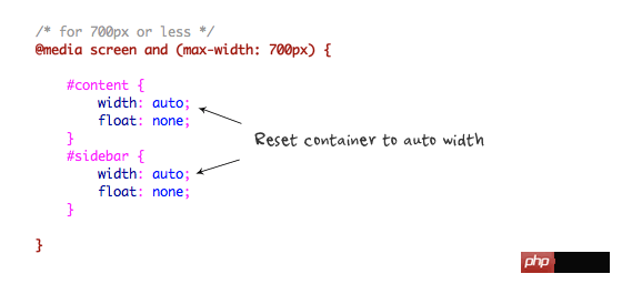
When the viewport is equal to or less than 700px, set the width of #content and #sidebar to auto, and remove float, so that they will Display in full width mode.
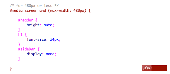
For mobile screens of 480px or smaller, set the height of #header to automatic, the font size of h1 to 24px, and hide the #sidebar.
You can add as many media queries as needed. In my demo, I only added three media queries. The purpose of media query is to use different css to achieve page layout based on the width of a specific viewport. The media query can be in one css file or distributed among several css files.
Summarize
The above is the detailed content of HTML5 practice-detailed introduction to three-step implementation of responsive design. For more information, please follow other related articles on the PHP Chinese website!

Hot AI Tools

Undresser.AI Undress
AI-powered app for creating realistic nude photos

AI Clothes Remover
Online AI tool for removing clothes from photos.

Undress AI Tool
Undress images for free

Clothoff.io
AI clothes remover

AI Hentai Generator
Generate AI Hentai for free.

Hot Article
Hot Tools

Notepad++7.3.1
Easy-to-use and free code editor

SublimeText3 Chinese version
Chinese version, very easy to use

Zend Studio 13.0.1
Powerful PHP integrated development environment

Dreamweaver CS6
Visual web development tools

SublimeText3 Mac version
God-level code editing software (SublimeText3)
Hot Topics
 1377
1377
 52
52

 Table Border in HTML
Sep 04, 2024 pm 04:49 PM
Table Border in HTML
Sep 04, 2024 pm 04:49 PM
Guide to Table Border in HTML. Here we discuss multiple ways for defining table-border with examples of the Table Border in HTML.
 HTML margin-left
Sep 04, 2024 pm 04:48 PM
HTML margin-left
Sep 04, 2024 pm 04:48 PM
Guide to HTML margin-left. Here we discuss a brief overview on HTML margin-left and its Examples along with its Code Implementation.
 Nested Table in HTML
Sep 04, 2024 pm 04:49 PM
Nested Table in HTML
Sep 04, 2024 pm 04:49 PM
This is a guide to Nested Table in HTML. Here we discuss how to create a table within the table along with the respective examples.
 HTML Table Layout
Sep 04, 2024 pm 04:54 PM
HTML Table Layout
Sep 04, 2024 pm 04:54 PM
Guide to HTML Table Layout. Here we discuss the Values of HTML Table Layout along with the examples and outputs n detail.
 HTML Ordered List
Sep 04, 2024 pm 04:43 PM
HTML Ordered List
Sep 04, 2024 pm 04:43 PM
Guide to the HTML Ordered List. Here we also discuss introduction of HTML Ordered list and types along with their example respectively
 HTML Input Placeholder
Sep 04, 2024 pm 04:54 PM
HTML Input Placeholder
Sep 04, 2024 pm 04:54 PM
Guide to HTML Input Placeholder. Here we discuss the Examples of HTML Input Placeholder along with the codes and outputs.
 Moving Text in HTML
Sep 04, 2024 pm 04:45 PM
Moving Text in HTML
Sep 04, 2024 pm 04:45 PM
Guide to Moving Text in HTML. Here we discuss an introduction, how marquee tag work with syntax and examples to implement.
 HTML onclick Button
Sep 04, 2024 pm 04:49 PM
HTML onclick Button
Sep 04, 2024 pm 04:49 PM
Guide to HTML onclick Button. Here we discuss their introduction, working, examples and onclick Event in various events respectively.
