

HTML5 practice-CSS3 Media Queries detailed introduction

CSS2 allows you to style specific media types, such as screens or printers. CSS3 provides more powerful media queries. You can set expression for different media types and set different styles according to different conditions. For example, you can set one style for large screens and another style for mobile. This function is quite powerful. You can provide different style effects for different devices without modifying the page content. In the following lessons we will introduce some sites that use this technology.
CSS3 Media Queries
Open my demo page, adjust the browser size, and check the page layout changes.
Max Width
When the page view area is less than 600px wide, css will be used.
@media screen and (max-width: 600px) {
  .class {
    background: #ccc;
}}You can also use the following method to reference external css files in the
of the page.<link rel="stylesheet" media="screen and (max-width: 600px)" href="small.css" />
Min Width
When the view area is larger than 900px width, css will be used.
@media screen and (min-width: 900px) {
  .class {
    background: #666;
}}Multiple Media Queries
You can combine multiple media queries together. When the width of the view area is between 600px and 900px, the following will be used css.
@media screen and (min-width: 600px) and (max-width: 900px) {
  .class {
    background: #333;
}}Device Width
The following css will be used when max-device-width is 480px, such as iPhone.
Note: max-device-width refers to the actual resolution of the device, and max-width refers to the area size.
@media screen and (max-device-width: 480px) {
  .class {
    background: #000;
}}For iPhone 4
The following is the css for iphone4.
<link rel="stylesheet" media="only screen and (-webkit-min-device-pixel-ratio: 2)" type="text/css" href="iphone4.css" />
For iPad
You can also check the positioning (portrait or landscapse) on iPad.
<link rel="stylesheet" media="all and (orientation:portrait)" href="portrait.css">
<link rel="stylesheet" media="all and (orientation:landscape)" href="landscape.css">
Media Queries for Internet Explorer
Because IE8 and previous versions of IE browsers do not support media queries, you need to use JavaScript hacks to solve the problem. Here are some solutions:
CSS Tricks - Using jquery to determine browser size
The Man in Blue - Using Javascript ( This article was written six years ago)
jQuery Media Queries plugin
Sample site
You The following sites can be accessed using browsers that support media query, such as Firefox, Chrome, and Safari. You can see how their layout responds to the browser width.
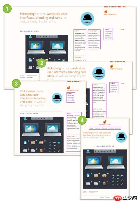
Hicksdesign
##Large size: 3 column sidebar
Small size: 2 columns of sidebars (the middle sidebar runs to the left)
Smaller size: 1 column of sidebars (the rightmost one runs below the logo)
Minimum size: No sidebar (logo and sidebar on the right move up, other sidebars move down)
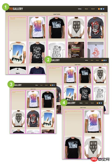
visual area of the browser.
Large size:Navigation at the top, 1 line of pictures
Medium size: Navigation on the left, 3 columns of images
Small size: Navigation on the top, logo without background image, 3 columns of images
The above is the detailed content of HTML5 practice-CSS3 Media Queries detailed introduction. For more information, please follow other related articles on the PHP Chinese website!

Hot AI Tools

Undresser.AI Undress
AI-powered app for creating realistic nude photos

AI Clothes Remover
Online AI tool for removing clothes from photos.

Undress AI Tool
Undress images for free

Clothoff.io
AI clothes remover

AI Hentai Generator
Generate AI Hentai for free.

Hot Article
Hot Tools

Notepad++7.3.1
Easy-to-use and free code editor

SublimeText3 Chinese version
Chinese version, very easy to use

Zend Studio 13.0.1
Powerful PHP integrated development environment

Dreamweaver CS6
Visual web development tools

SublimeText3 Mac version
God-level code editing software (SublimeText3)
Hot Topics
 1378
1378
 52
52

 Table Border in HTML
Sep 04, 2024 pm 04:49 PM
Table Border in HTML
Sep 04, 2024 pm 04:49 PM
Guide to Table Border in HTML. Here we discuss multiple ways for defining table-border with examples of the Table Border in HTML.
 HTML margin-left
Sep 04, 2024 pm 04:48 PM
HTML margin-left
Sep 04, 2024 pm 04:48 PM
Guide to HTML margin-left. Here we discuss a brief overview on HTML margin-left and its Examples along with its Code Implementation.
 Nested Table in HTML
Sep 04, 2024 pm 04:49 PM
Nested Table in HTML
Sep 04, 2024 pm 04:49 PM
This is a guide to Nested Table in HTML. Here we discuss how to create a table within the table along with the respective examples.
 HTML Table Layout
Sep 04, 2024 pm 04:54 PM
HTML Table Layout
Sep 04, 2024 pm 04:54 PM
Guide to HTML Table Layout. Here we discuss the Values of HTML Table Layout along with the examples and outputs n detail.
 HTML Input Placeholder
Sep 04, 2024 pm 04:54 PM
HTML Input Placeholder
Sep 04, 2024 pm 04:54 PM
Guide to HTML Input Placeholder. Here we discuss the Examples of HTML Input Placeholder along with the codes and outputs.
 HTML Ordered List
Sep 04, 2024 pm 04:43 PM
HTML Ordered List
Sep 04, 2024 pm 04:43 PM
Guide to the HTML Ordered List. Here we also discuss introduction of HTML Ordered list and types along with their example respectively
 Moving Text in HTML
Sep 04, 2024 pm 04:45 PM
Moving Text in HTML
Sep 04, 2024 pm 04:45 PM
Guide to Moving Text in HTML. Here we discuss an introduction, how marquee tag work with syntax and examples to implement.
 HTML onclick Button
Sep 04, 2024 pm 04:49 PM
HTML onclick Button
Sep 04, 2024 pm 04:49 PM
Guide to HTML onclick Button. Here we discuss their introduction, working, examples and onclick Event in various events respectively.
