 Web Front-end
 H5 Tutorial
 HTML5 practice-detailed graphic and text explanation of scalable mobile search box
HTML5 practice-detailed graphic and text explanation of scalable mobile search box
Today I will introduce how to use CSS to create a scalable mobile search box, which is very suitable for the needs of mobile responsive design. This tutorial does not use JavaScript, only native cssproperties, so this is a very simple and efficient implementation.
Purpose
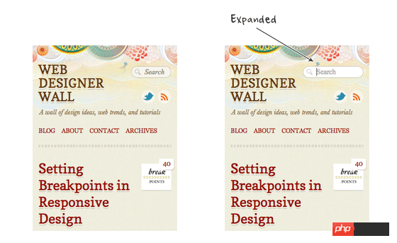
When displaying information on mobile devices, every inch of land must be valued and every inch of the screen must be cherished. For example, the design of the search box is in a contracted state under normal circumstances and expands when activated. This can provide more display area for other elements on the screen. That's what this course does. Let’s take a look at a rendering first:
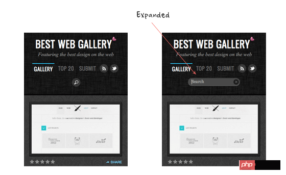
There is a similar design on my site Best Web Gallery. When the query button When clicked, the focus event of jquery is triggered to fade into the search box.
HTML code
The following code uses the search tag of html5:
<form>
<input type="search" placeholder="Search"></form>Reset the webkit default search input box
The default webkit input box style is as follows:
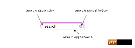
In order to remove the default effect and make it look more Like a general text input box, we need to add the following css:
input[type=search] {
    -webkit-appearance: textfield;
    -webkit-box-sizing: content-box;
    font-family: inherit;
    font-size: 100%;
}input::-webkit-search-decoration,
input::-webkit-search-cancel-button {
    display: none;
}Setting the input box style
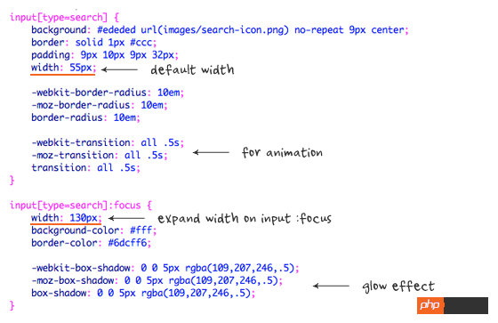
I will not explain each css statement line by line. Only a few points are emphasized here. The width of the search I set by default is 55px. When it is in focus, it will expand and the width will become 130px. The transition attribute implements the animation effect, and Box-shadow is used to achieve a glowing effect on the input box.
Example B
In demo B, the search box is minimized, with only a query icon and no text input part. I changed the padding and width properties of search to display a perfectly round button. I also use color:transparent to hide the text area.
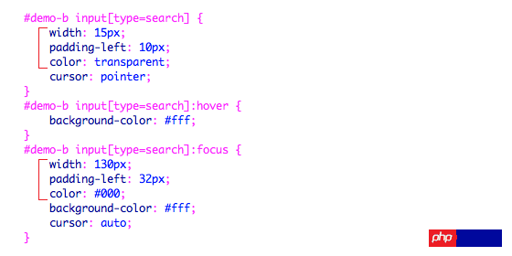
:focuspseudo-class.
The above is the detailed content of HTML5 practice-detailed graphic and text explanation of scalable mobile search box. For more information, please follow other related articles on the PHP Chinese website!

Hot AI Tools

Undresser.AI Undress
AI-powered app for creating realistic nude photos

AI Clothes Remover
Online AI tool for removing clothes from photos.

Undress AI Tool
Undress images for free

Clothoff.io
AI clothes remover

Video Face Swap
Swap faces in any video effortlessly with our completely free AI face swap tool!

Hot Article

Hot Tools

Notepad++7.3.1
Easy-to-use and free code editor

SublimeText3 Chinese version
Chinese version, very easy to use

Zend Studio 13.0.1
Powerful PHP integrated development environment

Dreamweaver CS6
Visual web development tools

SublimeText3 Mac version
God-level code editing software (SublimeText3)

Hot Topics
 1387
1387
 52
52
 Table Border in HTML
Sep 04, 2024 pm 04:49 PM
Guide to Table Border in HTML. Here we discuss multiple ways for defining table-border with examples of the Table Border in HTML.
 HTML margin-left
Sep 04, 2024 pm 04:48 PM
Guide to HTML margin-left. Here we discuss a brief overview on HTML margin-left and its Examples along with its Code Implementation.
 Nested Table in HTML
Sep 04, 2024 pm 04:49 PM
This is a guide to Nested Table in HTML. Here we discuss how to create a table within the table along with the respective examples.
 HTML Table Layout
Sep 04, 2024 pm 04:54 PM
Guide to HTML Table Layout. Here we discuss the Values of HTML Table Layout along with the examples and outputs n detail.
 HTML Input Placeholder
Sep 04, 2024 pm 04:54 PM
Guide to HTML Input Placeholder. Here we discuss the Examples of HTML Input Placeholder along with the codes and outputs.
 Moving Text in HTML
Sep 04, 2024 pm 04:45 PM
Guide to Moving Text in HTML. Here we discuss an introduction, how marquee tag work with syntax and examples to implement.
 HTML Ordered List
Sep 04, 2024 pm 04:43 PM
Guide to the HTML Ordered List. Here we also discuss introduction of HTML Ordered list and types along with their example respectively
 HTML onclick Button
Sep 04, 2024 pm 04:49 PM
Guide to HTML onclick Button. Here we discuss their introduction, working, examples and onclick Event in various events respectively.


