
Today our content is an introduction to the text-shadow, box-shadow and border-radius properties of CSS3. They can enhance the page layout and are worth learning.
The first three values code the value of RBG respectively, and the last value represents transparency (0 means transparent, 1 means opaque).
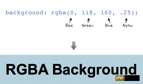
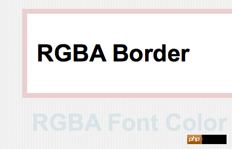
RGBA can be used for any color-related attributes, such as font color, border color, background color, shadow color, etc.
The structure of text shadow is in this order: x-offset, y-offset, blur, and color .
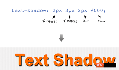
Setting a negative value for x-offset will change the shadow position to the left, and setting a negative value for y-offset will change the shadow position to the head. We can also use RBGA to set the color of the shadow.

You can set a group of text-shadows separated by commas. The example below uses two text-shadows (top 1px and bottom 1px) to set a news text effect for the name.
text-shadow: 0 1px 0 #fff, 0 -1px 0 #000;

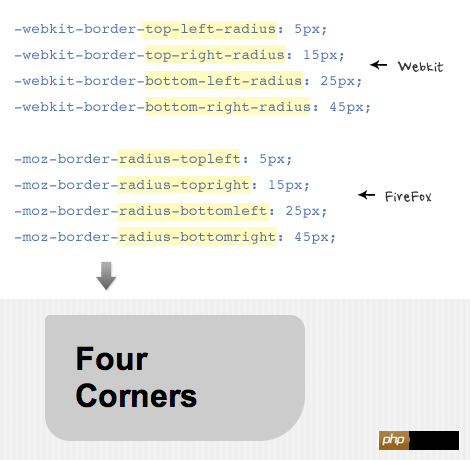
The convenient writing method of border radius assignment to attributes is similar to padding and margin ( For example: border-radius: 20px). In order for some browsers to render the effect correctly, you need to add a prefix in front of the attribute. For example, for webkit browsers, you need to add the "-webkit-" prefix, and for firefox browsers, you need to add "-moz-" prefix.
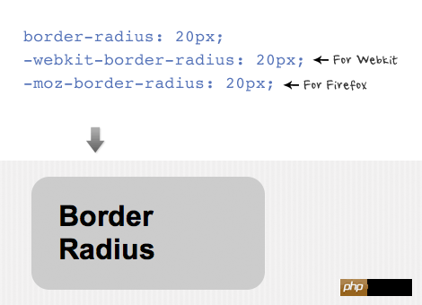
You can set different radii for different corners. Note that webkit and firefox browsers have different property names for each corner.
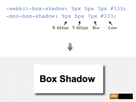
The structure and text-shadow properties of the box shadow Same, in this order: x-offset, y-offset, blur, and color.
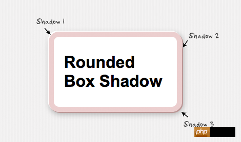
You can set many effects for the box shadow. For example, the following example uses a set of parameters to set the effect (parameters are separated by commas).
-moz-box-shadow:
-2px -2px 0 #fff,
2px 2px 0 #bb9595,
2px 4px 15px rgba(0, 0, 0, .3);
The above is the detailed content of HTML5 practice-detailed introduction to several properties text-shadow, box-shadow and border-radius in css3. For more information, please follow other related articles on the PHP Chinese website!
 css3 tutorial
 What are the production methods of html5 animation production?
 What are the css3 gradient properties?
 Introduction to article tag attributes
 The difference between HTML and HTML5
 How to withdraw money on WeChat without handling fees
 propertydescriptor usage
 What are the types of traffic?
 Check folder size in linux


