Introduction to box-shadow IE8 compatible processing method
According to canisue (http://caniuse.com/#search=box-shadow), box-shadow compatibility is shown in the figure below:
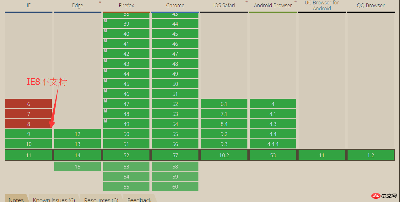
Test code:
<!DOCTYPE html>
<html>

    <head>
        <meta charset="UTF-8">
        <meta http-equiv="X-UA-Compatible" content="IE=edge,chrome=1">
        <title></title>
        <style type="text/css">
            * {
                margin: 0;
                padding: 0;
            }

            #header {
                width: 400px;
                height: 400px;
                margin: 10px;
                background-color: #999999;
                box-shadow: 3px 3px 5px #000;
            }
        </style>
    </head>

    <body>
        <div id="header">
        </div>
    </body>

</html>
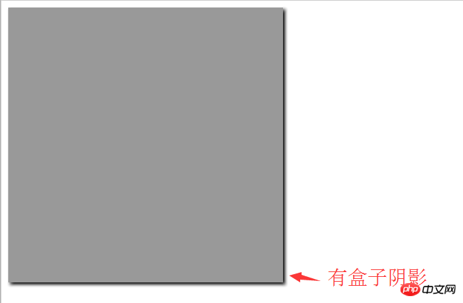
IE8 browser effect:

border-radius compatible solution in IE8 browser:
<!DOCTYPE html>
<html>

    <head>
        <meta charset="UTF-8">
        <meta http-equiv="X-UA-Compatible" content="IE=edge,chrome=1">
        <title></title>
        <style type="text/css">
            * {
                margin: 0;
                padding: 0;
            }

            #header {
                width: 400px;
                height: 400px;
                margin: 10px;
                background-color: #999999;
                box-shadow: 3px 3px 5px #000;
                /*关键属性设置 需要把路径设置好*/
                behavior: url(PIE.htc);
            }
        </style>
    </head>

    <body>
        <div id="header">
        </div>
    </body>

</html>
Effect under IE8 browser:
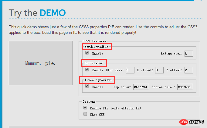
PIE can handle some properties of CSS3, such as:
The above is the detailed content of Introduction to box-shadow IE8 compatible processing method. For more information, please follow other related articles on the PHP Chinese website!

Hot AI Tools

Undresser.AI Undress
AI-powered app for creating realistic nude photos

AI Clothes Remover
Online AI tool for removing clothes from photos.

Undress AI Tool
Undress images for free

Clothoff.io
AI clothes remover

AI Hentai Generator
Generate AI Hentai for free.

Hot Article

Hot Tools

Notepad++7.3.1
Easy-to-use and free code editor

SublimeText3 Chinese version
Chinese version, very easy to use

Zend Studio 13.0.1
Powerful PHP integrated development environment

Dreamweaver CS6
Visual web development tools

SublimeText3 Mac version
God-level code editing software (SublimeText3)

Hot Topics
 How to select a child element with the first class name item through CSS?
Apr 05, 2025 pm 11:24 PM
When the number of elements is not fixed, how to select the first child element of the specified class name through CSS. When processing HTML structure, you often encounter different elements...
 What are the encoded fonts used in the picture? How to apply this font style in a project?
Apr 05, 2025 pm 05:06 PM
Introduction and use of encoded fonts In programming and web design, choosing the right font can greatly improve the readability and aesthetics of the code. recent,...
 How to correctly display the locally installed 'Jingnan Mai Round Body' on the web page?
Apr 05, 2025 pm 10:33 PM
Using locally installed font files in web pages Recently, I downloaded a free font from the internet and successfully installed it into my system. Now...
 Does H5 page production require continuous maintenance?
Apr 05, 2025 pm 11:27 PM
The H5 page needs to be maintained continuously, because of factors such as code vulnerabilities, browser compatibility, performance optimization, security updates and user experience improvements. Effective maintenance methods include establishing a complete testing system, using version control tools, regularly monitoring page performance, collecting user feedback and formulating maintenance plans.
 How to use CSS and Flexbox to implement responsive layout of images and text at different screen sizes?
Apr 05, 2025 pm 06:06 PM
Implementing responsive layouts using CSS When we want to implement layout changes under different screen sizes in web design, CSS...
 How to customize the hover effect of merge rows in el-table?
Apr 05, 2025 pm 06:54 PM
How to customize the hover effect of merge rows in el-table? Using Element...
 How to adjust hover style and logic of merged rows in el-table in Element UI?
Apr 05, 2025 pm 07:45 PM
How to adjust the hover style and logic of merged rows in el-table? Using Element...
 How to make multiple lines of text aligned and underscore with CSS?
Apr 05, 2025 pm 08:00 PM
How to make multiple lines of text aligned and underscore with CSS? In daily web design, we often need to style multiple lines of text in special styles...


