 Web Front-end
 CSS Tutorial
 Detailed explanation of how to center a single line in CSS, center two lines on the left, and end more than two lines with an ellipsis
Detailed explanation of how to center a single line in CSS, center two lines on the left, and end more than two lines with an ellipsis
Solving problems does not consider compatibility. The questions are wild and unconstrained. Just say whatever comes to mind. If there are CSS properties that you feel are unfamiliar in the problem solving, go and learn about it quickly.
Keep updating, keep updating, keep updating, say important things three times.
5. A single line of text is displayed in the center, multiple lines are displayed on the left, and a maximum of two lines are ended with an ellipsis
This question is amazing for me elder brother.
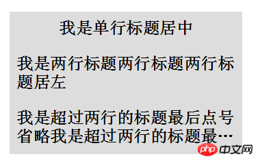
The question is as required. Use pure CSS to display a single line of text in the center and multiple lines of text on the left. A maximum of two lines must end with an ellipsis. The effect is as follows:
If you don’t want to read a long article, you can take a look at the effect first: -webkit- Demo under the kernel. Click me

The next step is One step to achieve this effect.
The first is to center a single line, and center multiple lines to the left
To center, you need to use <a href="http://www.php.cn/wiki/870.html" target="_blank">text-align</a>:center , left is the default value, which is text-align<a href="http://www.php.cn/wiki/974.html" target="_blank">:left</a>. What if we combine the two to achieve a single row in the center and multiple rows in the left? This requires one more tag. Suppose we define it as follows at the beginning:
<h2 id="单行居中-多行居左">单行居中,多行居左</h2>
Now, we are nesting one more layer of tags p in the middle of h2 :
<h2></h2><p>单行居中,多行居左</p>
Let the inner layer p be on the left text-align:left, and the outer layer h2 Center text-align:center, and set p to <a href="http://www.php.cn/wiki/927.html" target="_blank">display</a>:inline-block, using inline-block Elements can be centered by the parent text-align:center, so that single rows can be centered and multiple rows can be left. The CSS is as follows:
p {
    display: inline-block;
    text-align: left;
}
h2{
    text-align: center;
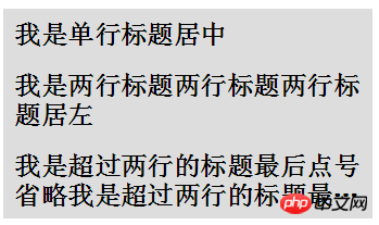
}Get The effect is as follows: 
Omit more than two lines
After completing the first step, the next thing to be implemented is Displays ellipses beyond two lines.
Multiple line omission can be achieved by special new CSS properties, but some compatibility is not good. The following are mainly used:
##display: -webkit-box; //Set the display to display the object as an elastic expansion box model
-webkit-line-clamp: 2; // Limit the number of lines of text displayed in a block element
-
-webkit-box-orient: vertical; // Specifies that the child elements of the box should be arranged horizontally or vertically
上述 3 条样式配合 <a href="http://www.php.cn/wiki/923.html" target="_blank">overflow</a> : hidden 和 <a href="http://www.php.cn/wiki/868.html" target="_blank">text-overflow</a>: ellipsis 即可实现 webkit 内核下的多行省略。好,我们将上述说的一共 5 条样式添加给 p 元素
p {
    display: inline-block;
    text-align: left;
    display: -webkit-box;
    -webkit-line-clamp: 2;
    -webkit-box-orient: vertical;
}
h2{
    text-align: center;
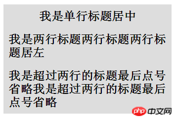
}看看效果如下:

(在 -webkit- 内核浏览器下)发现,虽然超出两行的是被省略了,但是第一行也变回了居左,而没有居中。
看回上面的 CSS 中的 p 元素,原因在于我们第一个设置的 display: inline-block ,被接下来设置的display: -webkit-box 给覆盖掉了,所以不再是 inline-block 特性的内部 p 元素占据了一整行,也就自然而然的不再居中,而变成了正常的居左展示。
记得上面我们解决单行居中,多行居左时的方法吗?上面我们添加多了一层标签解决了问题,这里我们再添加多一层标签,如下:
<h2></h2><p><em>单行居中,多行居左<em></em></em></p>
这里,我们再添加一层 em 标签,接下来,
设置
em为display: -webkit-box设置
p为inline-block设置
h2为text-align: center
嘿!通过再设置多一层标签,解决 display 的问题,完美解决问题,再看看效果,和一开始的示意图一样:

-webkit- 内核下 Demo 戳我
法二: 伪元素单行绝对定位障眼法
是的,还有第二种方法......
上面我们为了让第一行居中,使用了三层嵌套标签。
这次我们换一种思路,只使用两层标签,但是我们加多一行。结构如下:
<p>
    </p><h2>
        </h2><p>我是单行标题居中</p>
        <p>我是单行标题居中</p>
这里,新添加了一行 class 为 pesudo 的 p 标签,标签内容与文本内容一致,但是我们限定死class="pesudo" 的 p 标签高度 height 与上面的 p 的行高 <a href="http://www.php.cn/wiki/864.html" target="_blank">line-height</a>一致,并设置 overflow:hidden ,那么这个 p 标签最多只能能展示出一行文本,接下来使用绝对定位,定位到 h2 的顶部,再设置 text-align:center 以及背景色与 h2 背景色一致。
这样最多显示单行且样式为居中的 class="pesudo" p 标签就重叠到了原本的 p 标签之上。表现为单行居中,多行时第一行则铺满,解决了我们的问题。多行省略与方法一相同。CSS 如下:
<p>
    </p><h2>
        </h2><p>我是单行标题居中</p>
        <p>我是单行标题居中</p>
The above is the detailed content of Detailed explanation of how to center a single line in CSS, center two lines on the left, and end more than two lines with an ellipsis. For more information, please follow other related articles on the PHP Chinese website!

Hot AI Tools

Undresser.AI Undress
AI-powered app for creating realistic nude photos

AI Clothes Remover
Online AI tool for removing clothes from photos.

Undress AI Tool
Undress images for free

Clothoff.io
AI clothes remover

AI Hentai Generator
Generate AI Hentai for free.

Hot Article

Hot Tools

Notepad++7.3.1
Easy-to-use and free code editor

SublimeText3 Chinese version
Chinese version, very easy to use

Zend Studio 13.0.1
Powerful PHP integrated development environment

Dreamweaver CS6
Visual web development tools

SublimeText3 Mac version
God-level code editing software (SublimeText3)

Hot Topics
 1386
1386
 52
52
 How to use bootstrap in vue
Apr 07, 2025 pm 11:33 PM
Using Bootstrap in Vue.js is divided into five steps: Install Bootstrap. Import Bootstrap in main.js. Use the Bootstrap component directly in the template. Optional: Custom style. Optional: Use plug-ins.
 The Roles of HTML, CSS, and JavaScript: Core Responsibilities
Apr 08, 2025 pm 07:05 PM
HTML defines the web structure, CSS is responsible for style and layout, and JavaScript gives dynamic interaction. The three perform their duties in web development and jointly build a colorful website.
 How to write split lines on bootstrap
Apr 07, 2025 pm 03:12 PM
There are two ways to create a Bootstrap split line: using the tag, which creates a horizontal split line. Use the CSS border property to create custom style split lines.
 Understanding HTML, CSS, and JavaScript: A Beginner's Guide
Apr 12, 2025 am 12:02 AM
WebdevelopmentreliesonHTML,CSS,andJavaScript:1)HTMLstructurescontent,2)CSSstylesit,and3)JavaScriptaddsinteractivity,formingthebasisofmodernwebexperiences.
 How to resize bootstrap
Apr 07, 2025 pm 03:18 PM
To adjust the size of elements in Bootstrap, you can use the dimension class, which includes: adjusting width: .col-, .w-, .mw-adjust height: .h-, .min-h-, .max-h-
 How to use bootstrap button
Apr 07, 2025 pm 03:09 PM
How to use the Bootstrap button? Introduce Bootstrap CSS to create button elements and add Bootstrap button class to add button text
 How to set up the framework for bootstrap
Apr 07, 2025 pm 03:27 PM
To set up the Bootstrap framework, you need to follow these steps: 1. Reference the Bootstrap file via CDN; 2. Download and host the file on your own server; 3. Include the Bootstrap file in HTML; 4. Compile Sass/Less as needed; 5. Import a custom file (optional). Once setup is complete, you can use Bootstrap's grid systems, components, and styles to create responsive websites and applications.
 How to insert pictures on bootstrap
Apr 07, 2025 pm 03:30 PM
There are several ways to insert images in Bootstrap: insert images directly, using the HTML img tag. With the Bootstrap image component, you can provide responsive images and more styles. Set the image size, use the img-fluid class to make the image adaptable. Set the border, using the img-bordered class. Set the rounded corners and use the img-rounded class. Set the shadow, use the shadow class. Resize and position the image, using CSS style. Using the background image, use the background-image CSS property.


