Detailed introduction to Html layout using CSS
Single column layout horizontally centered
Horizontally centeredPage layout中The most common form of layout, which mostly appears in titles and the organization of content areas. Here are four ways to achieve horizontal centering (Note: What is implemented in each example below is the alignment operation of the child element. The parent container of the child element Is the parent element)
Use inline-block and text-align to achieve
.parent{text-align: center;}
.child{display: inline-block;} Advantages: good compatibility;
Disadvantages: need to set the child element and parent at the same time Element
Use margin:0 auto to implement
.child{width:200px;margin:0 auto;} Advantages: Good compatibility
Disadvantages: Need to specify the width
Use table to implement
.child{display:table;margin:0 auto;} Advantages: You only need to set yourself
Disadvantages: IE6 and 7 need to adjust the structure
Use Absolute positioningAchievement
.parent{position:relative;}
/*或者实用margin-left的负值为盒子宽度的一半也可以实现,不过这样就必须知道盒子的宽度,但兼容性好*/
.child{position:absolute;left:50%;transform:translate(-50%);}Disadvantages: Poor compatibility, available for IE9 and above
Practical flex layout implementation
/*第一种方法*/.parent{display:flex;justify-content:center;}
/*第二种方法*/.parent{display:flex;}.child{margin:0 auto;}Disadvantages: Poor compatibility, if a large area layout is performed, efficiency may be affected
Vertical centering
We all know that everyone has different hobbies. Some people like to eat sweets, some like to eat spicy things, and some like to eat spicy food. Some people don't like to eat celery, some people don't like to eat mutton, etc. The same is true for some elements in CSS, some of them are only interested in milk, some only like to eat nuts and jelly, and hate milk. Align is a rather picky eater. He only likes to eat jelly. He has grown up eating jelly. Without jelly, he will lose his temper and ignore you. I call it a "jelly-dependent element". It is called "inline-block dependent element", that is to say, only one element belongs to inline or inline-block (table-cell can also be understood as inline-block level) level, and its vertical-align Attribute will work. Some of my understanding and understanding of css-vertical-align
When using vertical-align, the alignment baseline is marked by the line height baseline. , so you need to set line-height or set display:table-cell;
/*第一种方法*/.parent{display:table-cell;vertical-align:middle;height:20px;}
/*第二种方法*/.parent{display:inline-block;vertical-align:middle;line-height:20px;}Practical absolute positioning
.parent{position:relative;}.child{positon:absolute;top:50%;transform:translate(0,-50%);}Practical flex implementation
.parent{display:flex;align-items:center;}Horizontal and vertical All centered
Use vertical-align, text-align, inline-block to achieve
.parent{display:table-cell;vertical-align:middle;text-align:center;}
.child{display:inline-block;}Use absolute positioning to achieve
.parent{position:relative;}
.child{position:absolute;top:50%;left:50%;transform:translate(-50%,-50%);}Use flex to achieve
.parent{display:flex;justify-content:center;align-items:center;}More Column layout: The left column has a fixed width, and the right column is adaptive
This layout method is very common. The side that is suitable for fixed width is usually navigation, and the adaptive side is the layout of content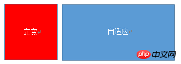
Use float+margin to achieve
.left{float:left;width:100px;}
.right{margin-left;margin-left:100px;}Note: IE6 will have a 3px bug
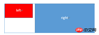
Use float+margin(fix) Implement
<p>
    </p><p></p>
    <p>
        </p><p></p>
.left{width:100px;float:left;}
.right-fix{width:100%;margin-left:-100px;float:right;}
.right{margin-left:100px;}Use float+overflow to implement
.left{width:100px;float:left;}
.right{overflow:hidden;}overflow:hidden, trigger bfc mode, float cannot Influence, isolate other elements, IE6 does not support it, set margin-left on the left side as the margin between left and right, use overflow:hidden on the right side to form bfc mode
If we need to set the two columns to be equal High, you can use the following method to set the "background" to be of equal height. In fact, it is not the equal height of the content.
.left{width:100px;float:left;}.right{overflow:hidden;}
.parent{overflow:hidden;}
.left,.right{padding-bottom:9999px;margin-bottom:-9999px;}Use table implementation
.parent{display:table;table-layout:fixed;width:100%;}
.left{width:100px;}
.right,.left{display:table-cell;}Practical flex implementation
.parent{display:flex;}
.left{width:100px;}.right{flex:1;}Using flex:1 of the container on the right, the remaining width is evenly divided and the same effect is achieved. The default value of align-items is stretch, so the heights of the two are equal
右列定宽,左列自适应
实用float+margin实现
.parent{background:red;height:100px;margin:0 auto;}
.left{background:green;margin-right:-100px;width:100%;float:left;}
.right{float:right;width:100px;background:blue;}使用table实现
.parent{display:table;table-layout:fixed;width:100%;}
.left{display:table-cell;}
.right{width:100px;display:table-cell;}实用flex实现
.parent{display:flex;}
.left{flex:1;}
.right{width:100px;}两列定宽,一列自适应

基本html结构为父容器为parent,自容器为left,center,right.其中,left,center定宽,right自适应
利用float+margin实现
.left,.center{float:left:width:200px;}
.right{margin-left:400px;}利用float+overflow实现
.left,.center{float:left:width:200px;}
.right{overflow:hidden;}利用table实现
.parent{display:table;table-layout:fixed;width:100%;}
.left,.center,.right{display:table-cell;}
.left,.center{width:200px;}利用flex实现
.parent{display:flex;}
.left,.center{width:100px;}
.right{flex:1}两侧定宽,中栏自适应

利用float+margin实现
.left{width:100px;float:left;}
.center{float:left;width:100%;margin-right:-200px;}
.right{width:100px;float:right;}利用table实现
.parent{width:100%;display:table;table-layout:fixed}
.left,.center,.right{display:table-cell;}
.left{width:100px;}.right{width:100px;}利用flex实现
.parent{display:flex;}
.left{width:100px;}
.center{flex:1;}
.right{width:100px;}一列不定宽,一列自适应
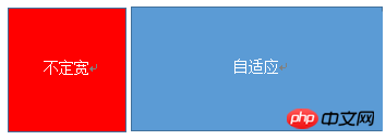
利用float+overflow实现
.left{float:left;}
.right{overflow:hidden;}利用table实现
.parent{display:table;table-layout:fixed;width:100%;}
.left{width:0.1%;}
.left,.right{display:table-cell;}利用flex实现
.parent{display:flex;}
.right{flex:1;}多列等分布局
多列等分布局常出现在内容中,多数为功能的,同阶级内容的并排显示等。
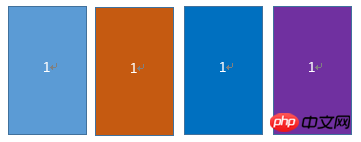
html结构如下所示
<p>
    </p><p>1</p>
    <p>1</p>
    <p>1</p>
    <p>1</p>
实用float实现
.parent{margin-left:-20px}
/*假设列之间的间距为20px*/
.column{float:left;width:25%;padding-left:20px;box-sizing:border-box;}利用table实现
.parent-fix{margin-left:-20px;}
.parent{display:table;table-layout:fixed;width:100%;}
.column{display:table-cell;padding-left:20px;}利用flex实现
.parent{display:flex;}.column{flex:1;}
.column+.column{margin-left:20px;}九宫格布局
使用table实现
<p>
        </p><p></p><p></p><p></p><p></p>
        <p></p><p></p><p></p><p></p>
        <p></p><p></p><p></p><p></p>
.parent{display:table;table-layout:fixed;width:100%;}.row{display:table-row;}.item{display:table-cell;width:33.3%;height:200px;}实用flex实现
<p></p><p></p><p></p>
<p></p>
<p></p>
<p></p><p></p>
<p></p>
<p></p>
<p></p><p></p>
<p></p>
<p></p>
.parent{display:flex;flex-direction:column;}
.row{height:100px;display:flex;}
.item{width:100px;background:red;}全屏布局
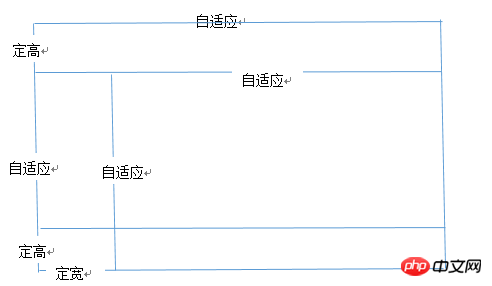
利用绝对定位实现
<p></p><p>top</p><p>left</p>
<p>right</p><p>bottom</p>
html,body,parent{height:100%;overflow:hidden;}
.top{position:absolute:top:0;left:0;right:0;height:100px;}
.left{position:absolute;top:100px;left:0;bottom:50px;width:200px;}
.right{position:absolute;overflow:auto;left:200px;right:0;top:100px;bottom:50px;}
.bottom{position:absolute;left:0;right:0;bottom:0;height:50px;}利用flex实现
<p></p><p>top</p>
<p></p><p>left</p>
<p>right</p>
<p>bottom</p>
.parent{display:flex;flex-direction:column;}
.top{height:100px;}
.bottom{height:50px;}
.middle{flex:1;display:flex;}
.left{width:200px;}
.right{flex:1;overflow:auto;}meta标签的实用
设置布局宽度等于设备宽度,布局viewport等于度量viewport
<meta>
HTML 4和CSS 2目前支持为不同的媒体类型设定专有的样式表, 比如, 一个页面在屏幕上显示时使用无衬线字体,
而在打印时则使用衬线字体, screen 和 print 是两种已定义的媒体类型, 媒体查询让样式表有更强的针对性,
扩展了媒体类型的功能;媒体查询由媒体类型和一个或多个检测媒体特性的条件表达式组成,
媒体查询中可用于检测的媒体特性有width、height和color(等), 使用媒体查询, 可以在不改变页面内容的情况下,
为特定的一些输出设备定制显示效果。
语法
@media screen and (max-width:960px){....}<link>The above is the detailed content of Detailed introduction to Html layout using CSS. For more information, please follow other related articles on the PHP Chinese website!

Hot AI Tools

Undresser.AI Undress
AI-powered app for creating realistic nude photos

AI Clothes Remover
Online AI tool for removing clothes from photos.

Undress AI Tool
Undress images for free

Clothoff.io
AI clothes remover

AI Hentai Generator
Generate AI Hentai for free.

Hot Article

Hot Tools

Notepad++7.3.1
Easy-to-use and free code editor

SublimeText3 Chinese version
Chinese version, very easy to use

Zend Studio 13.0.1
Powerful PHP integrated development environment

Dreamweaver CS6
Visual web development tools

SublimeText3 Mac version
God-level code editing software (SublimeText3)

Hot Topics
 1386
1386
 52
52
 What is the purpose of the <progress> element?
Mar 21, 2025 pm 12:34 PM
The article discusses the HTML <progress> element, its purpose, styling, and differences from the <meter> element. The main focus is on using <progress> for task completion and <meter> for stati
 Is HTML easy to learn for beginners?
Apr 07, 2025 am 12:11 AM
HTML is suitable for beginners because it is simple and easy to learn and can quickly see results. 1) The learning curve of HTML is smooth and easy to get started. 2) Just master the basic tags to start creating web pages. 3) High flexibility and can be used in combination with CSS and JavaScript. 4) Rich learning resources and modern tools support the learning process.
 What is the purpose of the <datalist> element?
Mar 21, 2025 pm 12:33 PM
The article discusses the HTML <datalist> element, which enhances forms by providing autocomplete suggestions, improving user experience and reducing errors.Character count: 159
 What is the purpose of the <meter> element?
Mar 21, 2025 pm 12:35 PM
The article discusses the HTML <meter> element, used for displaying scalar or fractional values within a range, and its common applications in web development. It differentiates <meter> from <progress> and ex
 What is the viewport meta tag? Why is it important for responsive design?
Mar 20, 2025 pm 05:56 PM
The article discusses the viewport meta tag, essential for responsive web design on mobile devices. It explains how proper use ensures optimal content scaling and user interaction, while misuse can lead to design and accessibility issues.
 What is the purpose of the <iframe> tag? What are the security considerations when using it?
Mar 20, 2025 pm 06:05 PM
The article discusses the <iframe> tag's purpose in embedding external content into webpages, its common uses, security risks, and alternatives like object tags and APIs.
 The Roles of HTML, CSS, and JavaScript: Core Responsibilities
Apr 08, 2025 pm 07:05 PM
HTML defines the web structure, CSS is responsible for style and layout, and JavaScript gives dynamic interaction. The three perform their duties in web development and jointly build a colorful website.
 What is an example of a starting tag in HTML?
Apr 06, 2025 am 12:04 AM
AnexampleofastartingtaginHTMLis,whichbeginsaparagraph.StartingtagsareessentialinHTMLastheyinitiateelements,definetheirtypes,andarecrucialforstructuringwebpagesandconstructingtheDOM.


