

Background and Border Part One
Background and Border Part Two
shape
.wrap{
  width: 200px;
  height: 120px;
  background: yellowgreen;
  box-shadow: 2px 0px 4px -2px black,
  -2px 0px 4px -2px black;
}
Background image, or border-image
background-clip is not border-box)
.wrap{
   width: 200px;
   height: 120px;
   border: 6px dotted yellowgreen;
   --box-shadow: 0px 0px 4px 0px black;
   -webkit-filter: drop-shadow(2px 0px 2px rgba(0,0,0,1))
 }
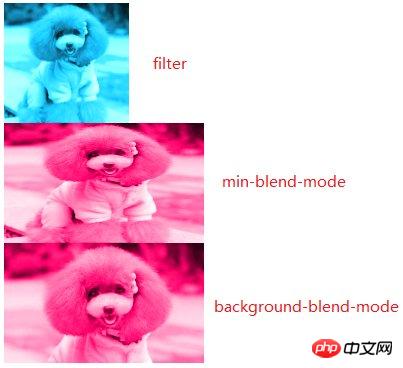
-mode, Function: To realize the "mixing" of element content and background and the following elements
.wrap1{
            width: 200px;
            height: 120px;
            overflow: hidden;
        }
        .wrap1 > img{
            max-height: 100%;
            max-width: 100%;
            -webkit-filter: sepia(1) saturate(4) hue-rotate(150deg);
        }

        .wrap2{
            width: 200px;
            height: 120px;
            background: hsl(335, 100%, 50%);
            overflow: hidden;
        }
        .wrap2 > img{
            height: 100%;
            width: 100%;
            mix-blend-mode: luminosity;
        }

        .wrap3{
            width: 200px;
            height: 120px;
            background-size: cover;
            background-color: hsl(335, 100%, 50%);
            background-image: url("../img/cat.png");
            background-blend-mode: luminosity;
} 4. Frosted glass effect
pseudo-elementsThe code is as follows:
body{
    background: url("../img/cat.png") no-repeat;
    background-size: cover;
}.wrap{
    position: relative;
    width: 500px;
    margin: 0px auto;
    padding: 10px;
    line-height: 1.5;
    background: hsla(0, 0%, 100%, .3);
    overflow: hidden;
}.wrap::before{
    content: '';
    background: url("../img/cat.png") 0/cover fixed;
    position: absolute;
    top: 0; right: 0; bottom: 0; left: 0;
    filter: blur(20px);
    z-index: -1;
    margin: -30px;
} Code description:
.wrap{
        background: linear-gradient(to left bottom, transparent 50%, rgba(0, 0, 0, .4) 0) no-repeat 100% 0/2em 2em,
        linear-gradient(-135deg, transparent 1.4em, #58a 0);
        width: 200px;
        height: 120px;
} Note
Note
The above is the detailed content of Detailed interpretation of visual effects in the application of css3 new features. For more information, please follow other related articles on the PHP Chinese website!


![[Web front-end] Node.js quick start](https://img.php.cn/upload/course/000/000/067/662b5d34ba7c0227.png)


