WeChat Mini Program Tutorial Demo: Maoyan Movie Example
1. Directory structure
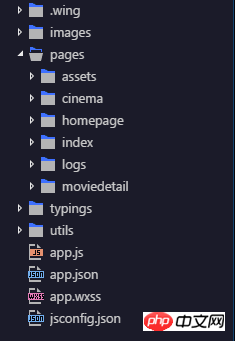
The development tool used is Egret Wing. The main directory description:
It can be seen from the directory that the overall structure is simple, mainly three Each interface: homepage, movie details page moviedetail, theater list page cinema.
2. Home page
tab code, open app.json as shown:
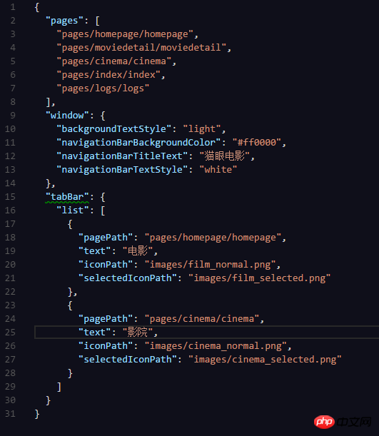
here I would like to say that I quite like the tabBar selection effect that comes with the WeChat applet (if you have to write a selector XML file for each tab on Android). Since there are no technical difficulties in this section, I like it very much. Not much to say.
Next, enter the homepage. The file structure of an interface is inseparable from three files: xxx.js, xxx.wxml, xxx.wxss
Let’s take a look at the layout code first:
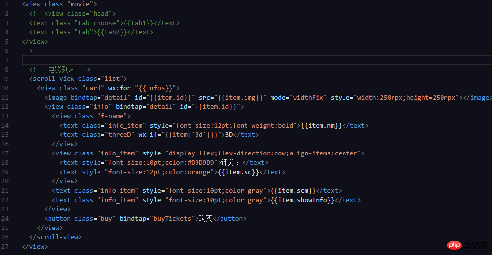
Here I admit that I was lazy when I first wrote it. I wrote some tag attributes directly in style, but when actually developing, it is best to put the style of each tag. Written in the .wxss file, through a custom class name (or id), the same class can be directly referenced in places with the same layout. Otherwise, some attributes will be written several times like me (manually embarrassing).
.js code looks down:
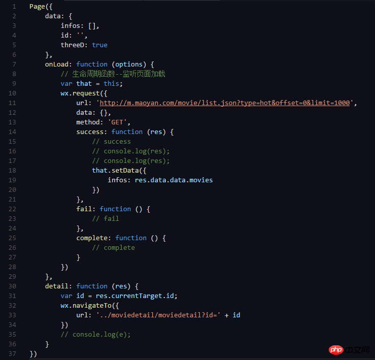
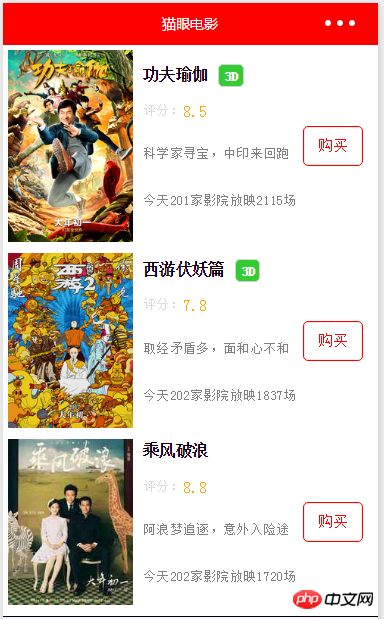
#The information of the movie list is placed in the defined infos[] array, and there is no json parsing in the applet. , the res obtained under the wx.request request takes the corresponding value res.data.data.movie, and is traversed directly in the homepage.html tag using wx:for="{{infos}}". The element defaults to item, and the value is When using "item.value name", you can get the data.
There is a small point that needs to be explained here. It took some time to solve it at the time: there is a parameter named "3d" in the json data, and this tag is not available in all movies, so it is defined In order to get the value of the variable threeD:true in .wxml, it can be imagined that it is directly written as wx:if="{{item.3d}}", and the result is an error:

The problem lies in this 3d. After checking the information, I found out that it should be rewritten as wx:if="{{item['3d']}}" and it was solved immediately. There is no reason, it is a convention. , it’s just that I, a front-end novice, don’t know it (don’t be surprised...smile manually)
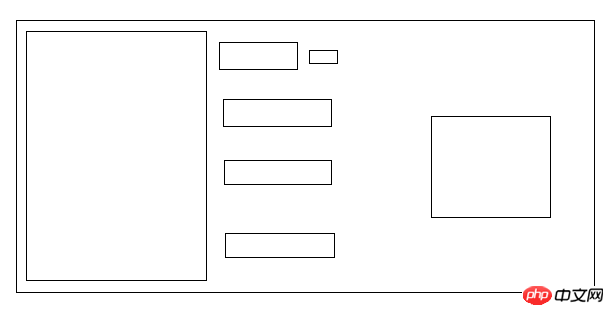
In order to give everyone a clearer understanding of the layout of the movie list, I drew a sketch:
2. Details page
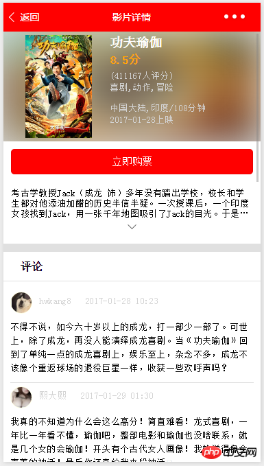
I won’t post all the codes here. I will only use the key codes to explain some of the things I encountered at that time. Question:
①Gaussian Blur
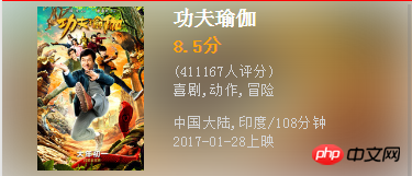
There are two here, one class="blur" (Gaussian blur background), one class="info" ( movie information). At the beginning, I wrote this layout based on Android layout design thinking. Isn't this a RelativeLayout? After writing and writing until the final effect came out, I found that I was still too naive. In the information column, I somehow wrote it under the Gaussian blur. , that is, it was written as LinearLayout and orientation=vertical. I laughed at myself at the time: You are not writing Android now, wake up! My kid~ The main reason is that the knowledge of CSS3 is not enough, so I studied it honestly. Here is the code:
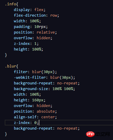
filter:blur(30px) and -webkit-filter:blur(30px) form a Gaussian blur effect (Inner OS: If it is Android, it is a lot of code). The combination of position: relative and z-index: 1 in info and position: absolute and z-index: 0 in blur can show the above effect. The key is that the z-index in info is greater than that in blur, which means the display Above blur, make sure that info is relative and blur is absolute. Friends who are interested and have never been exposed to CSS3 can download the code and try changing it to see the effect. Don't think like me that you can. Instead, he is being smart.
②Click to show all
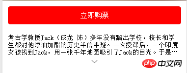
Here I want to praise the ternary operator again:

.js file sets three variables in data

showall method

hideText Boolean value is used To determine whether the current state is hidden, use style="{{hideText?'-webkit-line-clamp:3':' '}}" to set the number of displayed lines. When hideText is true, 3 lines are displayed, otherwise no value is given. , which is the default. Define hideClass to control the direction of the arrow. 'down' means that the current introduction is hidden, 'up' means that all are displayed. For icon rotation, just give a rotation attribute.

Okay, I spend a lot of time in these two places on the details page. It’s still the old saying: If you don’t understand, look up more information.
The comment section is a simple list and will not be explained in detail here.
3. Movie theater list
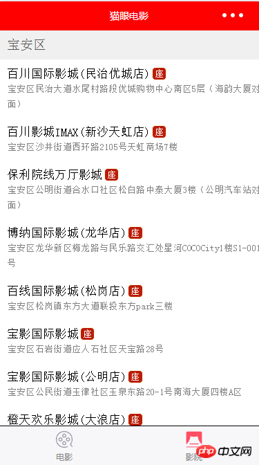
This is just a simple list of information. There is no difficulty in the layout, but the code can be optimized. For this purpose It saves trouble, so I didn’t write it, just to achieve the effect.
Summary
Generally speaking, the code is not difficult. There are only three pages. It is just a demo written to get familiar with JS and CSS3. Friends who have read the code will know that it can be optimized. There are many places. This is also the first article I have written since I joined Jianshu (alas~ I finally took the first step). I just want to summarize the knowledge I just learned, review it, and share it with everyone. Please correct me!
The above is the detailed content of WeChat Mini Program Tutorial Demo: Maoyan Movie Example. For more information, please follow other related articles on the PHP Chinese website!

Hot AI Tools

Undresser.AI Undress
AI-powered app for creating realistic nude photos

AI Clothes Remover
Online AI tool for removing clothes from photos.

Undress AI Tool
Undress images for free

Clothoff.io
AI clothes remover

Video Face Swap
Swap faces in any video effortlessly with our completely free AI face swap tool!

Hot Article

Hot Tools

Notepad++7.3.1
Easy-to-use and free code editor

SublimeText3 Chinese version
Chinese version, very easy to use

Zend Studio 13.0.1
Powerful PHP integrated development environment

Dreamweaver CS6
Visual web development tools

SublimeText3 Mac version
God-level code editing software (SublimeText3)

Hot Topics
 1386
1386
 52
52
 What does demo mean?
Feb 12, 2024 pm 09:12 PM
The word demo is no longer unfamiliar to friends who like to sing, but many users who have never been exposed to it are curious about what demo means. Now let’s take a look at the meaning of the demo brought by the editor. What does demo mean? Answer: Demo tape. 1. The pronunciation of demo is ['deməʊ] in English and ['demoʊ] in America. 2. Demo is the abbreviation of "demonstration", which generally refers to the preliminary effect of listening to a song before it is officially recorded. 3. Demo is used as a noun to refer to sample tapes and sample records. The meaning of verb is trial (especially software), demonstration and demonstration;
 Develop WeChat applet using Python
Jun 17, 2023 pm 06:34 PM
With the popularity of mobile Internet technology and smartphones, WeChat has become an indispensable application in people's lives. WeChat mini programs allow people to directly use mini programs to solve some simple needs without downloading and installing applications. This article will introduce how to use Python to develop WeChat applet. 1. Preparation Before using Python to develop WeChat applet, you need to install the relevant Python library. It is recommended to use the two libraries wxpy and itchat here. wxpy is a WeChat machine
 Can small programs use react?
Dec 29, 2022 am 11:06 AM
Mini programs can use react. How to use it: 1. Implement a renderer based on "react-reconciler" and generate a DSL; 2. Create a mini program component to parse and render DSL; 3. Install npm and execute the developer Build npm in the tool; 4. Introduce the package into your own page, and then use the API to complete the development.
 Implement card flipping effects in WeChat mini programs
Nov 21, 2023 am 10:55 AM
Implementing card flipping effects in WeChat mini programs In WeChat mini programs, implementing card flipping effects is a common animation effect that can improve user experience and the attractiveness of interface interactions. The following will introduce in detail how to implement the special effect of card flipping in the WeChat applet and provide relevant code examples. First, you need to define two card elements in the page layout file of the mini program, one for displaying the front content and one for displaying the back content. The specific sample code is as follows: <!--index.wxml-->&l
 Alipay launched the 'Chinese Character Picking-Rare Characters' mini program to collect and supplement the rare character library
Oct 31, 2023 pm 09:25 PM
According to news from this site on October 31, on May 27 this year, Ant Group announced the launch of the "Chinese Character Picking Project", and recently ushered in new progress: Alipay launched the "Chinese Character Picking-Uncommon Characters" mini program to collect collections from the society Rare characters supplement the rare character library and provide different input experiences for rare characters to help improve the rare character input method in Alipay. Currently, users can enter the "Uncommon Characters" applet by searching for keywords such as "Chinese character pick-up" and "rare characters". In the mini program, users can submit pictures of rare characters that have not been recognized and entered by the system. After confirmation, Alipay engineers will make additional entries into the font library. This website noticed that users can also experience the latest word-splitting input method in the mini program. This input method is designed for rare words with unclear pronunciation. User dismantling
 How uniapp achieves rapid conversion between mini programs and H5
Oct 20, 2023 pm 02:12 PM
How uniapp can achieve rapid conversion between mini programs and H5 requires specific code examples. In recent years, with the development of the mobile Internet and the popularity of smartphones, mini programs and H5 have become indispensable application forms. As a cross-platform development framework, uniapp can quickly realize the conversion between small programs and H5 based on a set of codes, greatly improving development efficiency. This article will introduce how uniapp can achieve rapid conversion between mini programs and H5, and give specific code examples. 1. Introduction to uniapp unia
 Tutorial on writing a simple chat program in Python
May 08, 2023 pm 06:37 PM
Implementation idea: Establishing the server side of thread, so as to process the various functions of the chat room. The establishment of the x02 client is much simpler than the server. The function of the client is only to send and receive messages, and to enter specific characters according to specific rules. To achieve the use of different functions, therefore, on the client side, you only need to use two threads, one is dedicated to receiving messages, and the other is dedicated to sending messages. As for why not use one, that is because, only
 How to use demo of python random library
May 05, 2023 pm 08:13 PM
Simple use of pythonrandom library demo When we need to generate random numbers or randomly select elements from a sequence, we can use Python's built-in random library. The following is an annotated example that demonstrates how to use the random library: #Import random library importrandom #Generate a random decimal between 0 and 1 random_float=random.random()print(random_float)#Generate a random decimal within the specified range Random integer (including endpoints) random_int=random.randint(1,10)print(random_int)#


